
Atom Power
messaging | logo design | brand identity
Second and third generation electricians Seth and Erwin worked with us to reposition their existing Atom Power business from general electrical services to commercial power management solutions. The business is now focusing purely on Power Factor Correction in commercial markets. Atom solves the problem of companies facing high energy bills while doing unnecessary damage to the environment. Their process is to figure out the causes of excess power usage, then supply advice on the solution—at which time they can also install and configure the solution.
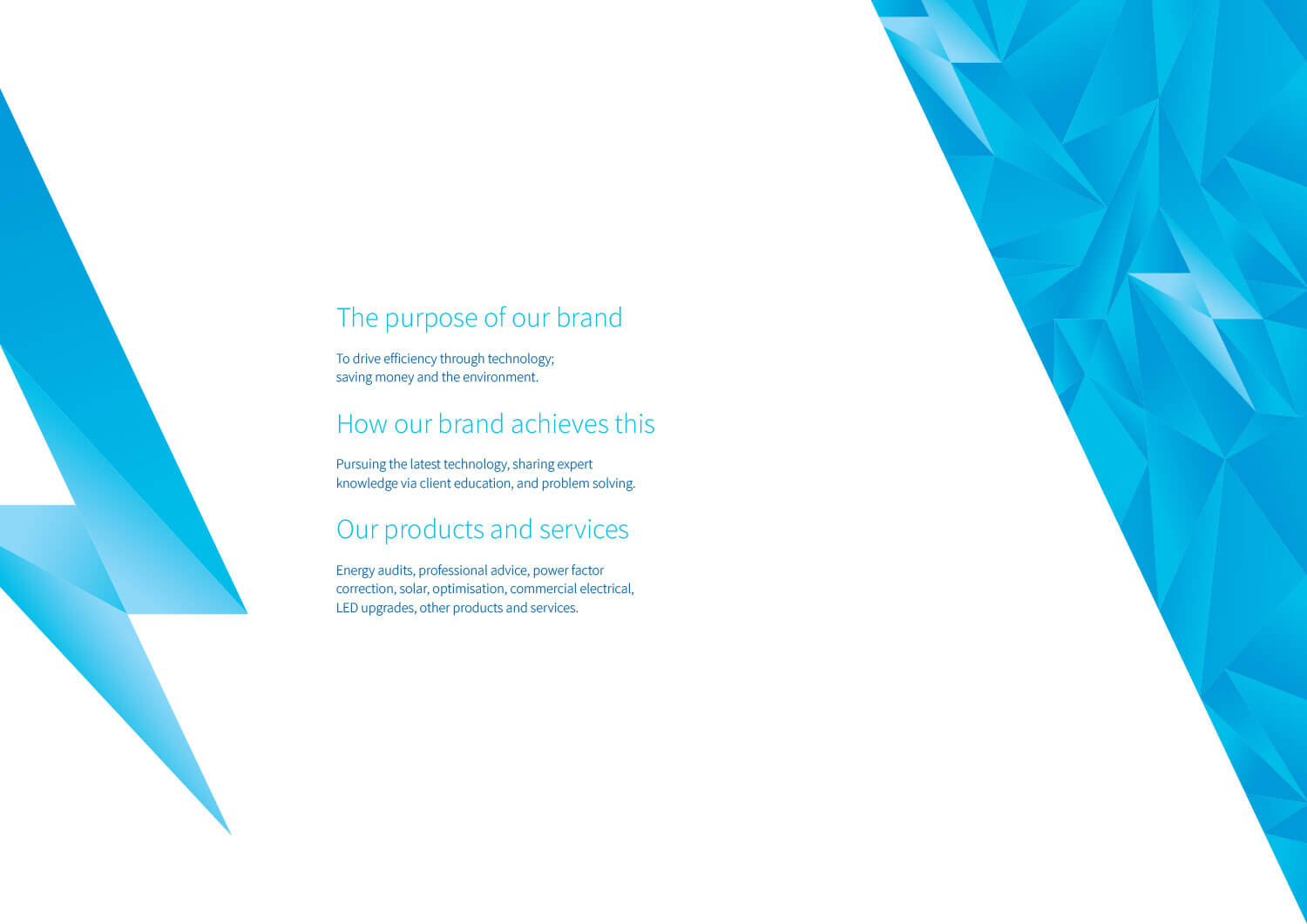
We began the brand design process with a thorough discovery session, which set the foundation and informed the messaging and design stages of the process. The messaging stage created a tagline, company statement, plus various length versions of the company story. We also articulated the purpose of the brand, how the brand achieves this purpose, and what products and services align with the purpose.
'Efficiency through technology.'
'Transforming companies to be energy efficient using state-of-the-art technology; reducing their power costs while decreasing their impact on the environment.'
Essentially, we distilled what is a highly complex and technical process to assess and correct a company’s power factor and translated that into a benefit to the customer: reduce your business’ power costs while decreasing your impact on the environment. We then took this idea of making a correction to reduce cost and waste into the logo design stage.
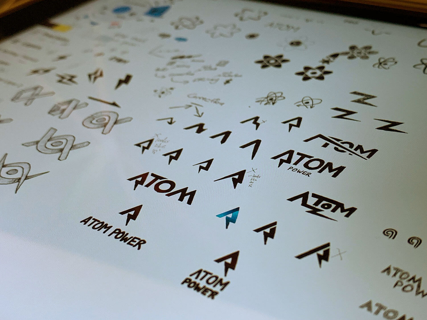
The Atom Power logo is designed to appear efficient and reliable while being cutting-edge and technological.
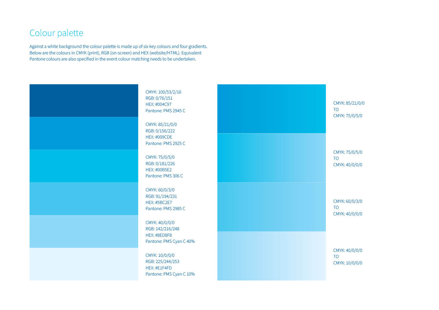
The blue colour palette has connotations of quality, trust and competency. The lighter sections of blue represent creativity in terms of problem solving and new ideas. Blue is also a corporate colour that appeals to a wide audience of business owners and CEOs.
The blue is offset by white which represents clarity, simplicity and sophistication—Atom makes energy management easy for the customer while using the latest in technology.
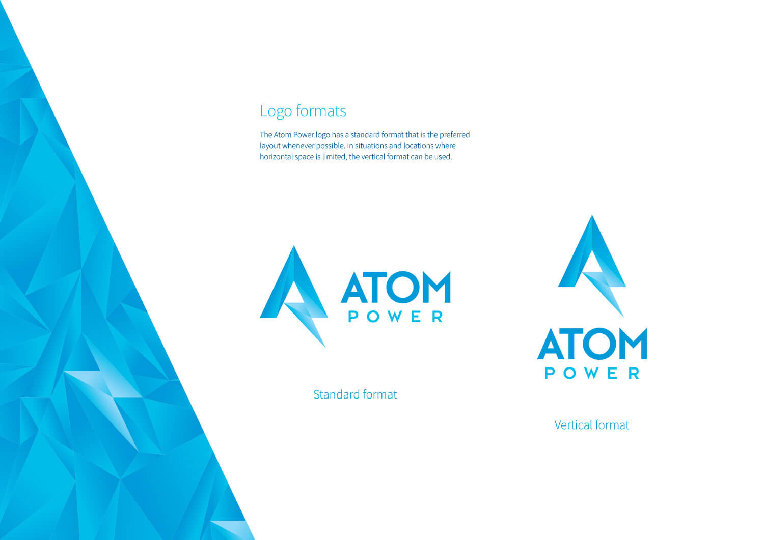
The graphic device is a stylised ‘A’ that incorporates an electricity bolt. The idea of the shape is to represent the immediate change that power factor correction has on a business’ power costs. Like a graph showing power consumption, the shape goes up then sharply turns down—and remains down. The crystal-like shapes represent the high-tech, multifaceted approach Atom uses to help its clients to save money.
The font is designed to appear edgy yet highly reliable and reputable. The sharp points of the ‘A’, ‘M’ and ‘W’ complement the angular pointy design of the graphic device.
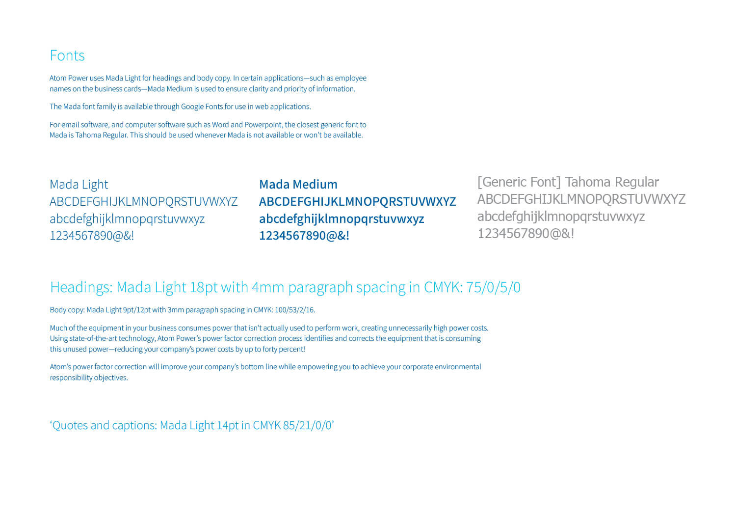
A font use guide was created stipulating Atom Power’s corporate fonts, fallback font, plus a range of typography guidelines including size, spacing and colours.
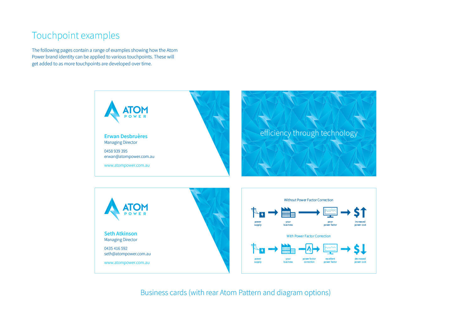
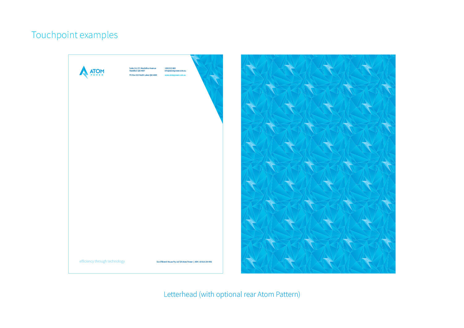
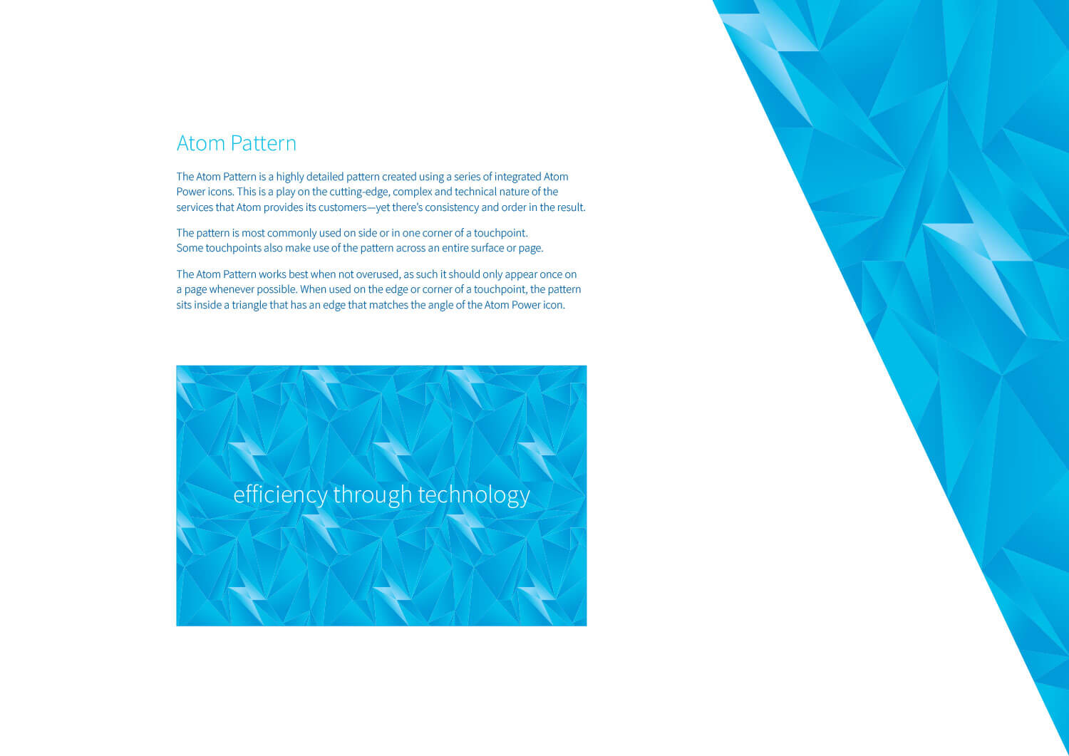
The Atom Pattern was also created to complement the other brand elements. The pattern is highly detailed, created using a series of integrated Atom Power icons. This is a play on the cutting-edge, complex and technical nature of the services that Atom provides its customers—yet there’s consistency and order in the result. The pattern gets used in a variety of ways, including as an angular element that covers one corner of a layout.
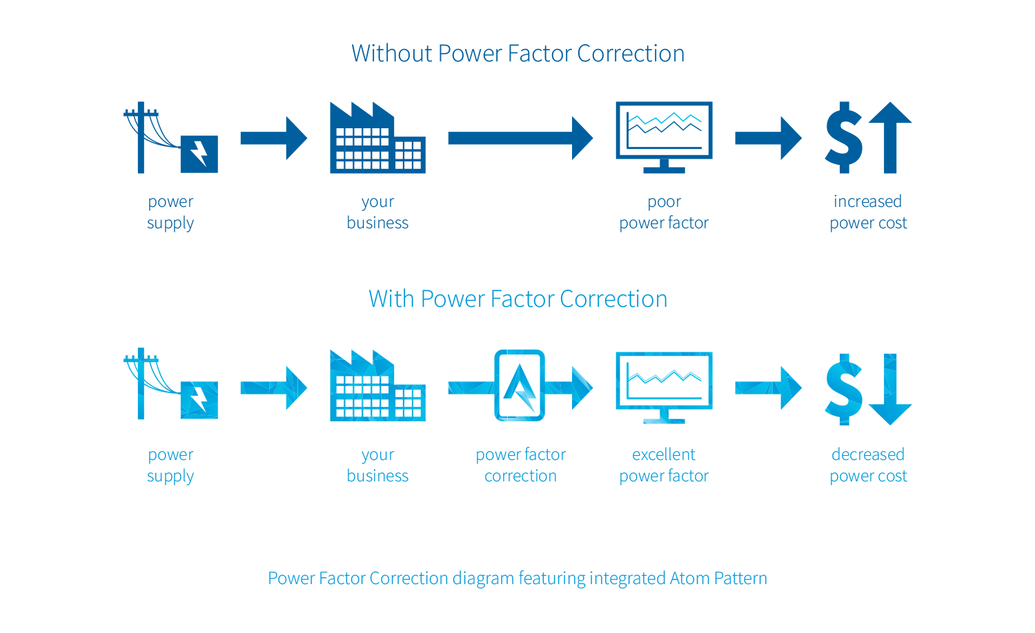
Evocative also updated one of Atom’s existing diagrams to feature more modern custom-drawn icons, a focus on business and power cost, plus we introduced the Atom Power pattern into the icon string that features Atom’s power factor correction.
This brand design project also included a couple of stationery touchpoints: double-sided business cards and letterhead design. We additionally created a Word template version of the letterhead that allows for in-house printing and PDF production.