![]()
THRIVE Institute
messaging | logo design | brand identity | website
The THRIVE Institute is a collection of psychologists and other professionals that work to build resilience to enhance wellbeing and workplace performance. Lead psychologists James and Leanne have a history of working in private practice and within government-run emergency departments. It was through this experience that an opportunity was identified to expand their expertise beyond the clinic and into real-world business applications. Part of the drive for this shift was a change in focus and intent: from looking after serious mental illness and PTSD, to working instead on preventative strategies including building wellbeing and resilience. They see prevention as being much better than treatment, as it improves people’s quality-of-life and wellbeing while avoiding the emotional and financial cost of absenteeism and burnout.
The THRIVE Institute works with a diverse range of organisations and individuals in safety-critical and high-performance industries including aeromedical, aviation from high-risk helicopter rescues to long haul flights, emergency services including police, fire, ambulance, and SES, the Australian Defence Force, aerospace, and a variety of commercial industries.
THRIVE came to Evocative with an amazing business story, and a client base who were passionate about the programmes and who had all experienced meaningful and profound change within their people and organisations. The thing that was virtually non-existent was a brand story and brand design for the THRIVE business.
 The
existing logo was a bit alternative and wasn't speaking to the government and corporate clients that THRIVE was targeting and working
with. It also had a lot of finer details that quickly got lost as the logo was scaled down in size. Apart from this logo, THRIVE didn't
have much in the way of other brand design elements.
The
existing logo was a bit alternative and wasn't speaking to the government and corporate clients that THRIVE was targeting and working
with. It also had a lot of finer details that quickly got lost as the logo was scaled down in size. Apart from this logo, THRIVE didn't
have much in the way of other brand design elements.
As the business had grown and become more sophisticated in product offering, the clarity of messaging and positioning had also become complicated and confused. Through the OUTLINE discovery and strategy phases, the first task was to clarify who THRIVE was and what their product structures look like. We then needed to translate this into some messaging that was meaningful to THRIVE's current and potential customers—crucially: what's the benefit-to-customer without too much detail.
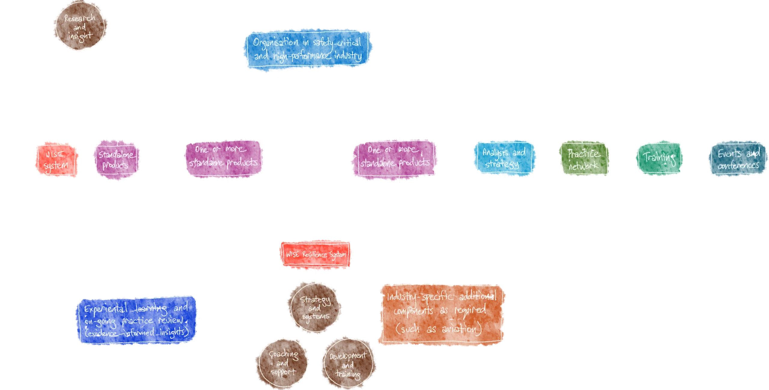
Process example, working through the various product offerings, how they relate to each other, and what the different customer journeys are through each product:
Some of the key phrases that came out of the OUTLINE phase included:
WELLBEING AND PERFORMANCE
Transforming resilience culture so people can THRIVE
Create collective prosperity by enhancing the wellbeing and performance of team members while improving the business outcomes and bottom line for your organisation and stakeholders.
And an overall summary paragraph for THRIVE:
Create collective prosperity by enhancing the wellbeing and performance of team members while improving the business outcomes and bottom line for your organisation and stakeholders. With extensive experience and a proven track record in safety-critical and high-performance industries, the THRIVE Institute gives organisations the confidence that their people and systems remain resilient in the face of adversity and in times of awe. Wellbeing drives performance which empowers individuals and organisations to thrive!
Then written messaging was created to cover all aspects of the business, including an overview of the offerings for the two key customer types: organisations and individuals. In addition to the overviews, copy was written to cover THRIVE's services, their WISE Resilience System, and finally about the business itself and its people.
Next we used the messaging as a foundation to begin the logo design ideation process.
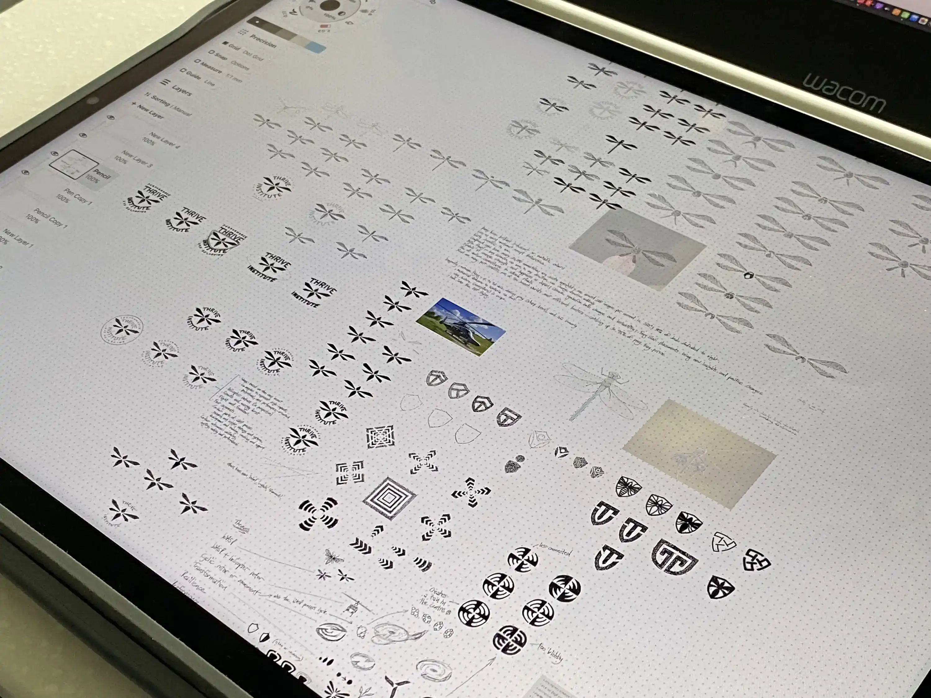
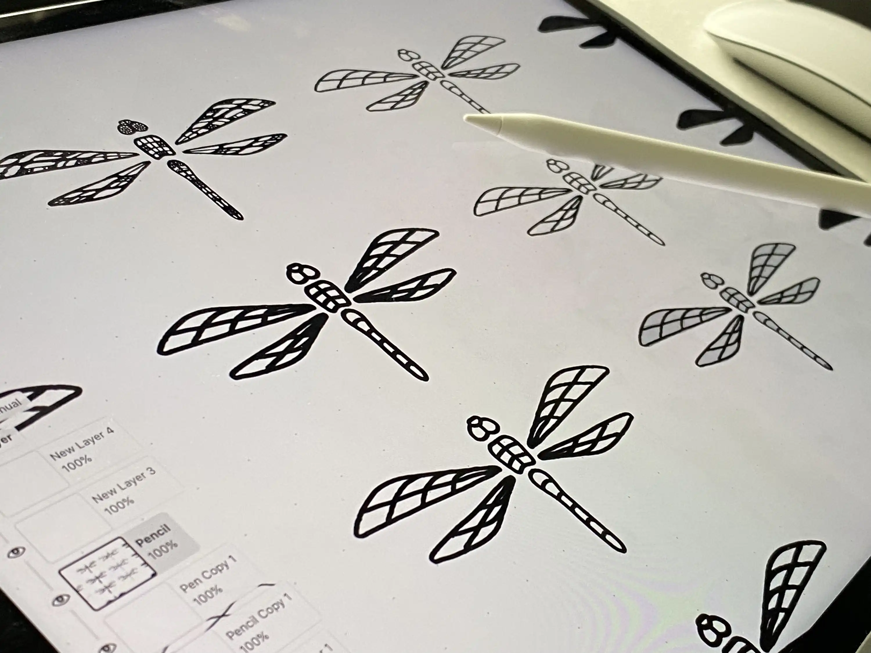
While various options ideas were explored, the dragonfly soon emerged as the leading concept. This was then pushed and refined until the final logomark was created.
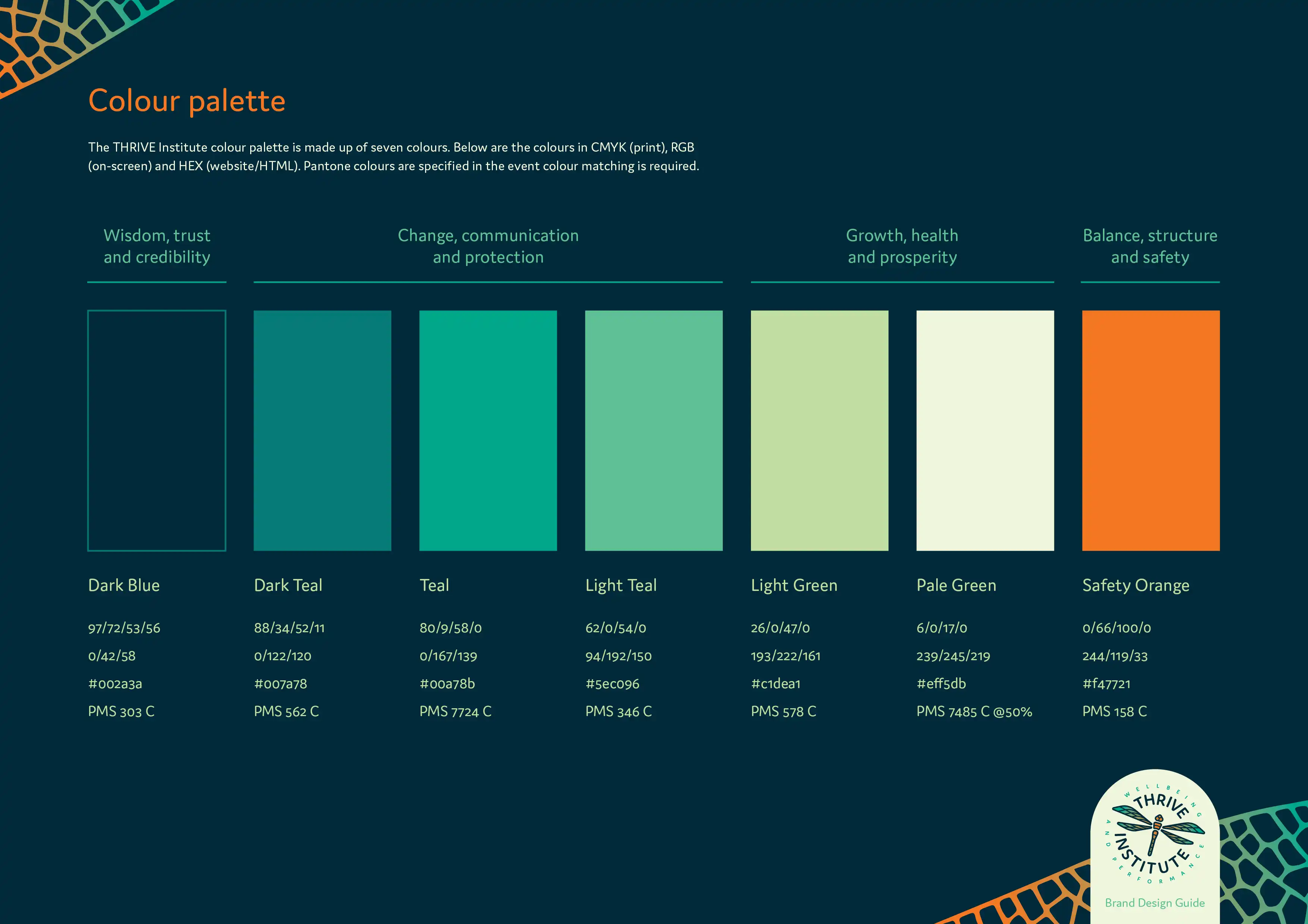
The stylised dragonfly design is angular to represent the high-performance, professional, and precision nature of the industries THRIVE works with. The rounded edges and corners reflects the human and wellbeing side of the business. The lines represent the complex and multi-faceted approach THRIVE takes through its various programs, services, and systems. The logomark and logotype shapes and arrangements also represent:
- helicopter rotors in perspective; link to THRIVE’s origins and aviation specialisation
- growth and bursts of energy and awe
- flight and freedom; free from the burden of high-impact events and adversity
The logomark features four segments expanding and growing from the centre, which represent the four parts of the WISE System process: research and insight, strategy and systems, development and training, and finally coaching and support.
Why a dragonfly? Dragonflies are highly resilient creatures that have been around since the Jurassic period. Existing on every continent except Antarctica, they are voracious predators of pests—catching up to 95% of prey they pursue (THRIVE works to control detrimental personal and organisational traits). Dragonflies are also profoundly agile flyers, able to travel long distances, move in any direction, and change direction almost instantly. Dragonflies in many cultures symbolise courage, strength, new insights, and positive change.
Within the dragonfly design, the THRIVE Institute logomark also integrates helicopter rotor blades in perspective—a subtle nod to THRIVE’s origins and specialisation in the aviation industry.

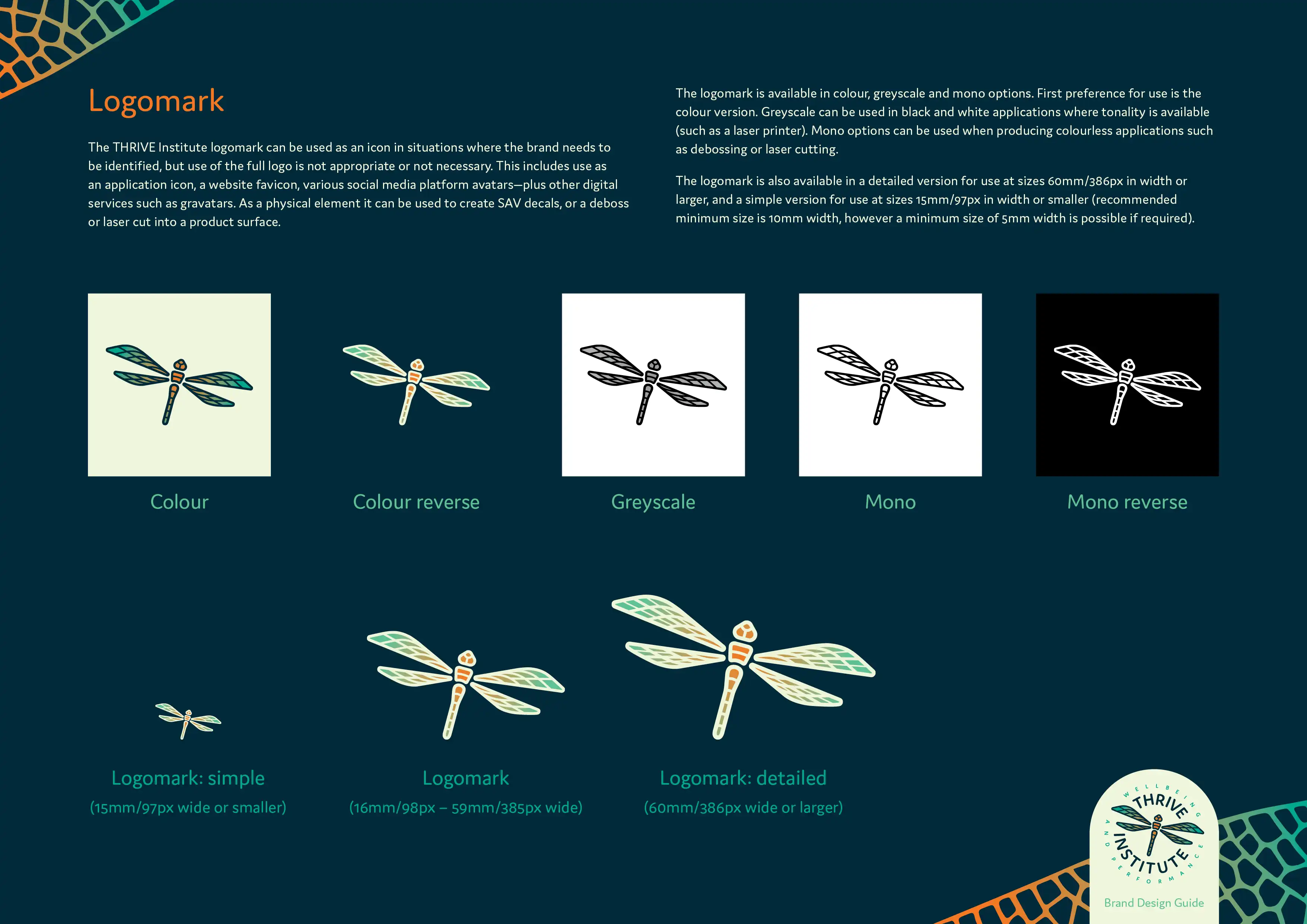
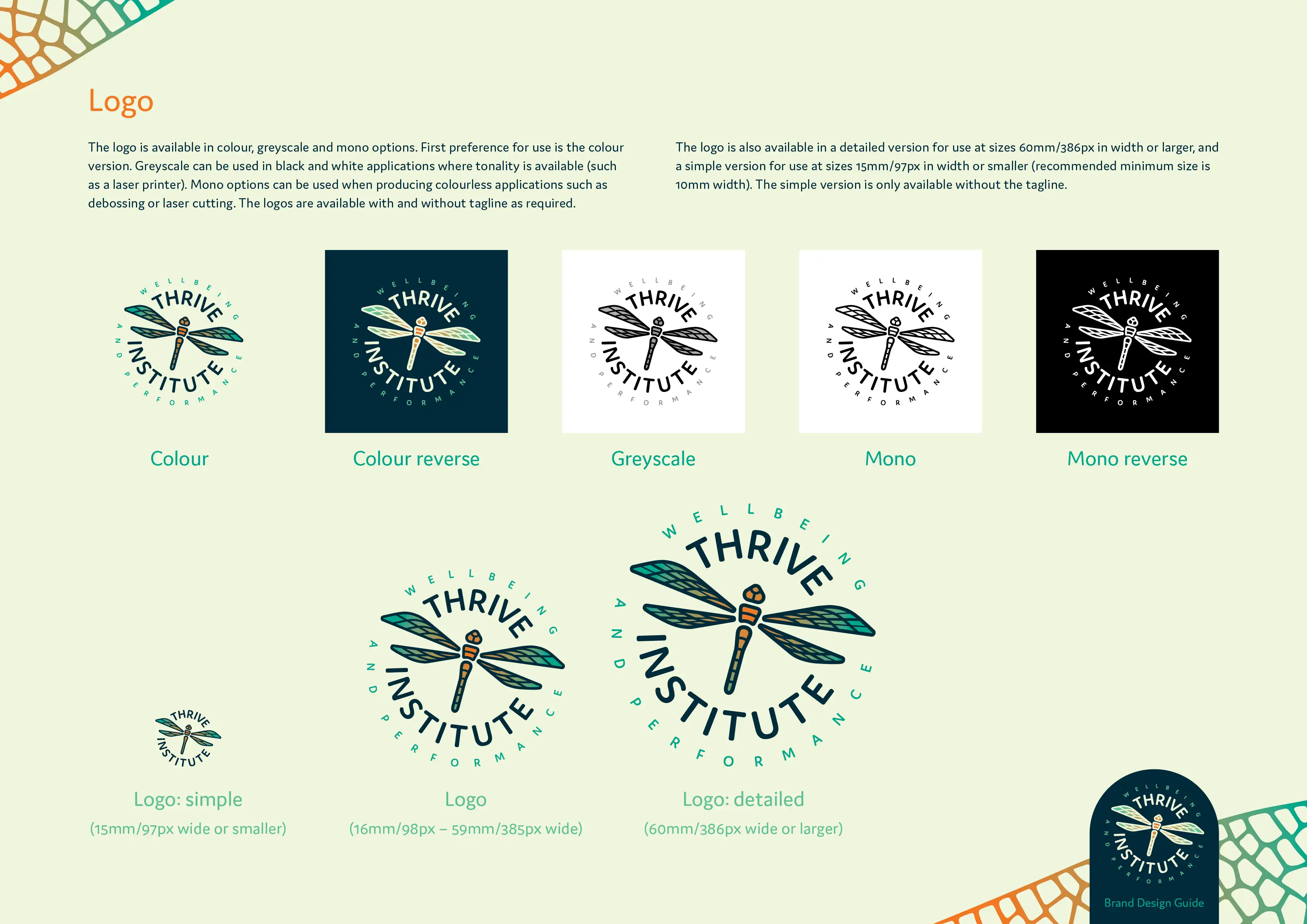
The logo comes in different versions that can be selected to suit particular applications. These versions include the logomark only, logo, and logo with tagline.
In addition to the versions, the logomark was also designed with different degrees of complexity; creating an extra-detailed version for use at larger sizes, and then a greatly simplified version for use at smaller sizes. Details on how and when to use each version were detailed in the brand design guide.
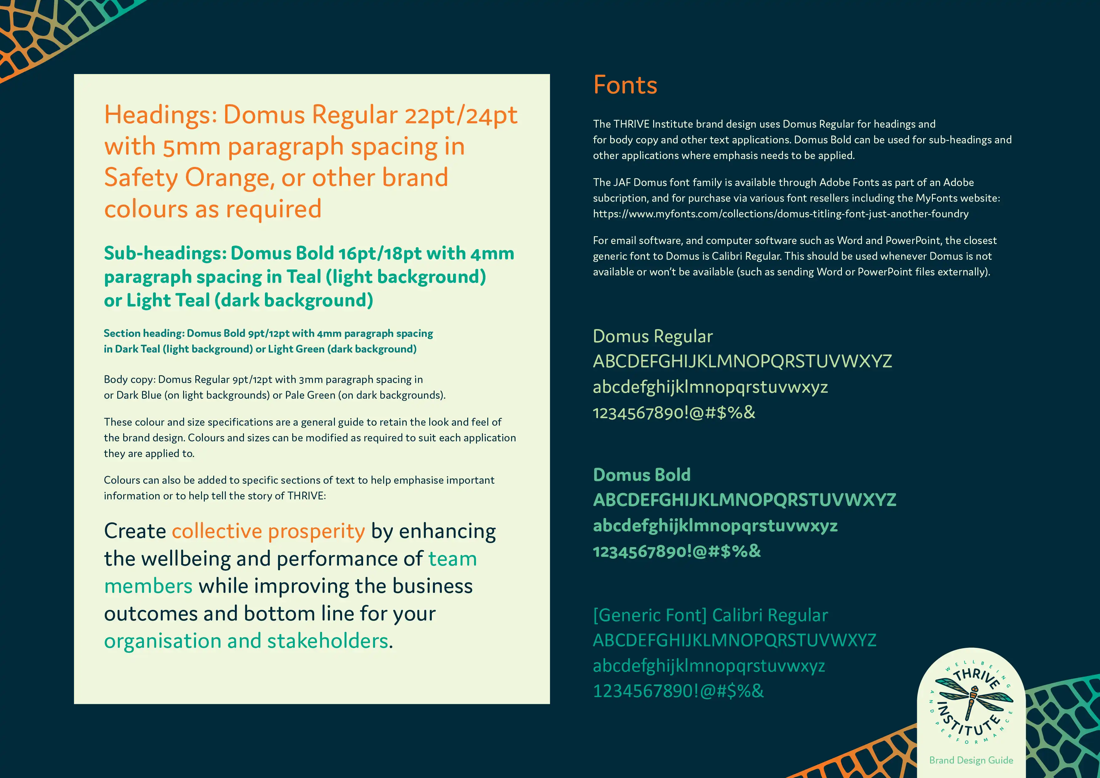
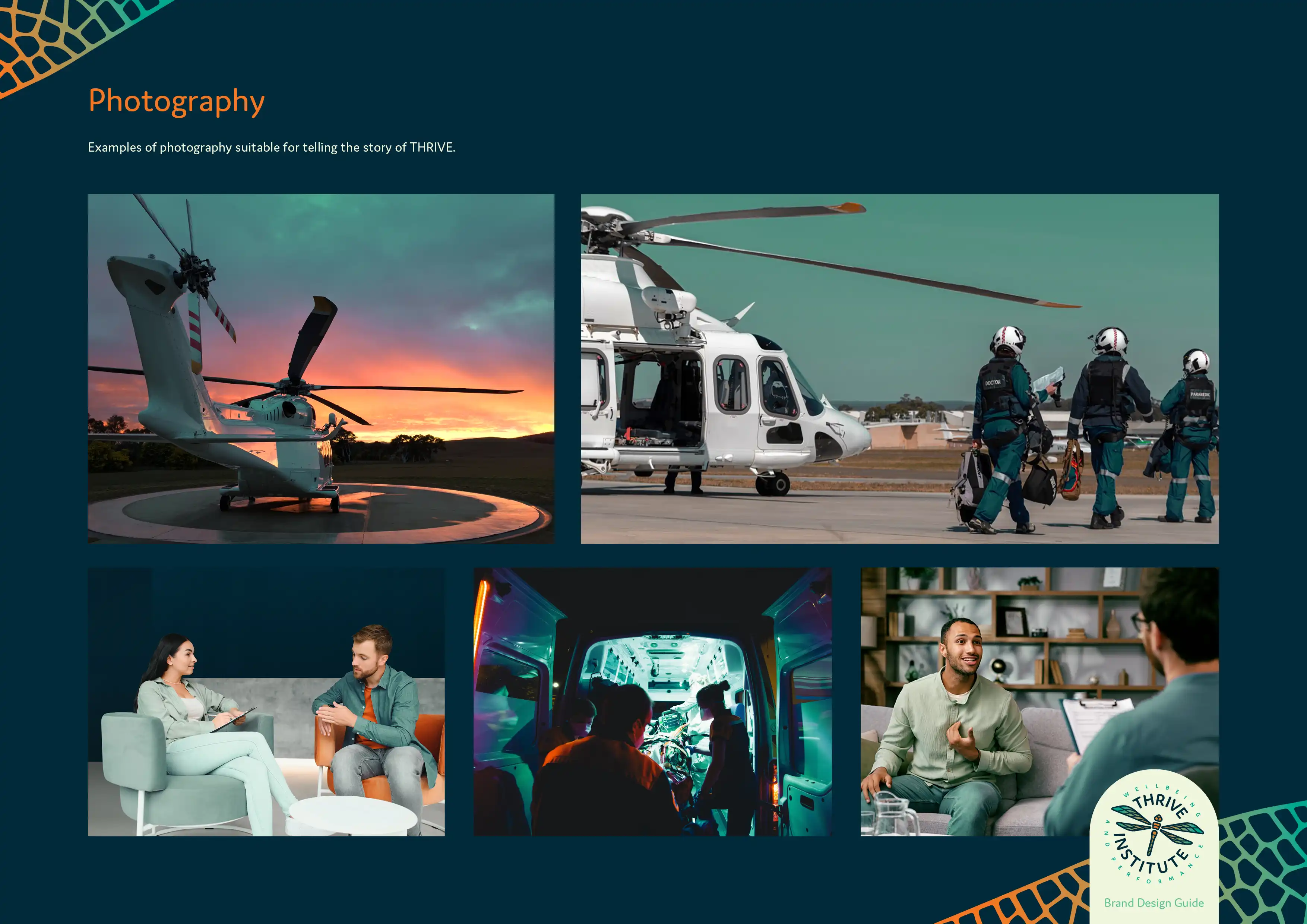
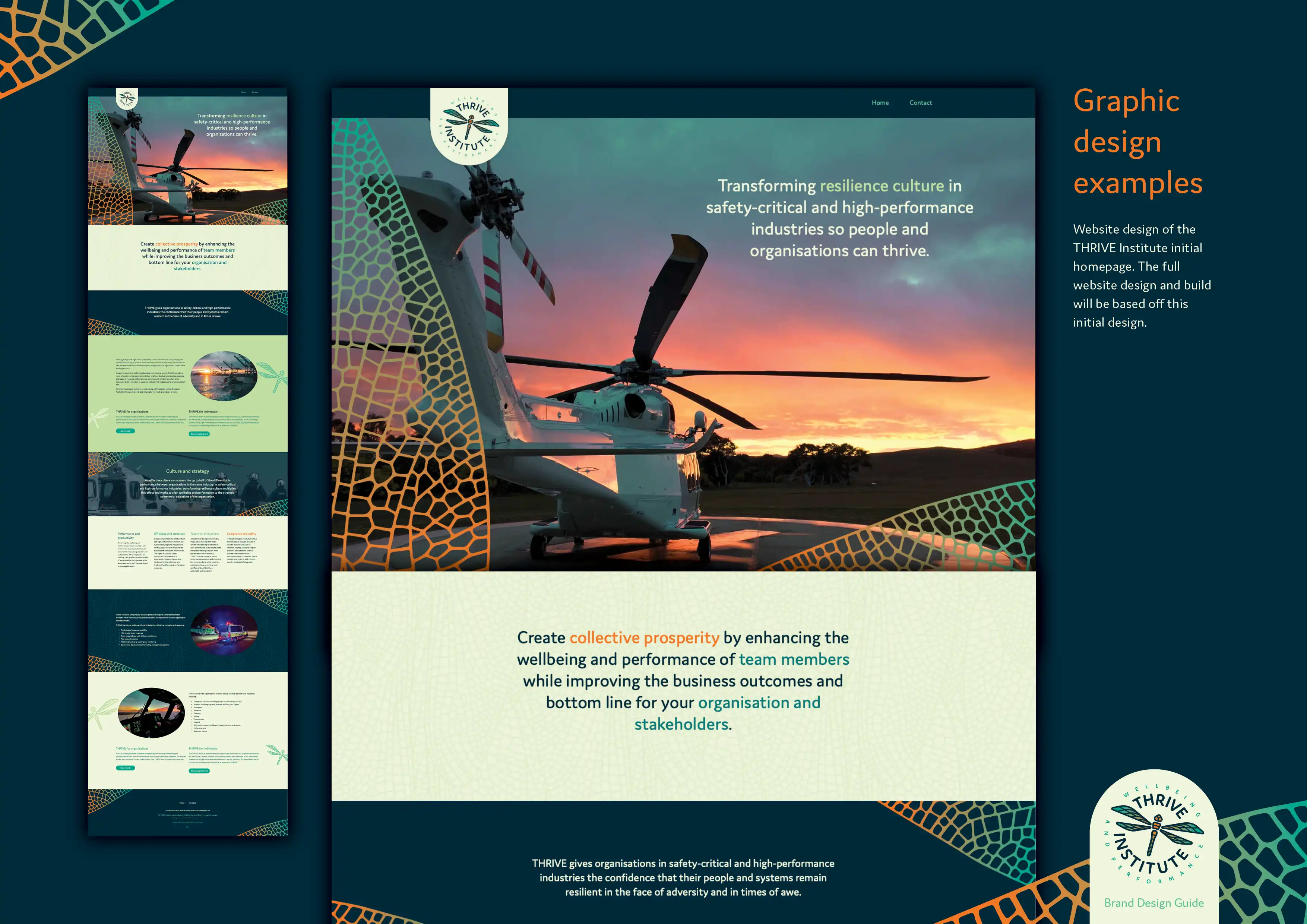
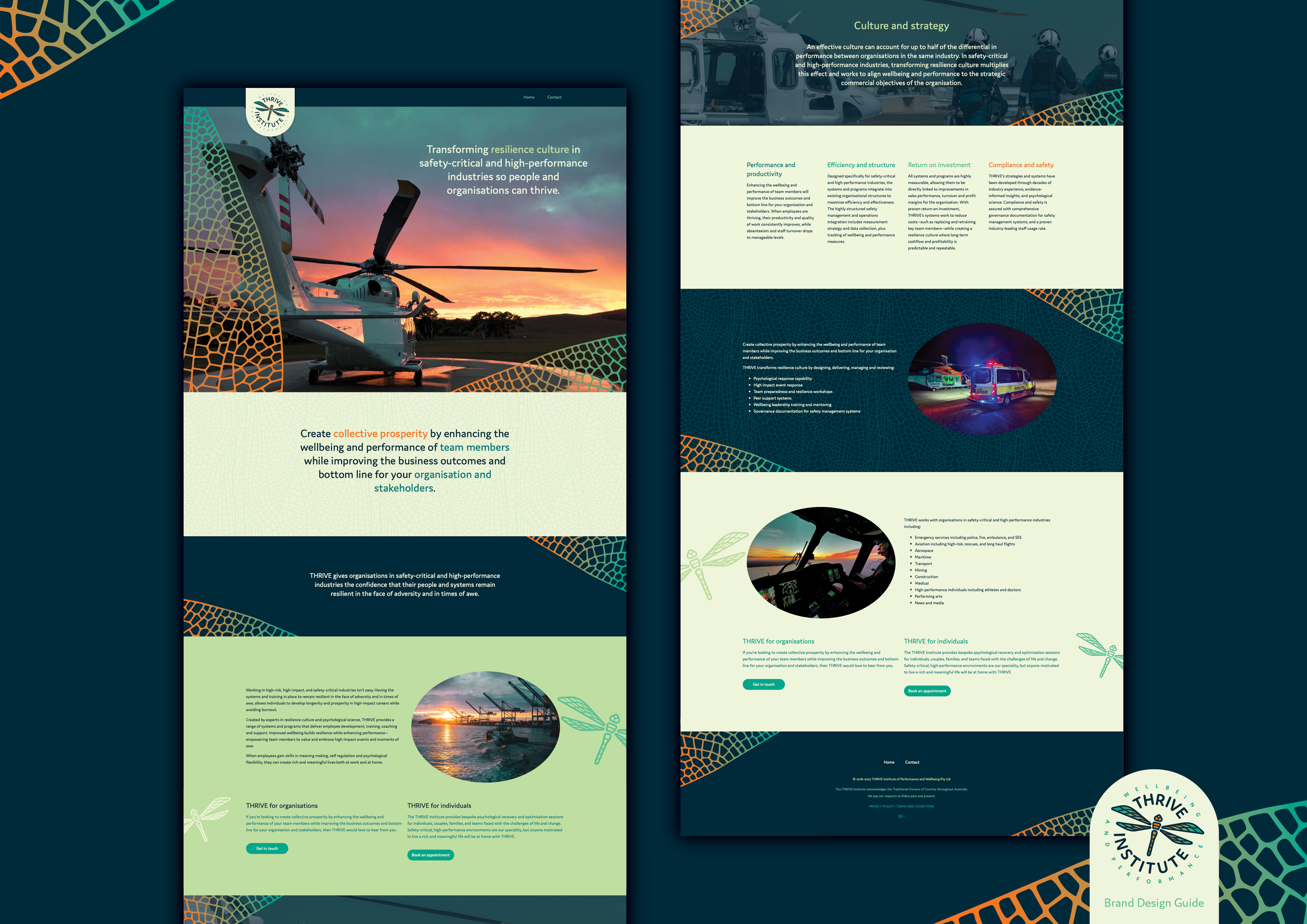
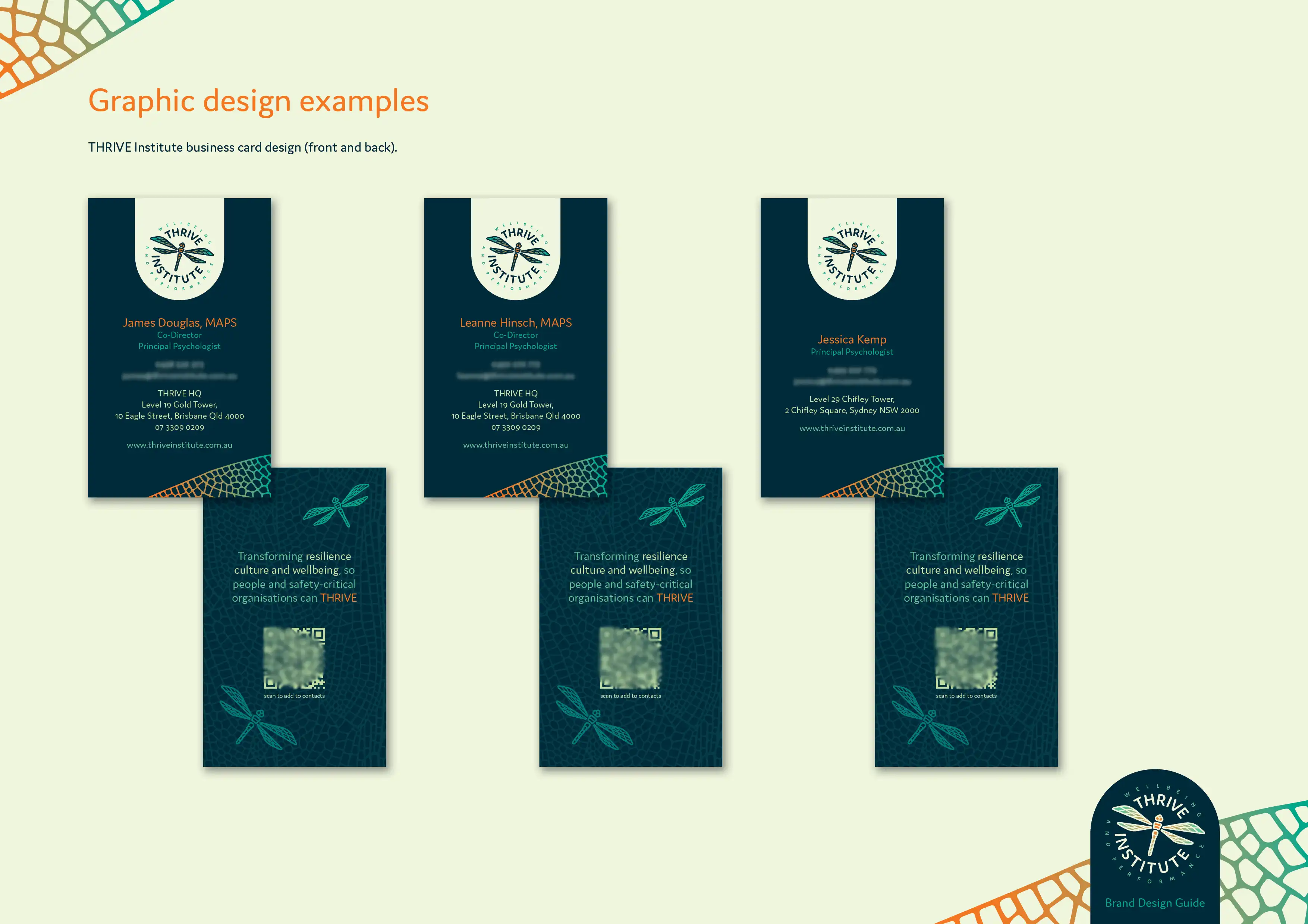
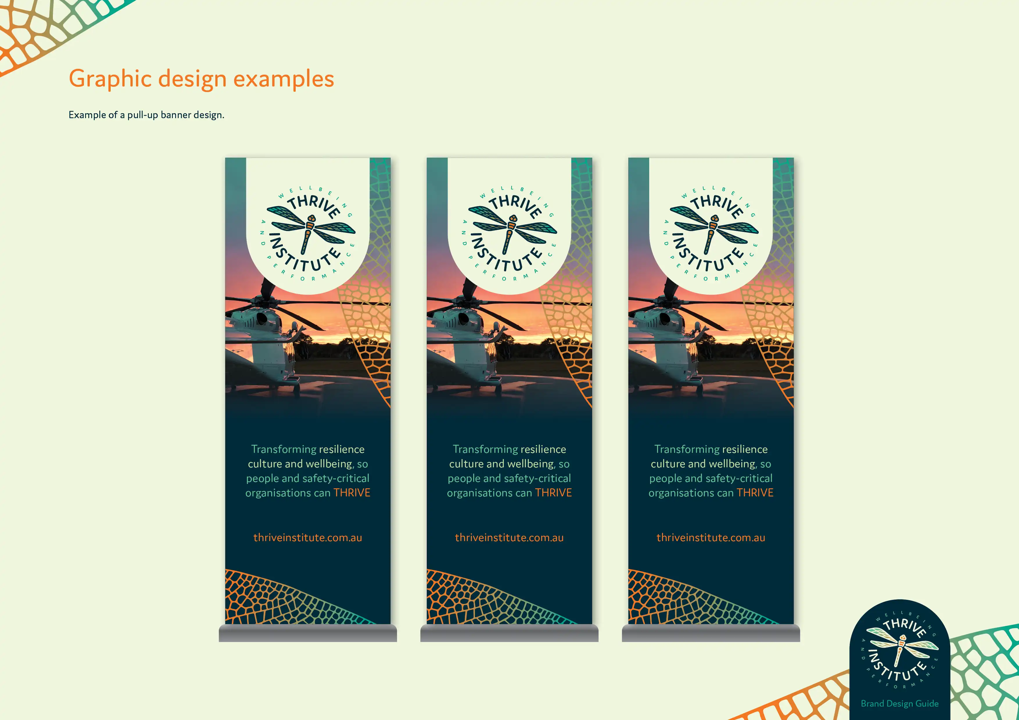
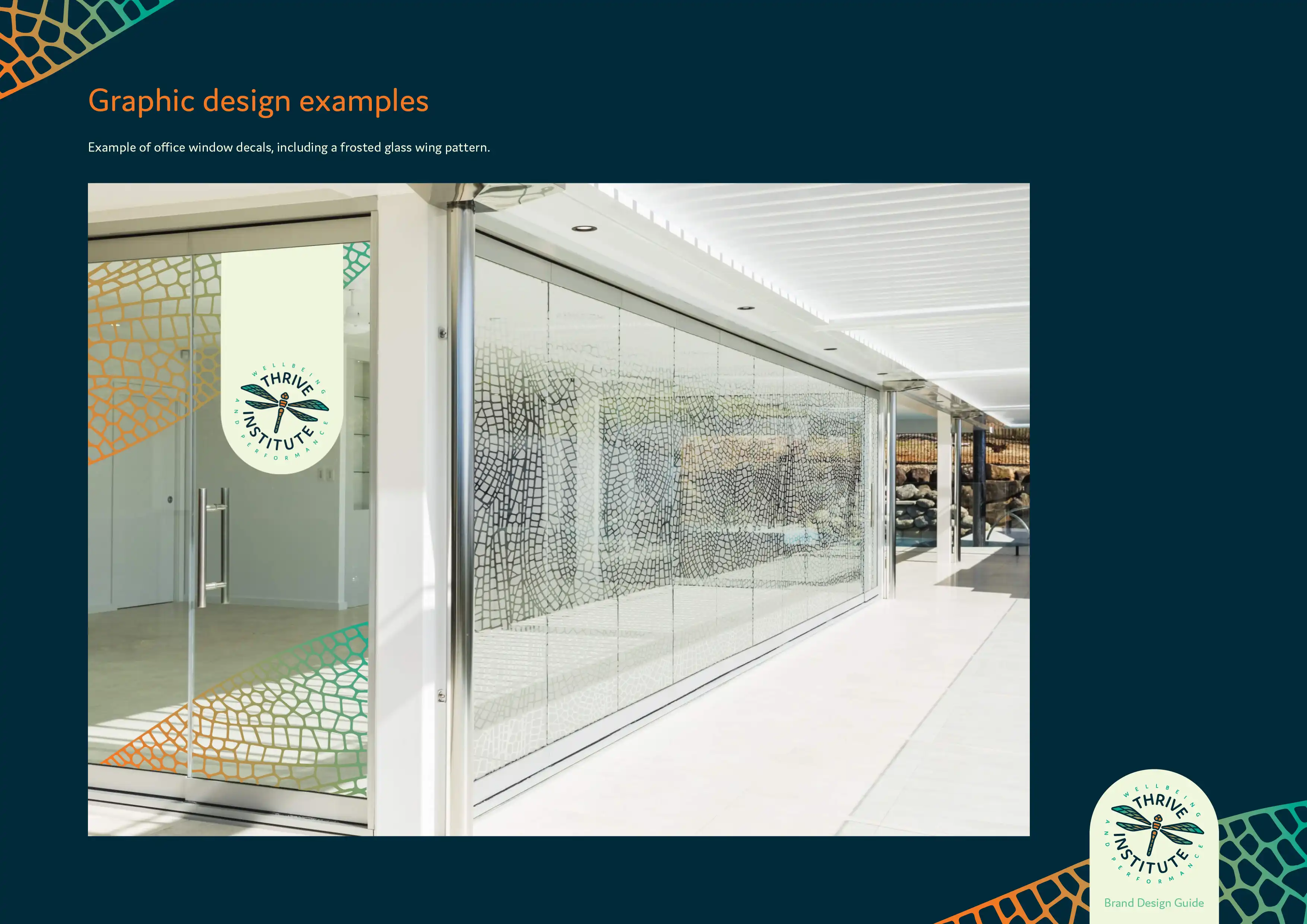
The rest of the brand design and guide was then developed to cover colours, typography, additional design elements, and photography styles, plus a range of touchpoints that included website mockups, business cards, email signatures, pull-up banners, and an office exterior design mockup.
The end result from the brand design process was a simplified messaging structure that focused on benefit-to-customer, that is supported by a unique and meaningful visual identity system.
The brand design is gradually being rolled out as the business continues to grow, including the initial four-page website we designed and build on the Oncord platform. You can visit the THRIVE Institute website here: thriveinstitute.com.au
In this Inspired by Evocative, Ben describes the process behind creating the THIRVE Institute logo. The unique design combines helicopter rotors with a stylised dragonfly, and makes use of versions so that the detailed design looks correct no matter how big or small it is used.