![]()
Sally Porteous and Red Lanyard
logo designs | brand identity
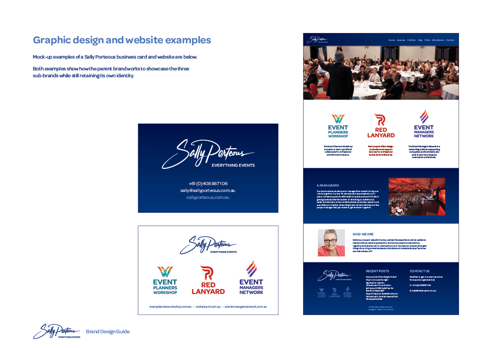
For more than twenty years, the names Sally Porteous and Red Lanyard have been well-known across the Australian events industry. Over time additional arms of the business have been added, including a popular event planners' workshop. While Sally is exceptional at what she does in the events space, she found that the additional brand names and lack of clarity around their architecture was making it difficult to communicate what each part of the business is all about.
While the initial feeling from Sally was that she had too many brands, it soon became apparent that the various brands are actually required due to the different clients and channels to market that each of them have. Conflicts of interest and other issues would arise if they were simply consolidated together.
The starting point for this brand design was sorting out the brand architecture to understand how the various brands related to each other.

After careful consideration we promoted the Sally Porteous personal brand to be the parent brand, with the three other brands becoming separate yet related sub-brands.
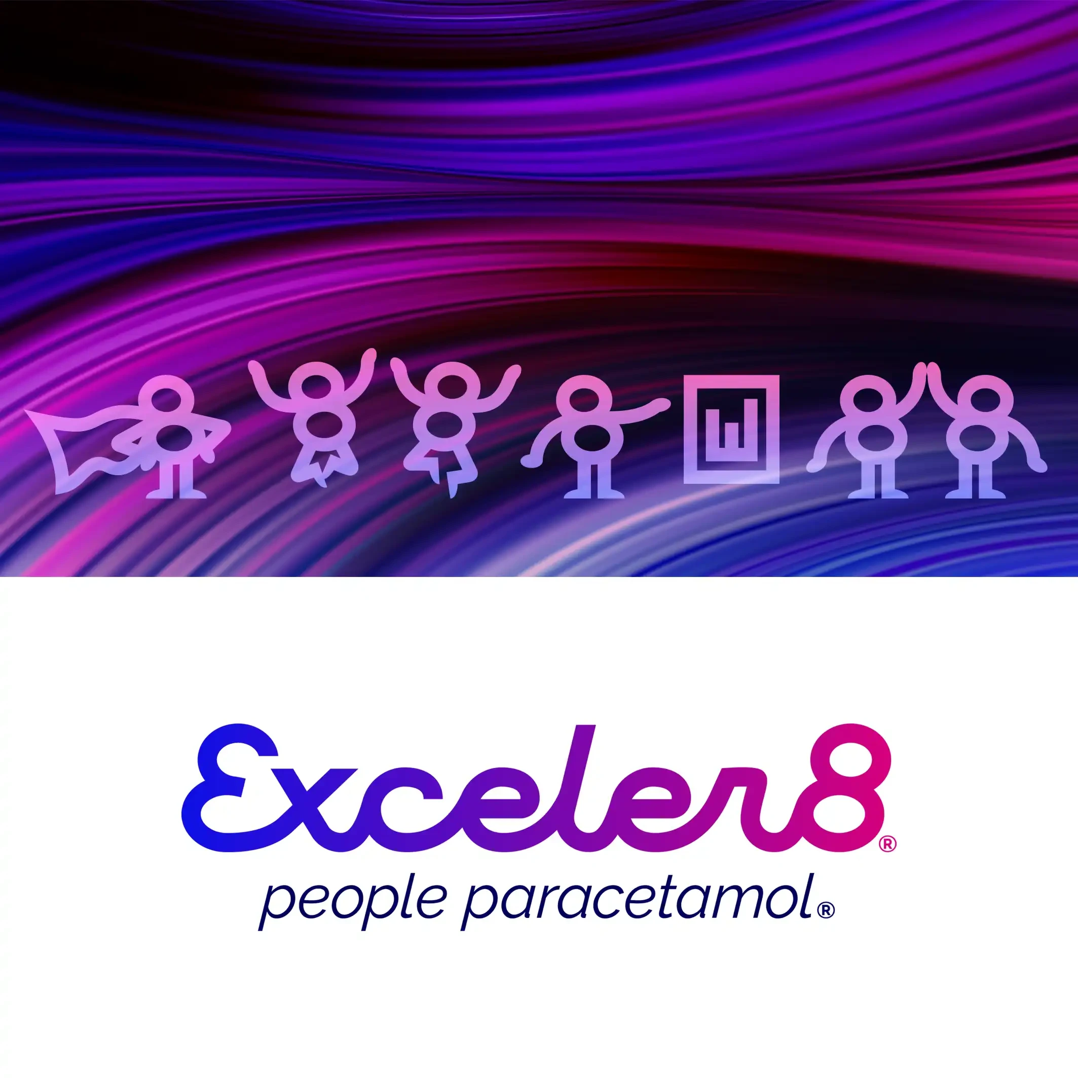
From the Sally Porteous brand design guide:
'The parent Sally Porteous brand represents the whole organisation including the three sub-brands; as such is often displayed together with the three sub-brand logos.
'When one of the sub-brands is presented it exists exclusive of the other two sub-brands, allowing it to connect with clients that may have conflicts of interest with the other two. The Sally Porteous parent brand can then be used when required to act as an endorsement of trust, quality and experience.'

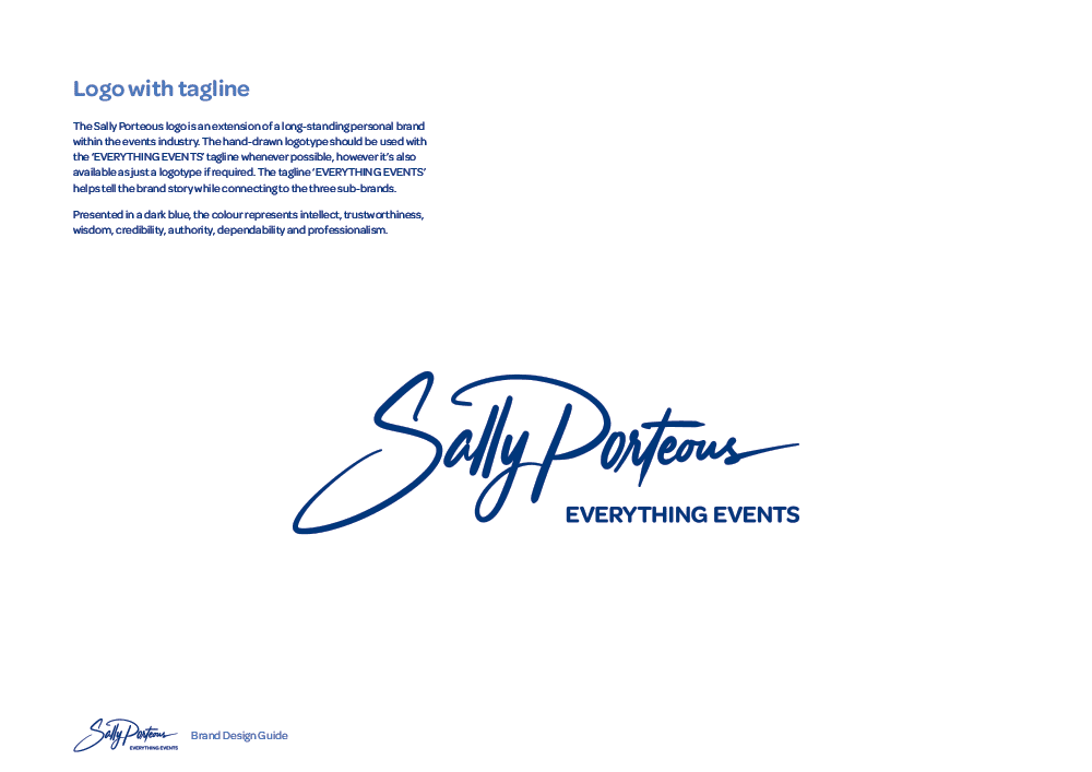
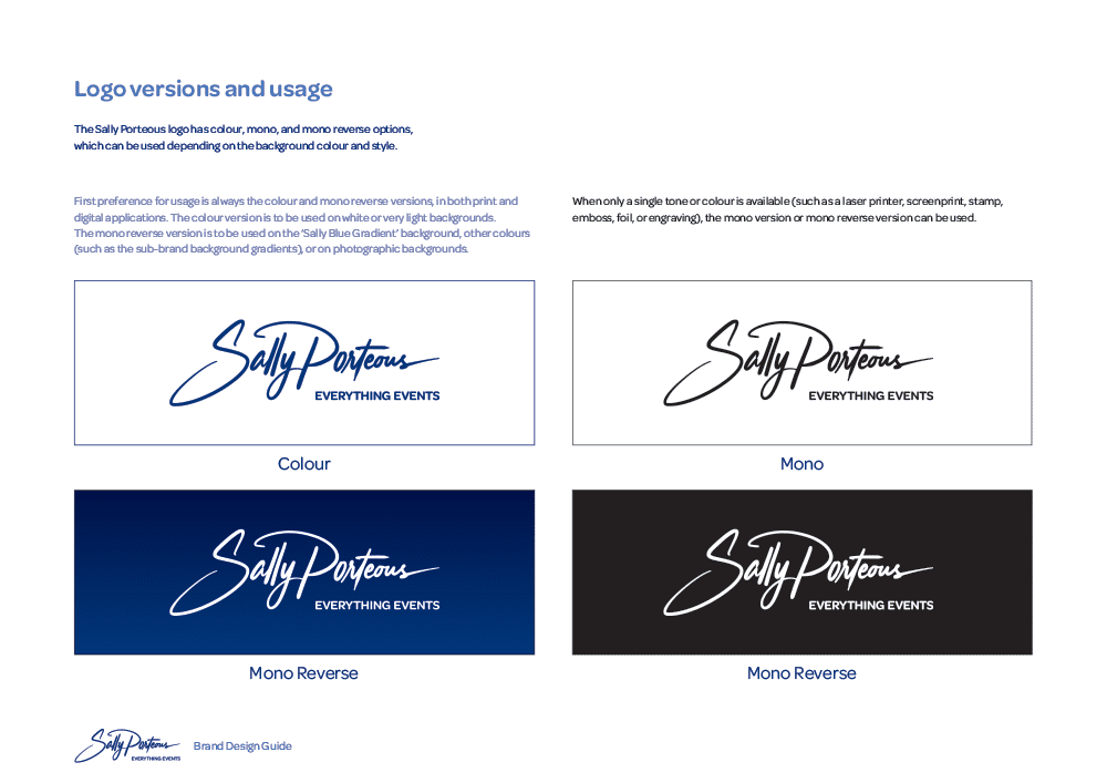
We worked on the existing Sally Porteous script logo, which we felt was a bit thin and wispy—plus had an underline that was both redundant and a bit wonky. We thickened up the script and removed the underline completely. We then added the tagline in a bolder rounded font that matches the other logos in the brand family.
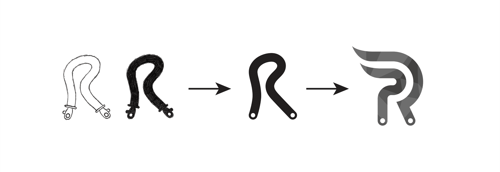
With the sub-brands we started with Red Lanyard, evolving a concept where the lanyard itself forms a stylised 'R'. From here we simplified it to a line with rounded ends and replaced the clasps with simple dots. This design was then further developed to set a style for all three sub-brands.
The original Red Lanyard logo design
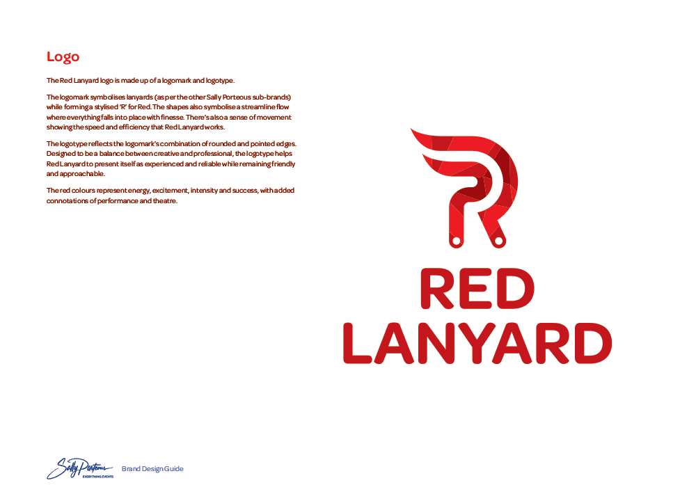
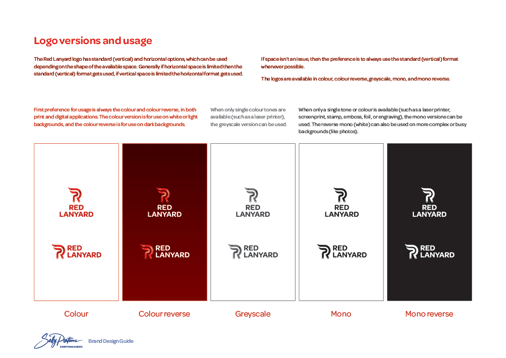
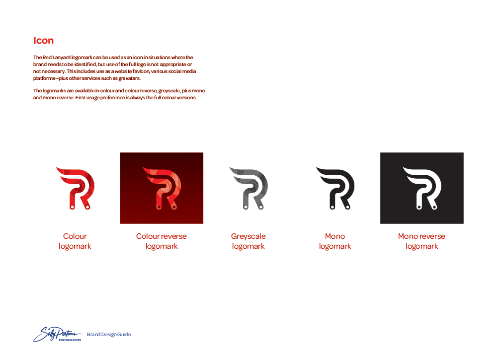
The final Red Lanyard logomark symbolises lanyards (as per the other Sally Porteous sub-brands) while forming a stylised ‘R’ for Red. The shapes also symbolise a streamline flow where everything falls into place with finesse. There’s also a sense of movement showing the speed and efficiency that Red Lanyard works.
The logotype reflects the logomark’s combination of rounded and pointed edges. Designed to be a balance between creative and professional, the logotype helps Red Lanyard to present itself as experienced and reliable while remaining friendly and approachable.
The red colours represent energy, excitement, intensity and success, with added connotations of performance and theatre.
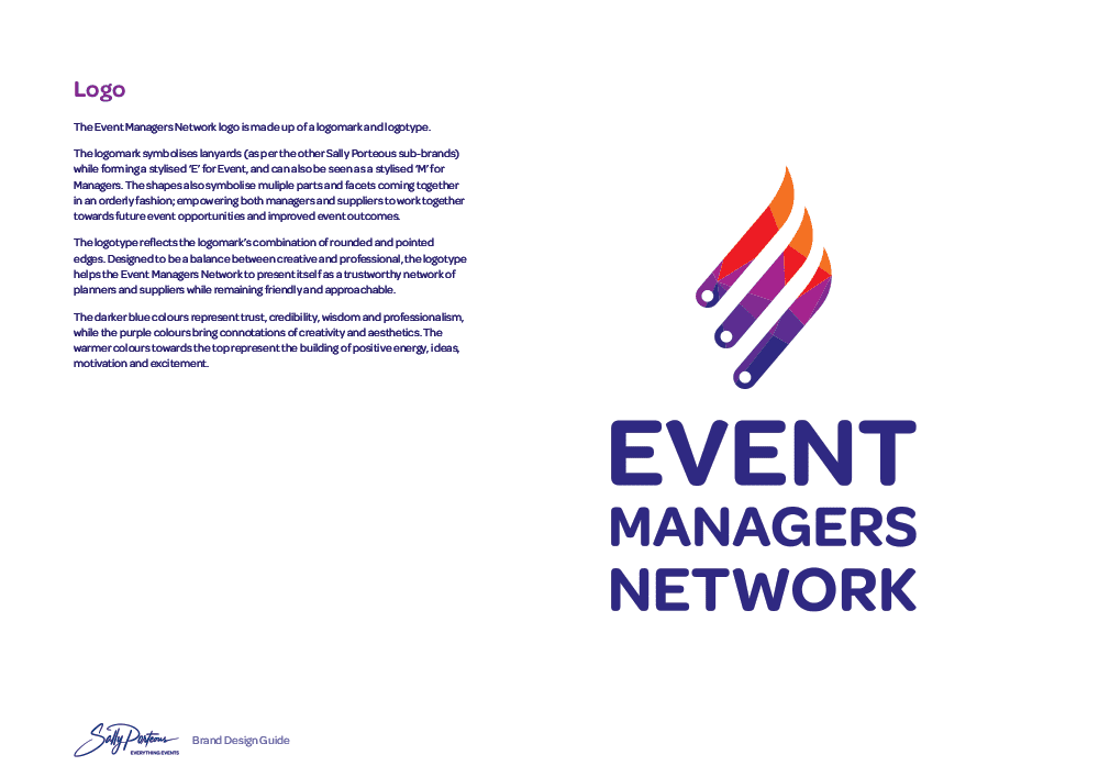
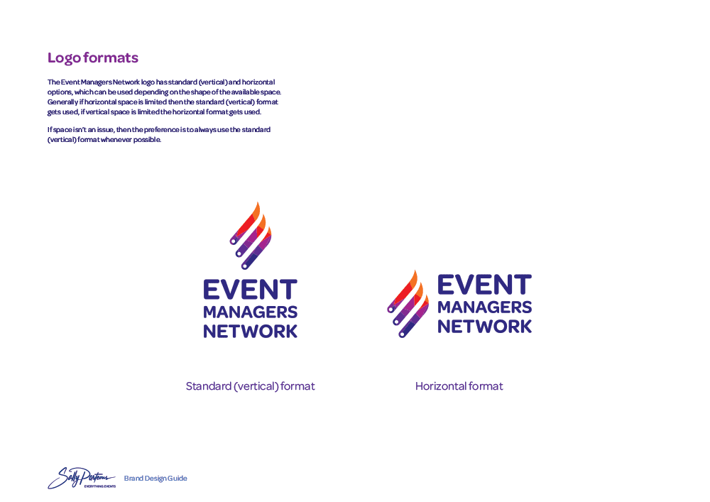
The Event Managers Network had an existing logo which we were able to evolve to match the new style while retaining some of its brand equity. The logomark symbolises lanyards (as per the other Sally Porteous sub-brands) while forming a stylised ‘E’ for Event, and can also be seen as a stylised ‘M’ for Managers. The shapes also symbolise multiple parts and facets coming together in an orderly fashion; empowering both managers and suppliers to work together towards future event opportunities and improved event outcomes.
The original Event Managers Network logo design
The logotype reflects the logomark’s combination of rounded and pointed edges. Designed to be a balance between creative and professional, the logotype helps the Event Managers Network to present itself as a trustworthy network of planners and suppliers while remaining friendly and approachable.
The darker blue colours represent trust, credibility, wisdom and professionalism, while the purple colours bring connotations of creativity and aesthetics. The warmer colours towards the top represent the building of positive energy, ideas, motivation and excitement.
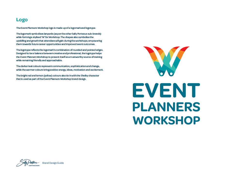
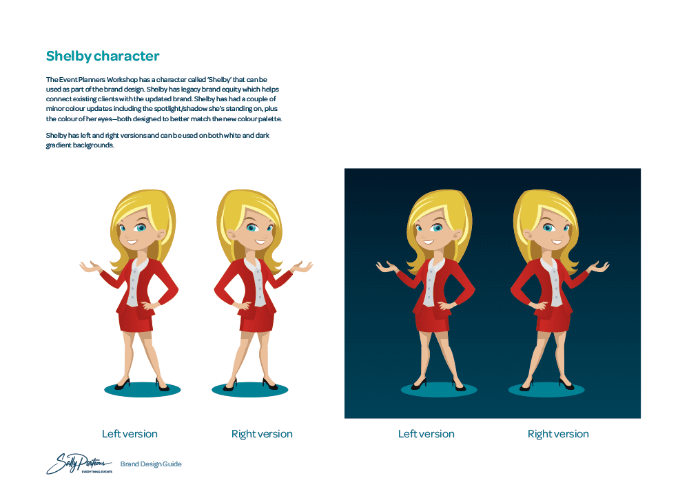
The Event Planners Workshop never had a logo, only the 'Shelby' cartoon character that has become well-known by people familiar with the workshop programmes. As such we developed a brand new logo that would slot in with the other two sub-brands.
The logomark symbolises lanyards (as per the other Sally Porteous sub-brands) while forming a stylised ‘W’ for Workshop. The shapes also symbolise the upskilling and growth that attendees will gain during the workshops; empowering them towards future career opportunities and improved event outcomes.
The logotype reflects the logomark’s combination of rounded and pointed edges. Designed to be a balance between creative and professional, the logotype helps the Event Planners Workshop to present itself as a trustworthy source of training while remaining friendly and approachable.
The darker teal colours represent communication, sophistication and change, while the warmer colours bring positive energy, ideas, motivation and excitement. The bright red and lemon (yellow) colours also tie in with the updated Shelby character that is used as part of the Event Planners Workshop brand design.
The end result from the brand design process is a family of three unified yet distinctly separate sub-brands, all operating under a single parent brand. This has allowed Sally to better communicate her different services to different markets, all while building up her personal brand as the link.
'Right from the beginning Ben made me feel heard and understood. He took all the dialogue I blurted and turned it into the most beautiful suite of logos, all connected and representative of exactly who I feel my company is. The result has been far beyond expectations and well worth the investment. Thanks Ben and Renée!'
You can find out more about the Sally Porteous family of event brands at sallyporteous.events