Bird's Nest
brand design: messaging | logo refinement | brand identity | illustration | animation | photography | website
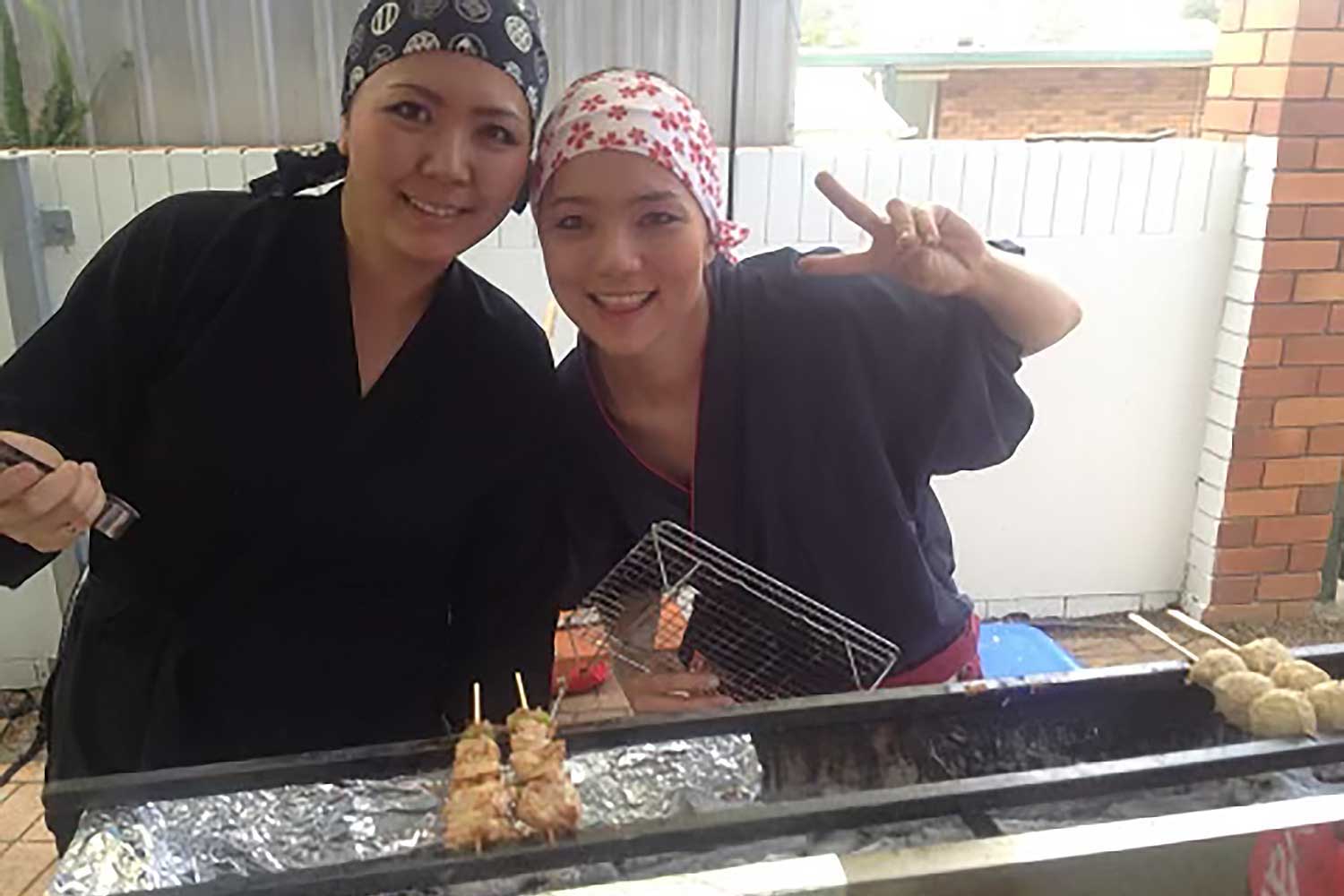
Bird’s Nest was born after co-founders Marie and Emi wanted to bring the art and taste of yakitori back to Australia. With a background in hospitality and food chains, they packed up and took their families across to Japan to learn everything they could about the local cuisine and cooking techniques. They received traditional training from expert yakitori chefs that would form the benchmark for Bird’s Nest’s kitchen setup, food preparation style, and the menu design.
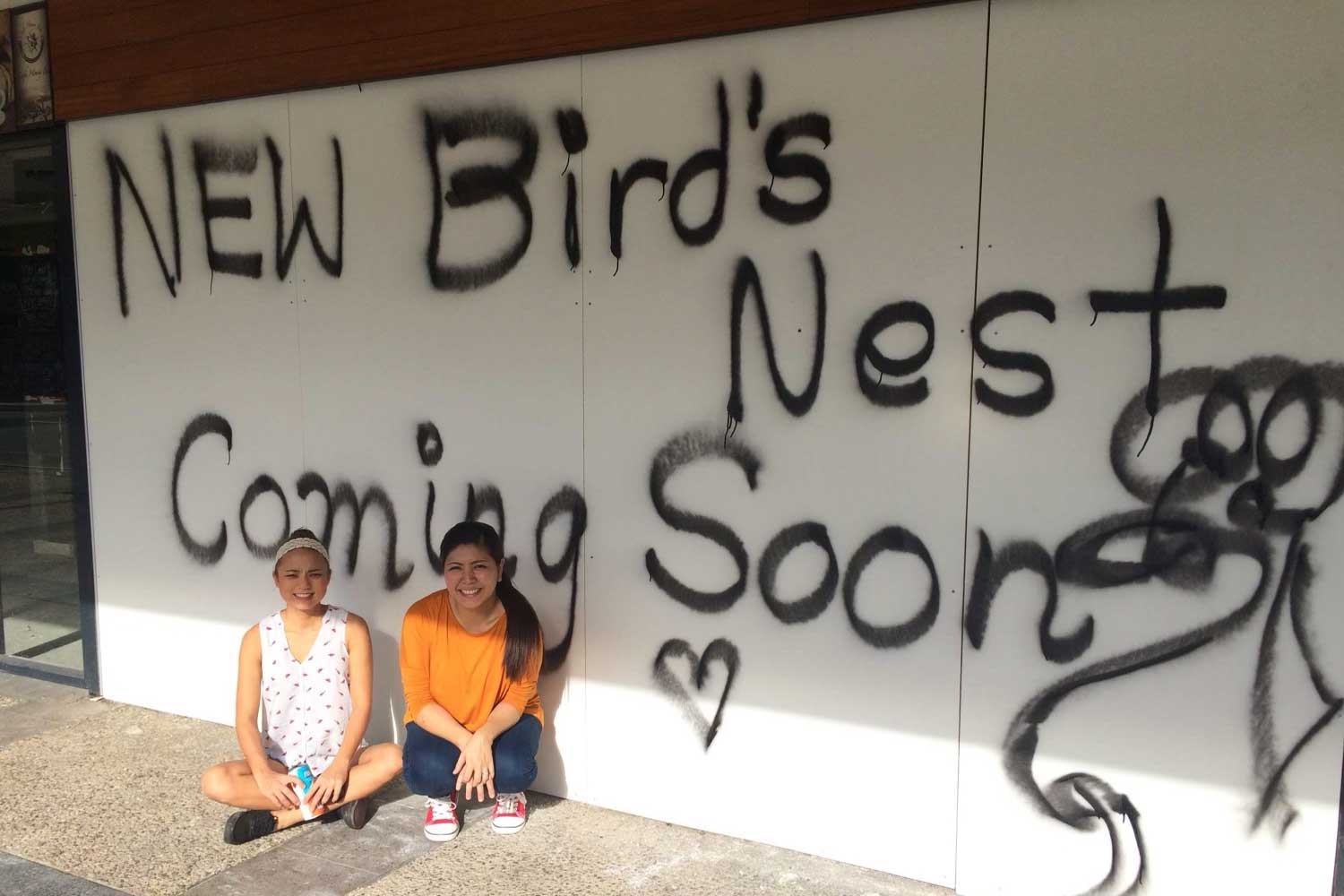
After a further twelve months of planning back in Australia the first Bird’s Nest Yakitori Bar Japanese restaurant was opened at West End in Brisbane, followed by a second location in Fortitude Valley. Realising they had created a unique balance between traditional Japanese yakitori and approachable modern cuisine, Bird's Nest has since opened four Yakitori Bar Japanese restaurants located across Brisbane: West End, Fortitude Valley, Portside Wharf at Hamilton, and Everton Plaza at Everton Park. In addition to the yakitori bars, Bird's Nest On The Run is a speedy casual dining and takeaway outlet located inside Toowong Village.
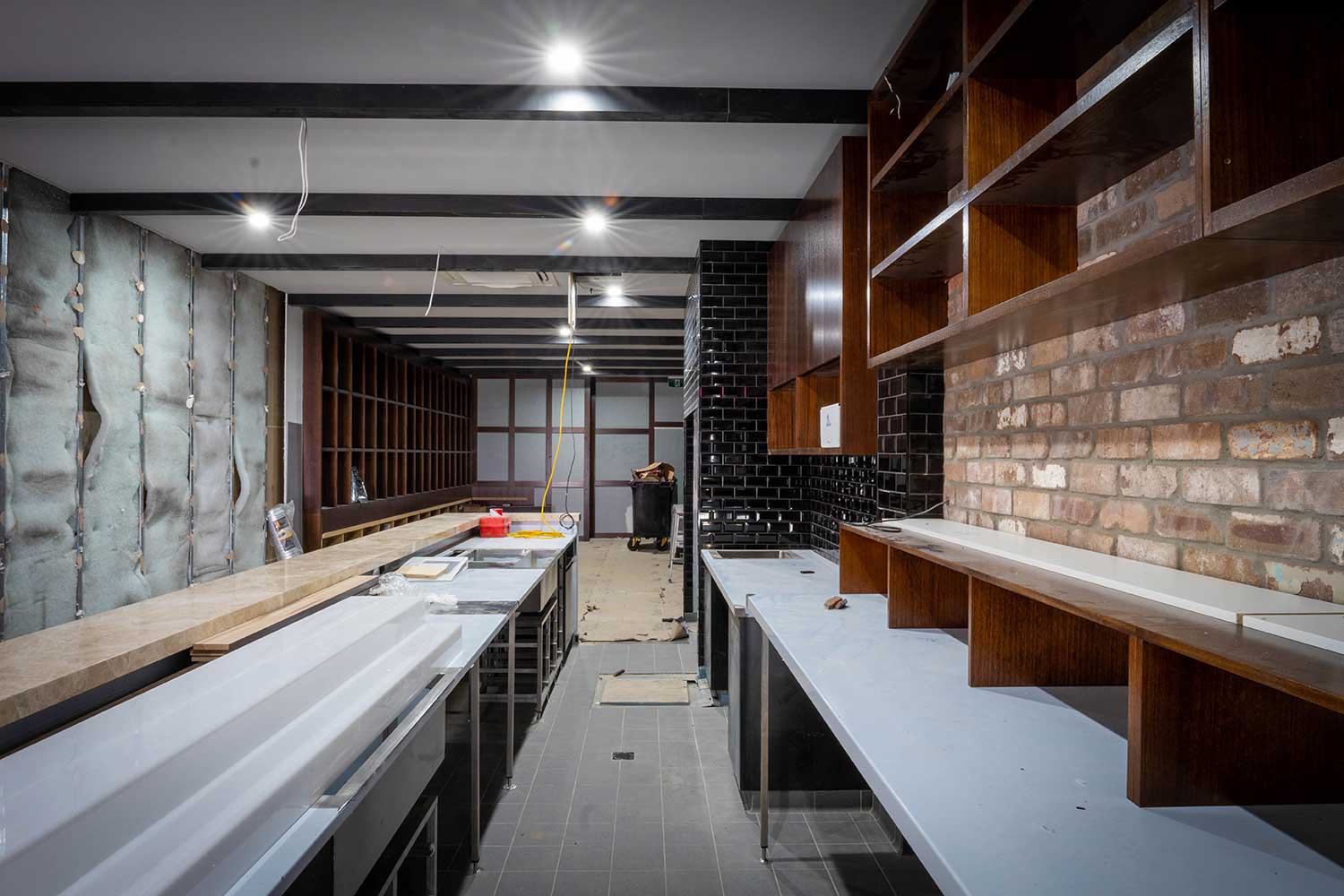
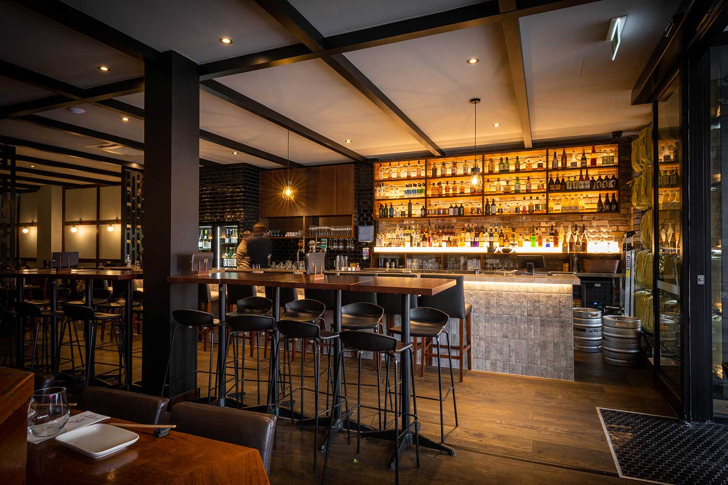
Over the ten years that Bird's Nest was building into what it is today, various designers and agencies had done bits and pieces of design work as the business grew. And while the existing name and logo were working well, it was all the other components of the brand design that had become inconsistent, cluttered, and confused.
Evocative was engaged around twelve months prior to the Portside and Everton Park venues opening, along with the move of West End into a larger venue.
After the discovery and strategy were done, we looked at the messaging and positioning. This involved creating custom written copy for the overall business as well as the individual venues. This copy incorporated lots of personality, and we added various chicken and bird puns to put some lively fun into the messaging.
A new tagline was created: 'ADDICTIVE YAKITORI; Japanese for everyone', which speaks to the serious regular customers that Bird's Nest accumulates, and also the highly approachable menu items that offers something for everyone. We also wrote some additional quirky catchphrases for the takeaway bags and other branded items.
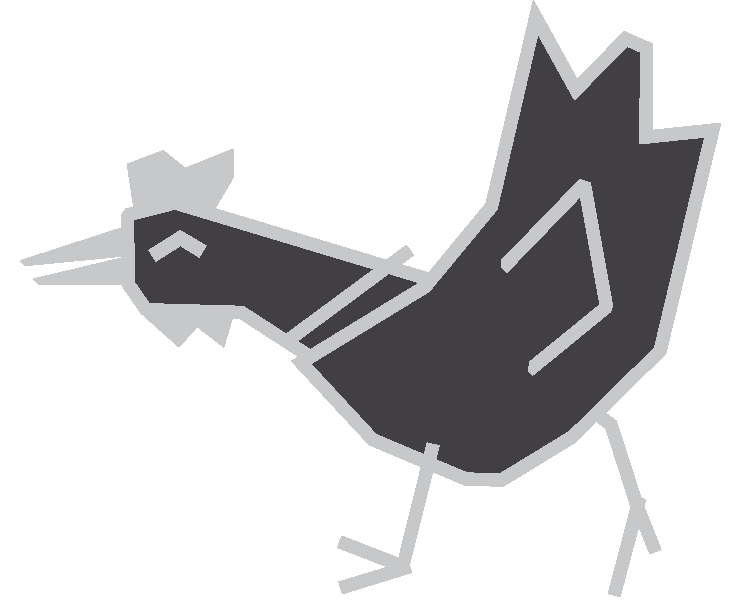
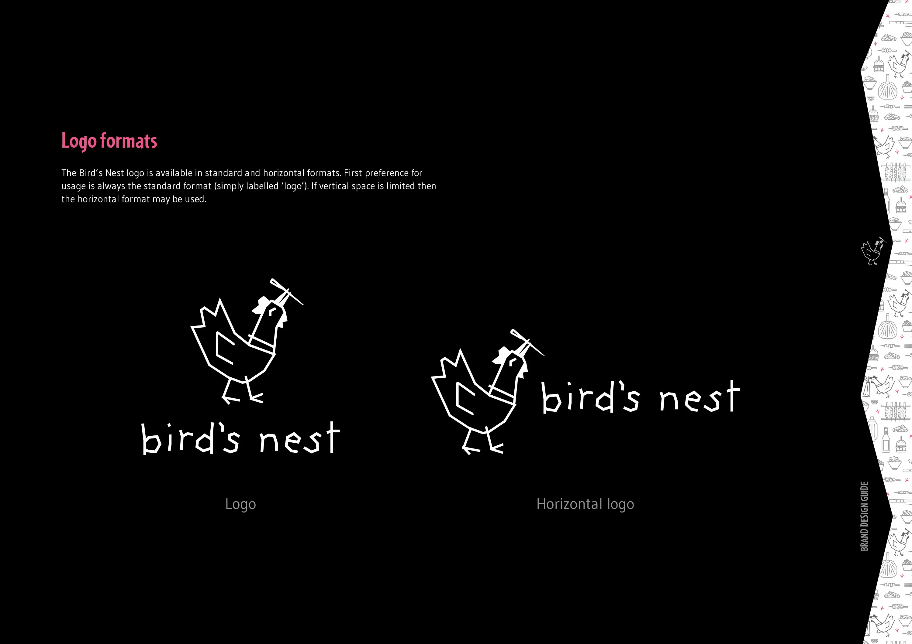
Once the messaging had been developed, this then informed the DESIGN phase. We decided the logo was solid and distinctive, but did have some quirks. Rather than a redesign, the existing chicken logomark was repaired and refined, and the positioning and letter spacing of the logotype was improved to make the brand appear more professional.
Below is the original logo (left), an overlay of the changes made (centre; original in grey, refined version in pink), and the final refined logo (right):

Once the chicken logomark had been refined, we then set about illustrating a collection of Bird's Nest chickens all doing different things. Some are walking, some have skewers in their beaks, and others are simply jumping for joy. Once illustrated, we took them a step further and created custom animations of each chicken.
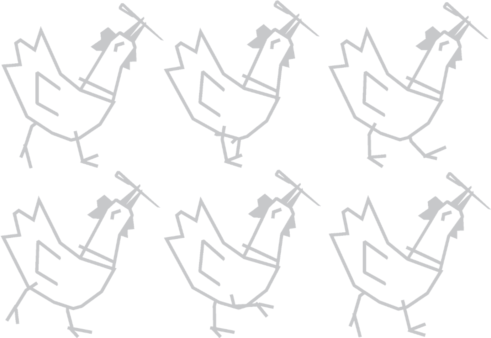
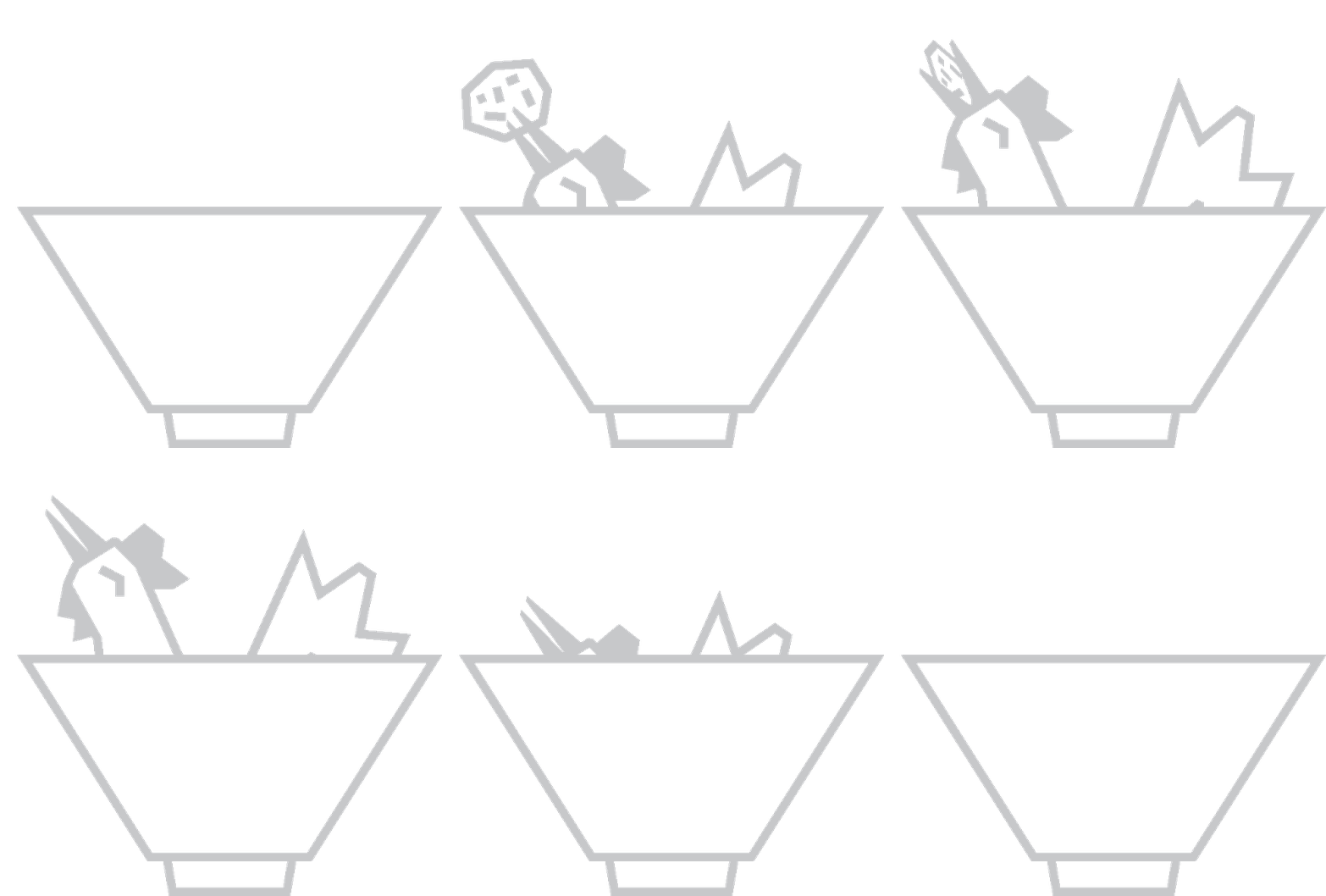
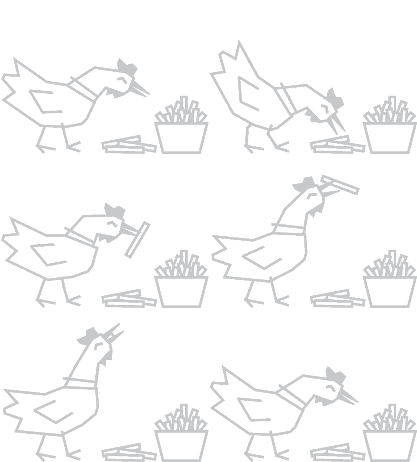
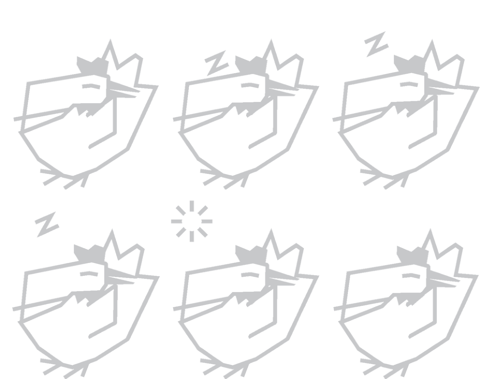
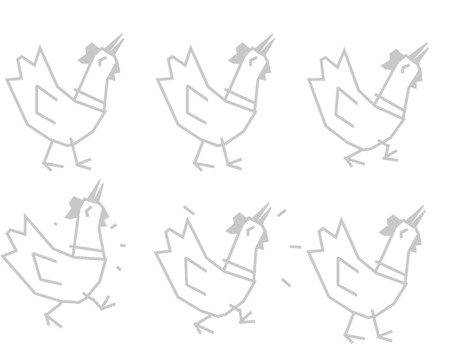
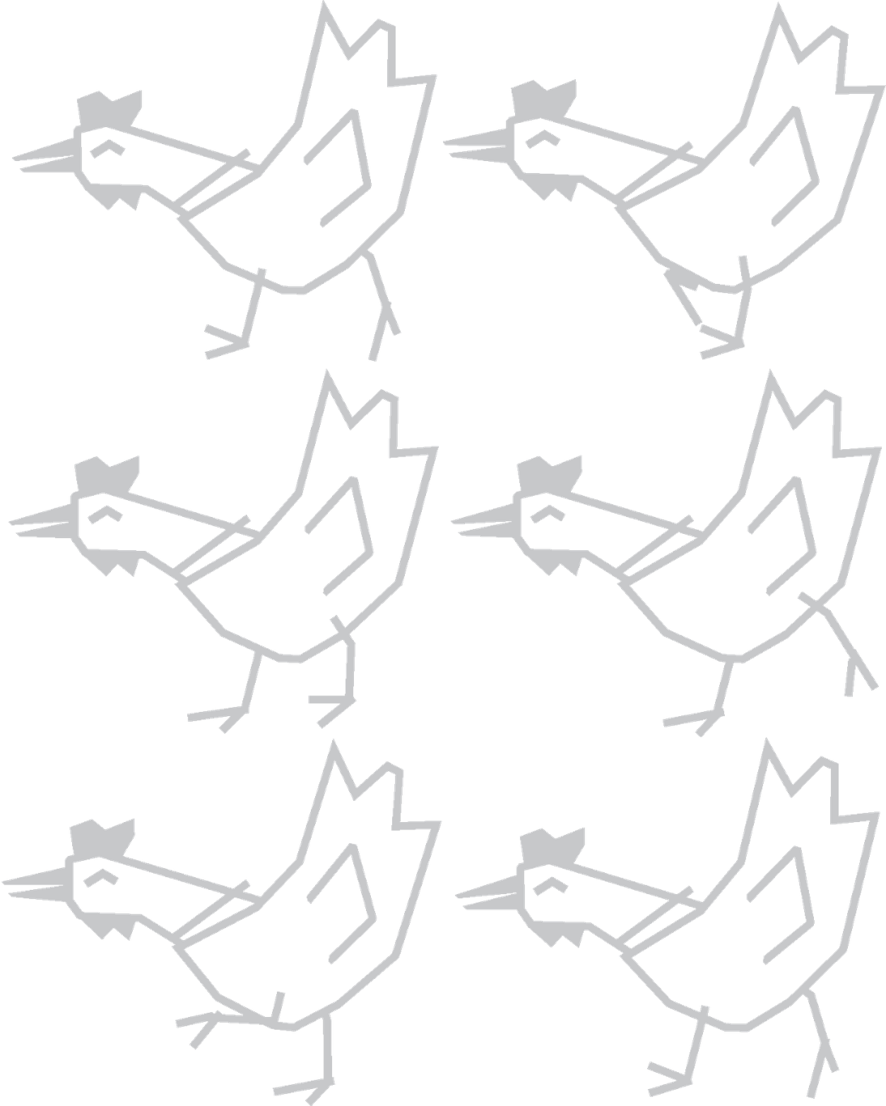
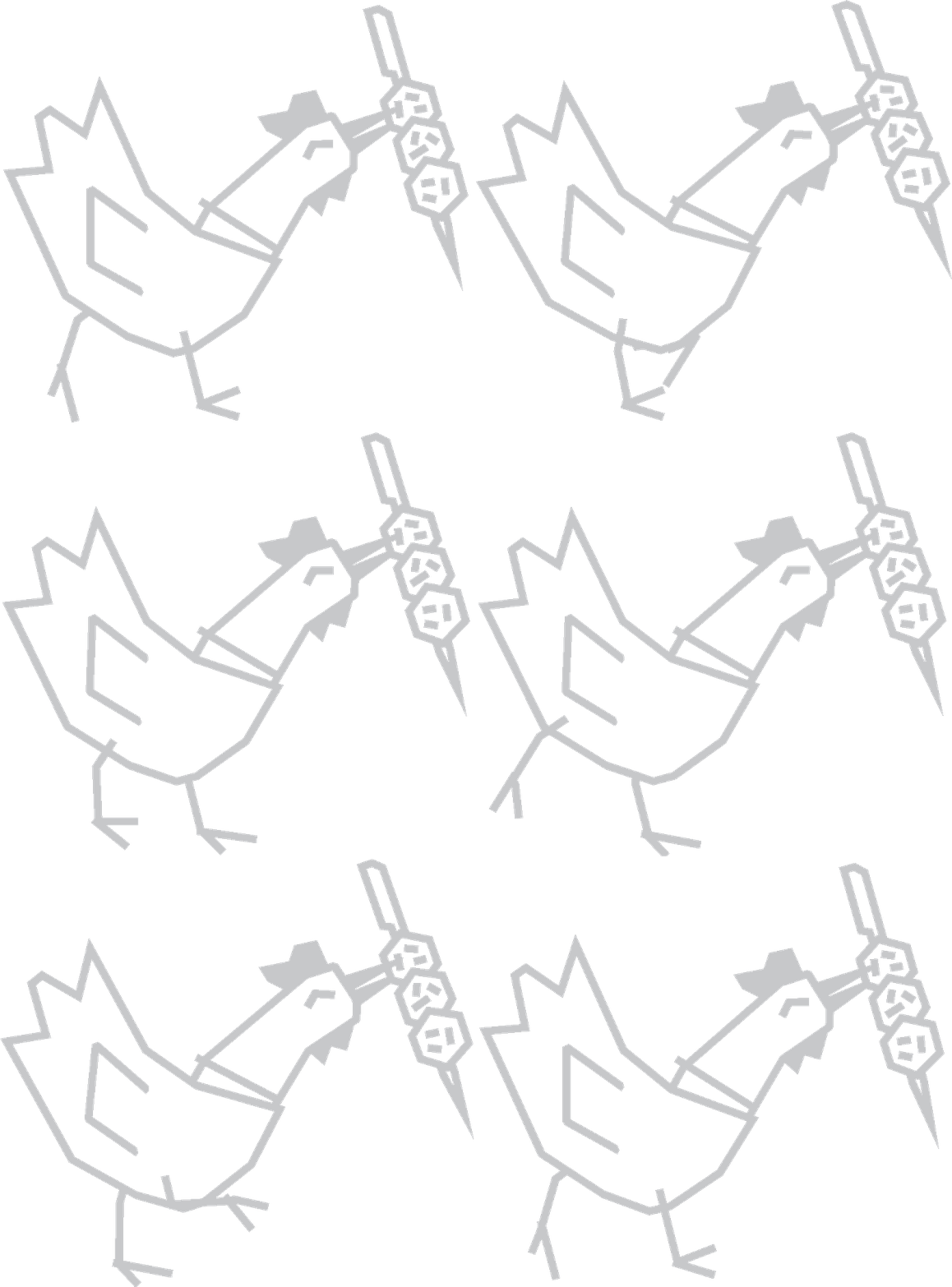
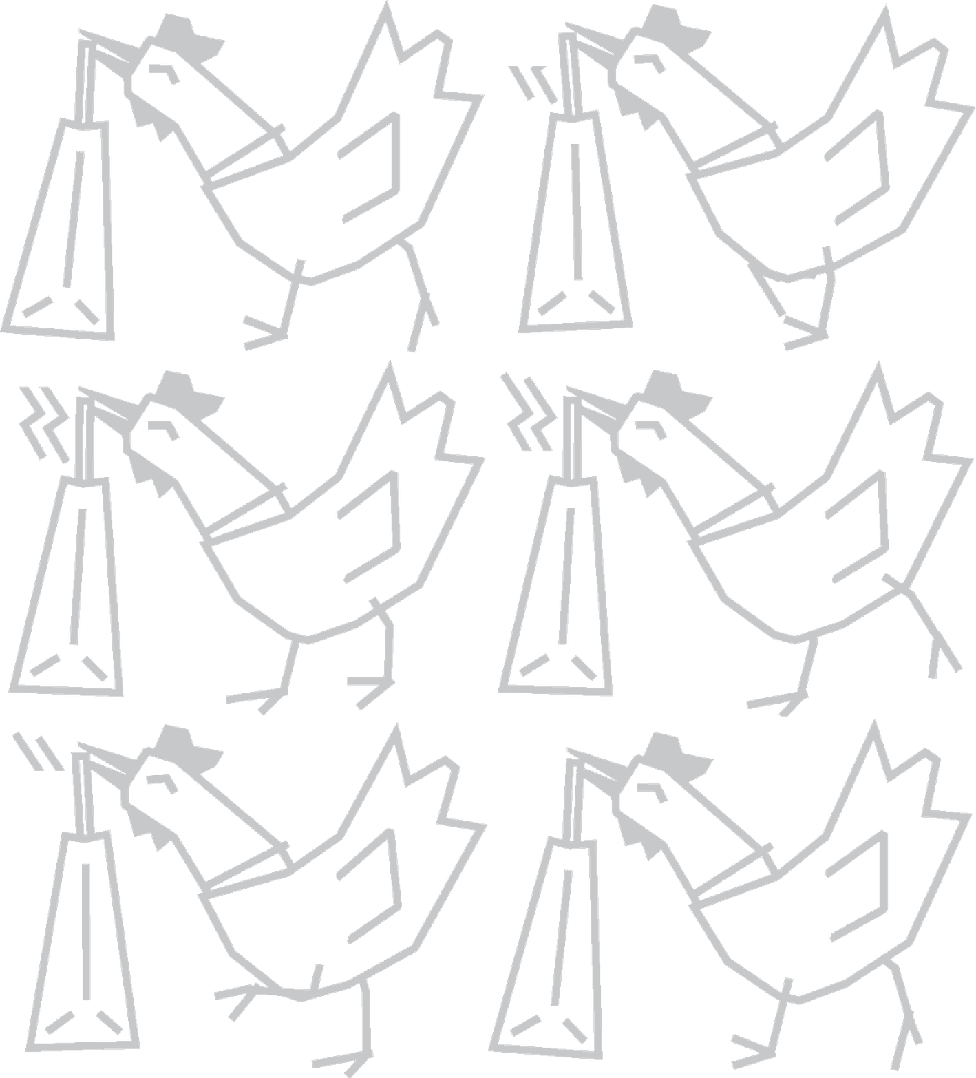
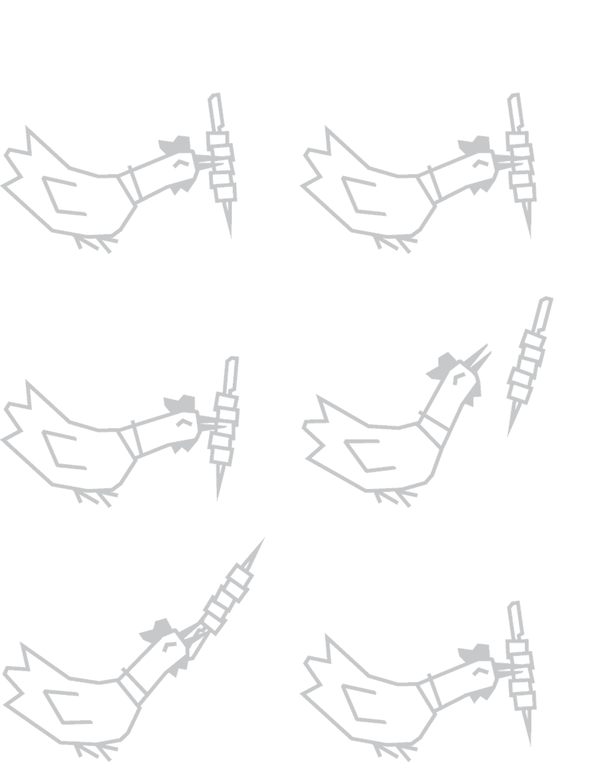
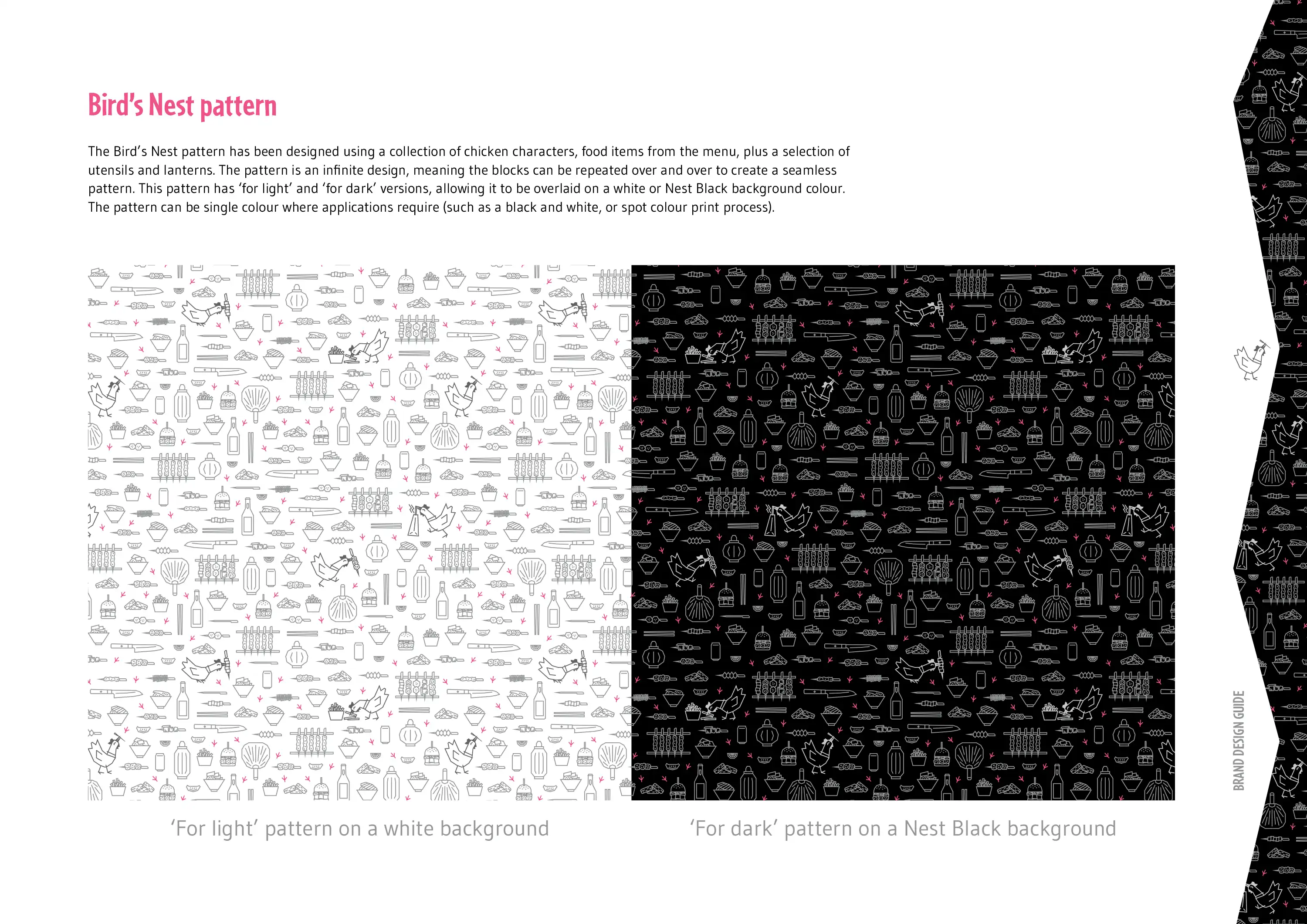
The chicken illustrations were then expanded to include a wide variety of menu items, food preparation items, Japanese lanterns, and a collection of chicken footprints. These were then meticulously arranged into an infinite pattern that became a cornerstone element for the new brand design.

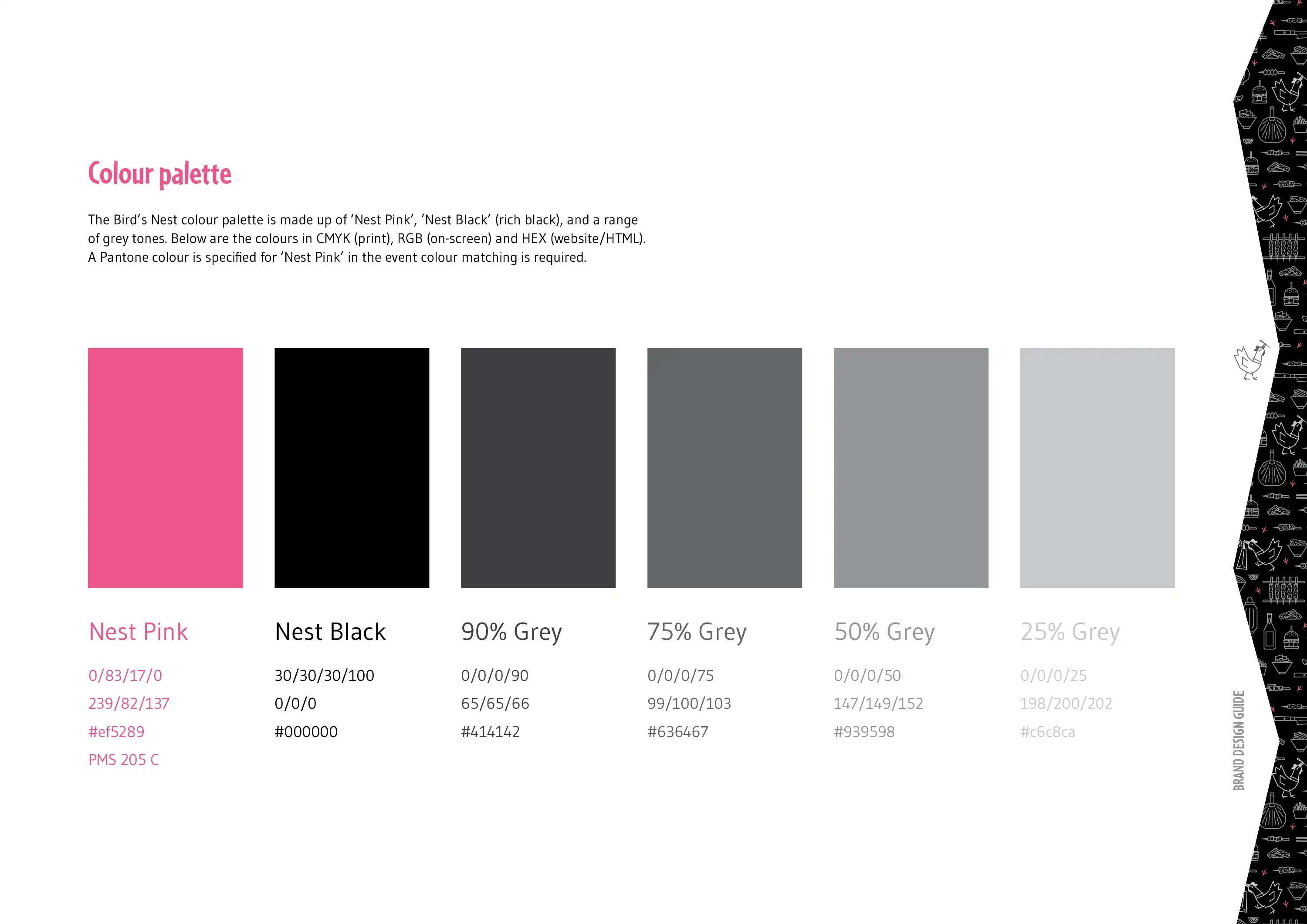
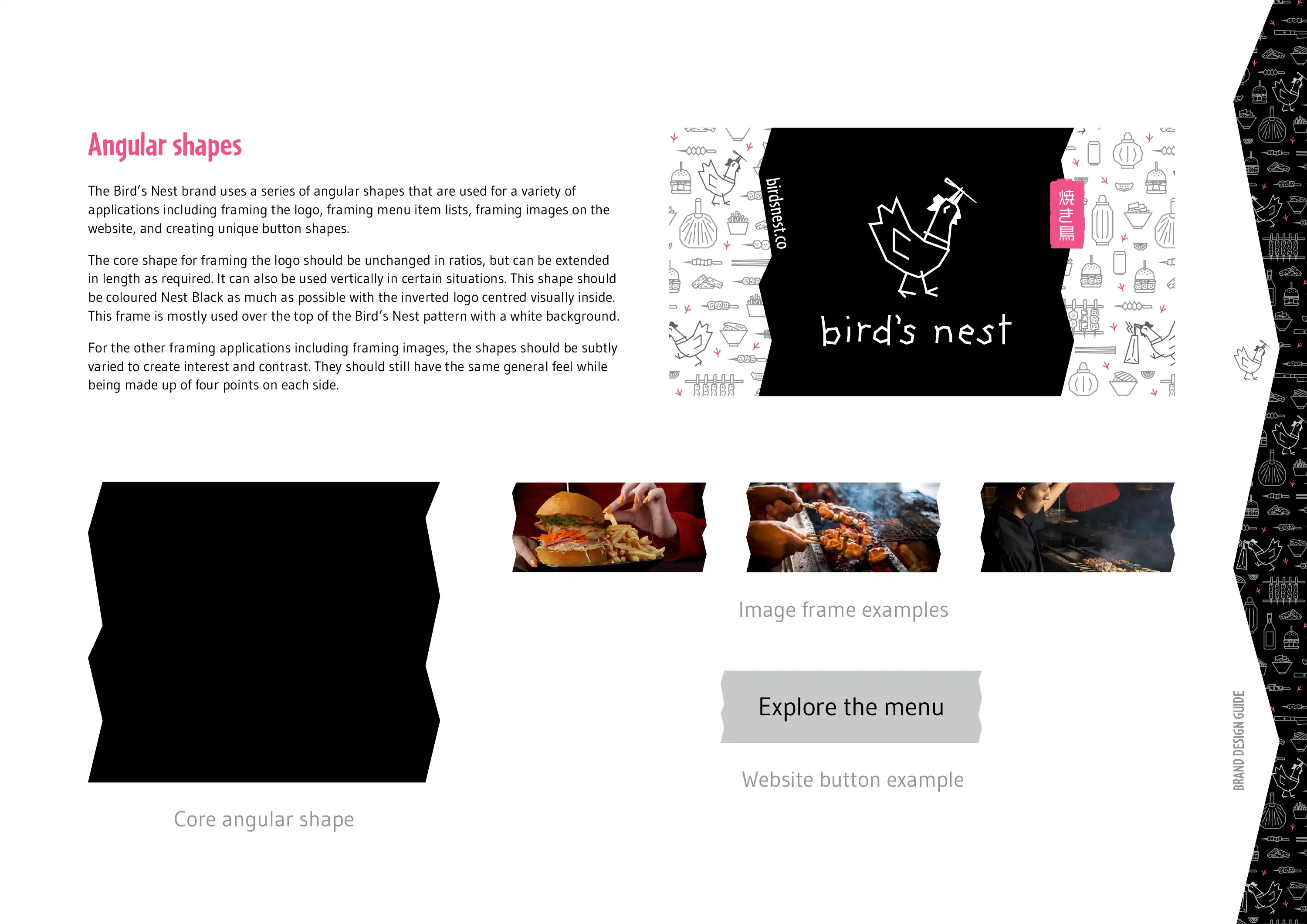
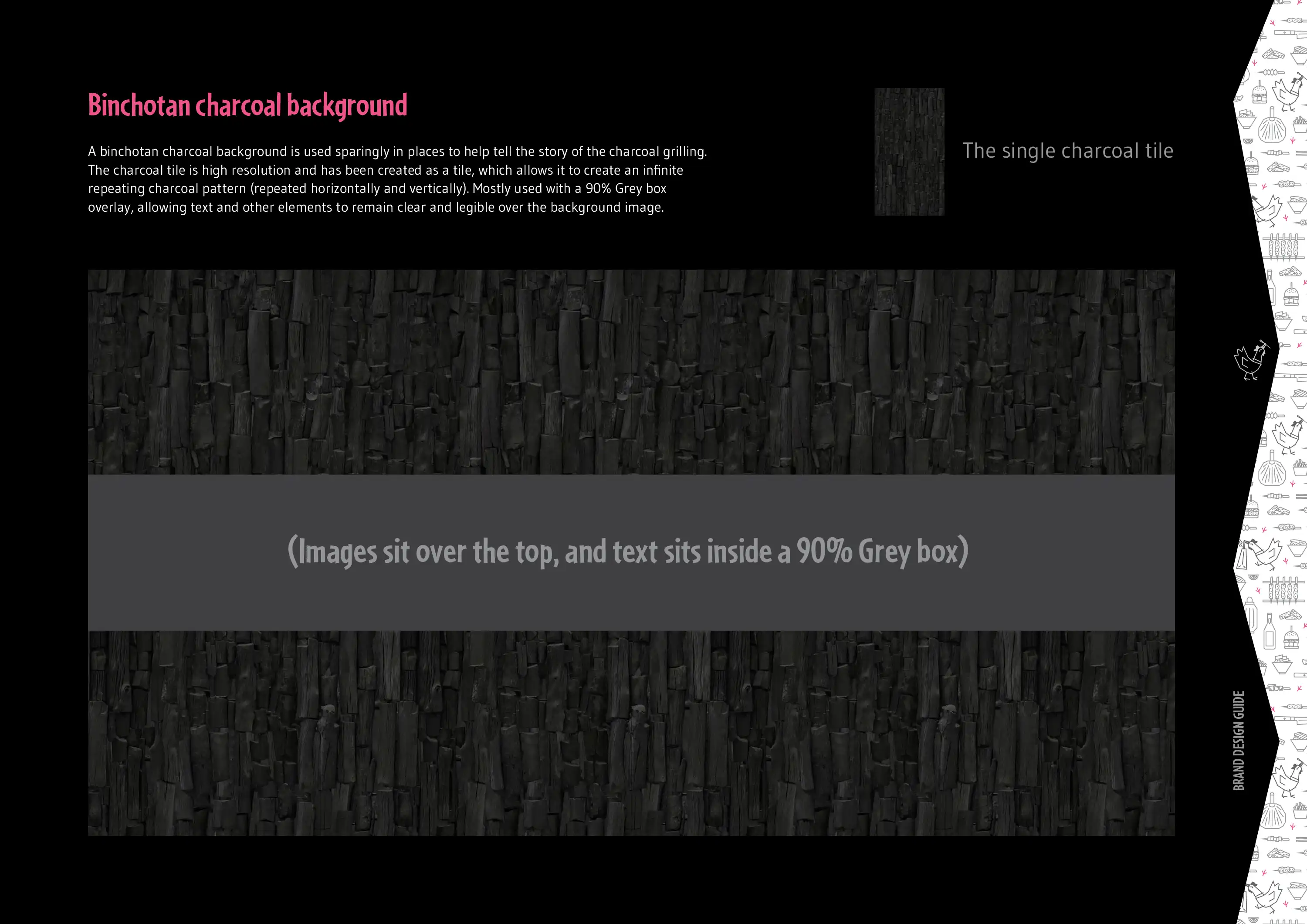
We then created two additional brand design elements: the black 'angular' shapes that frame the Bird's Nest logo and other content, and the charcoal background pattern which we photographed (to source the original charcoal images) and Photoshopped to generate an infinite pattern. We also updated the display font and refined the palette of brand colours.
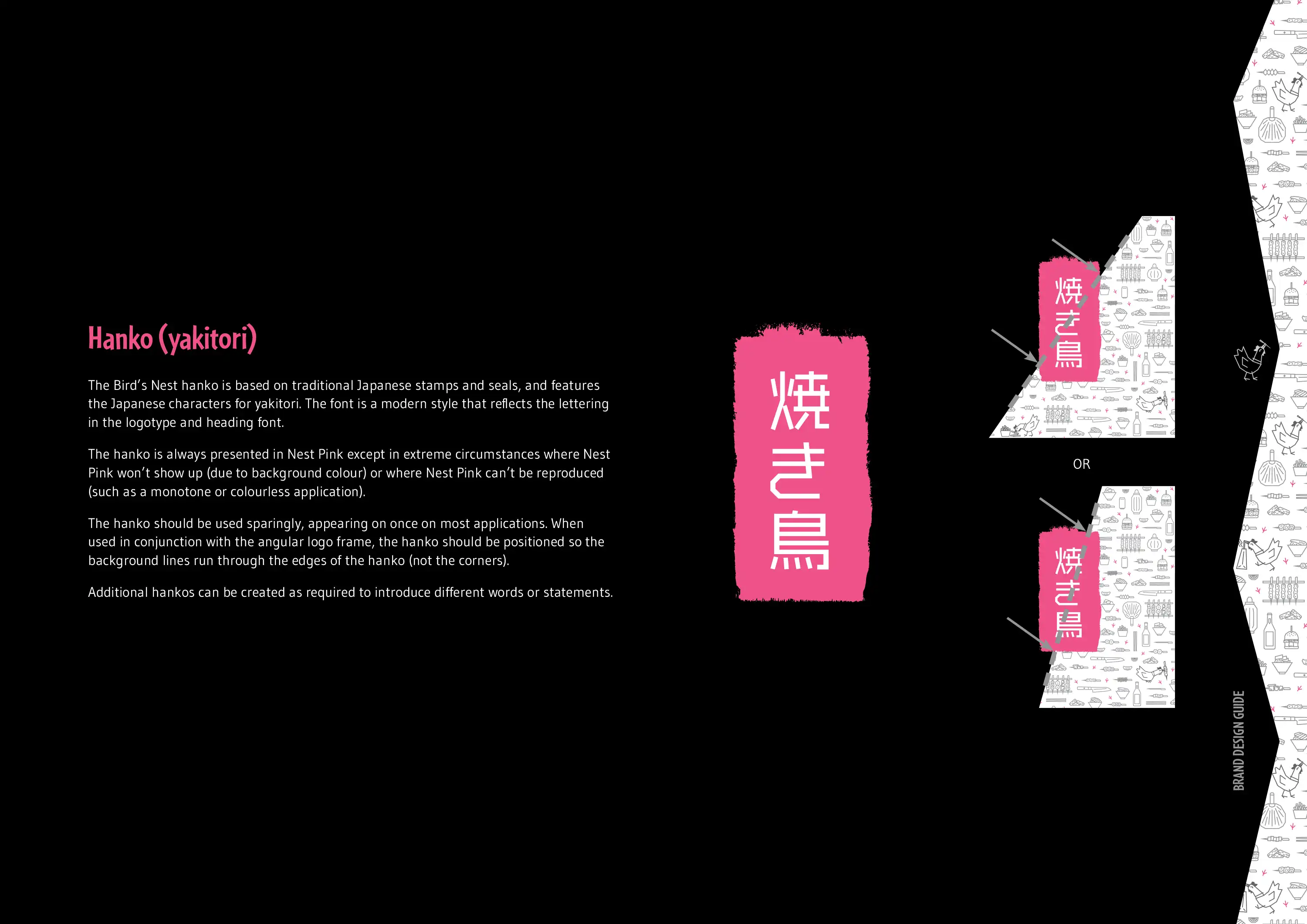
A brand design guide was created to ensure consistency across all touchpoints, no matter if the touchpoints were created internally or by external agencies. The guide covers messaging, logo use, the Bird's Nest pattern, the chicken characters, the angular shapes and charcoal background pattern, plus the updated fonts and colours.
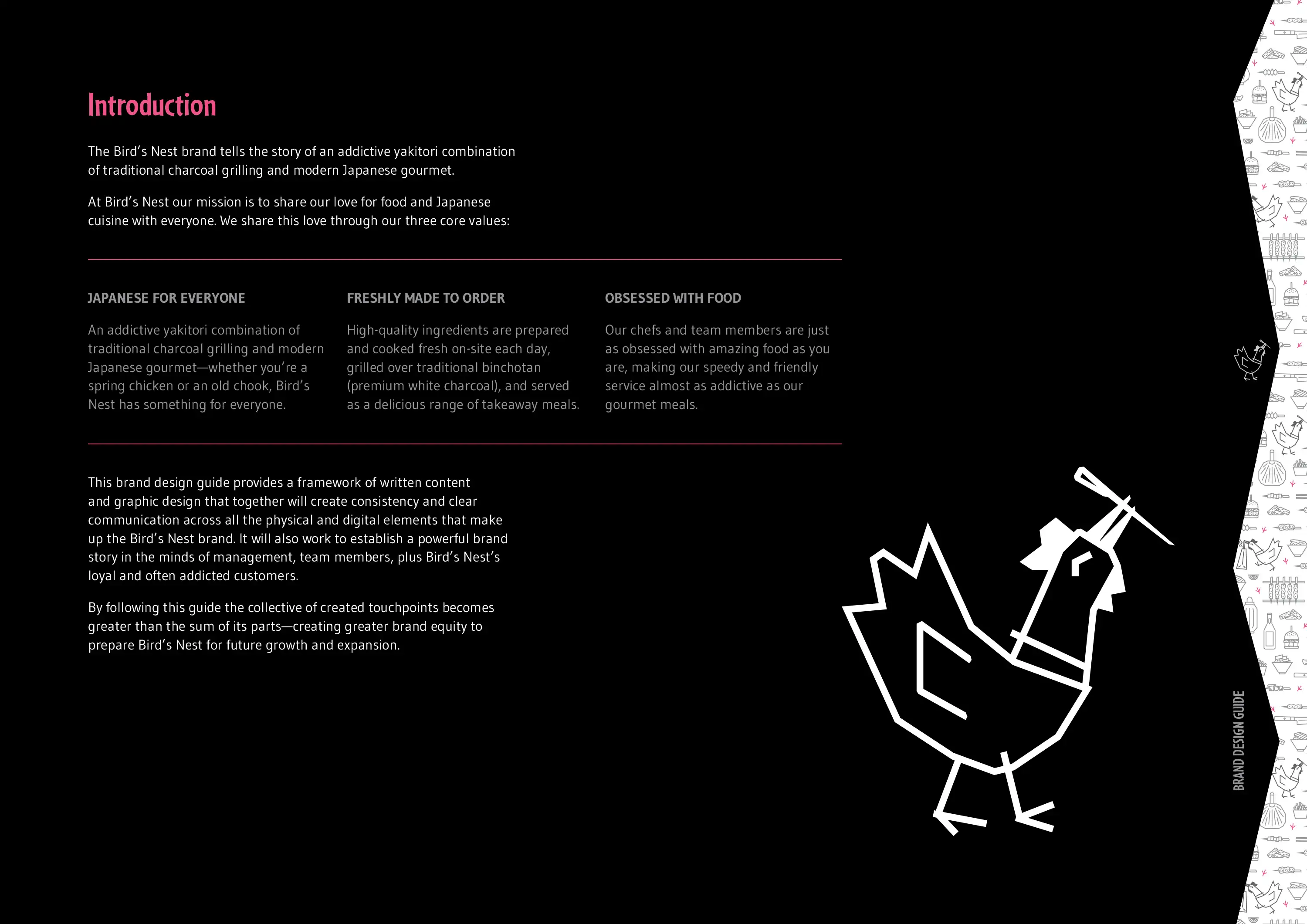
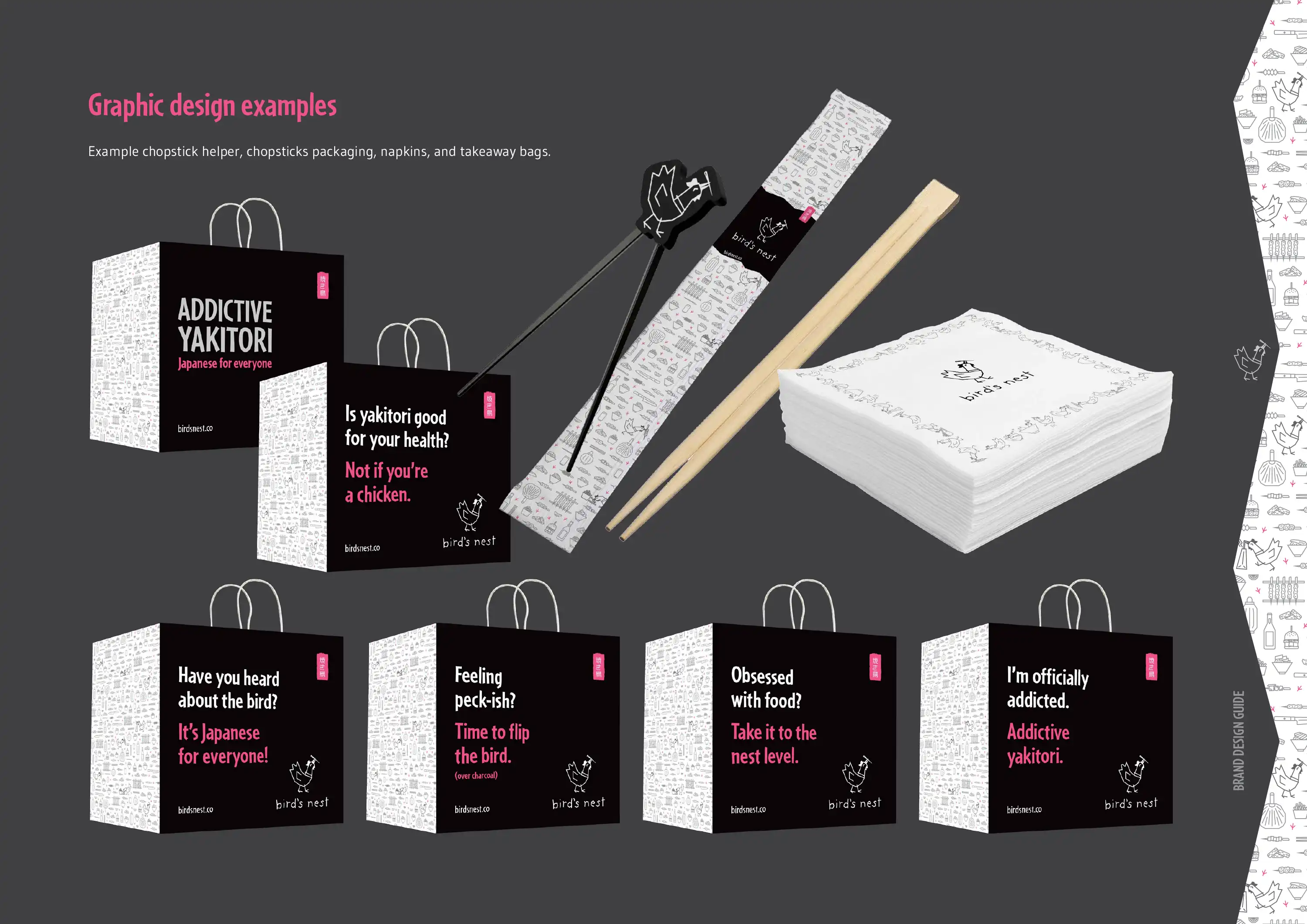
Following the DESIGN phase we then moved into the CREATE phase where we designed takeaway packaging, takeaway bags, menus, posters, venue flags and wallpapers, and even a vehicle wrap for the refrigerated van that travels between the prep kitchen and the various venues.
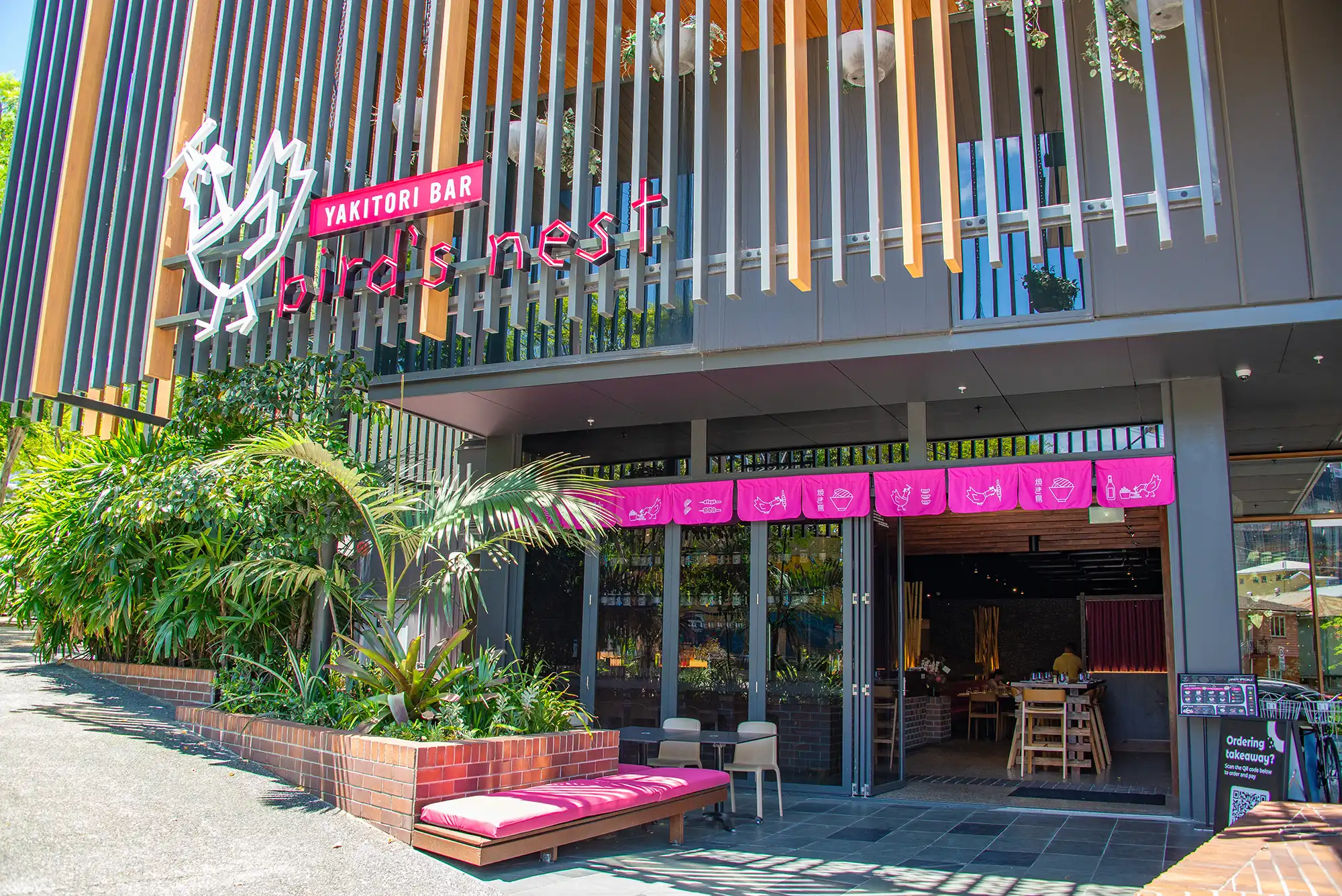
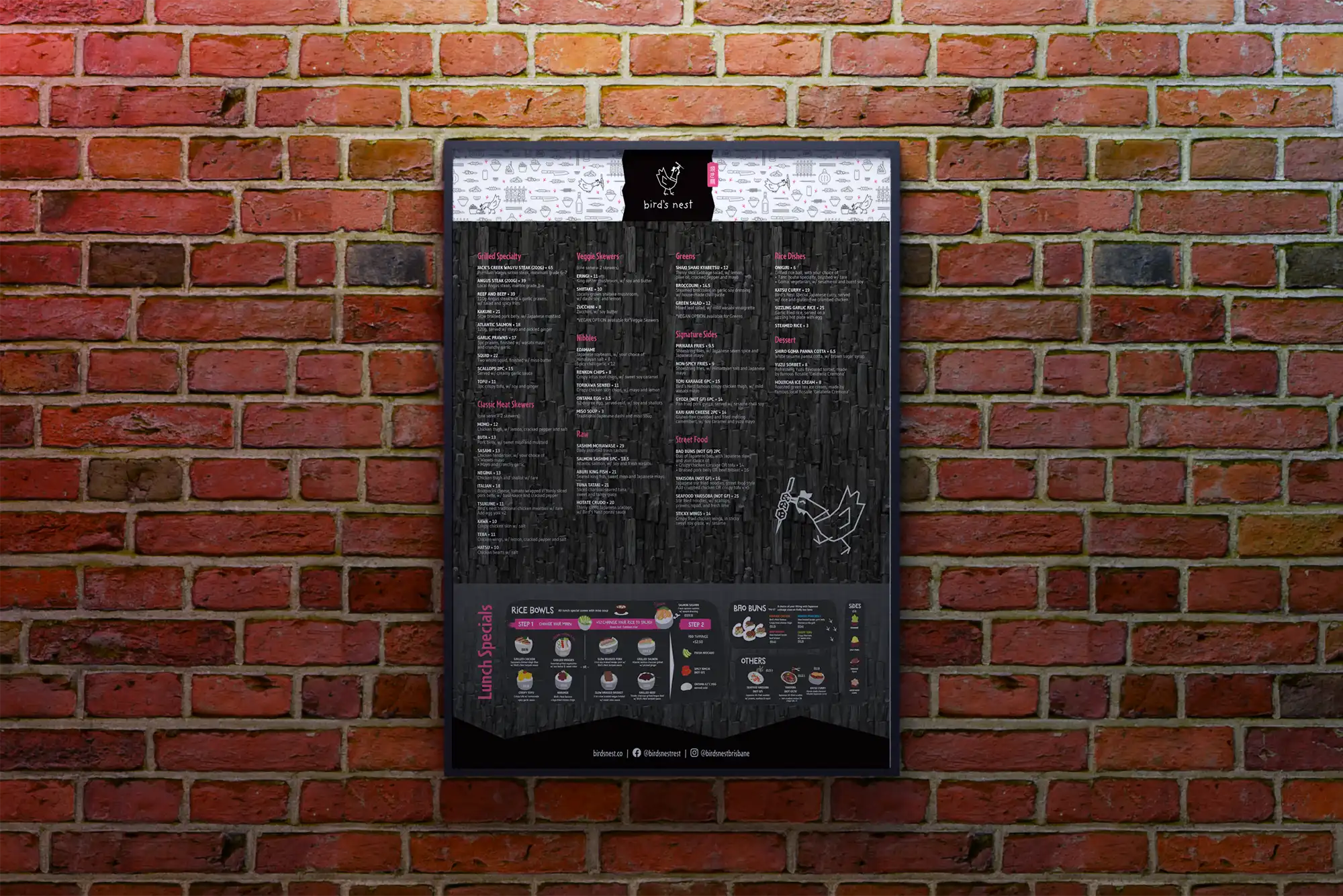
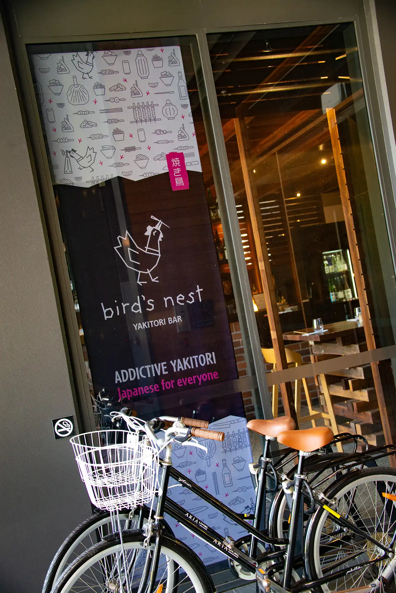
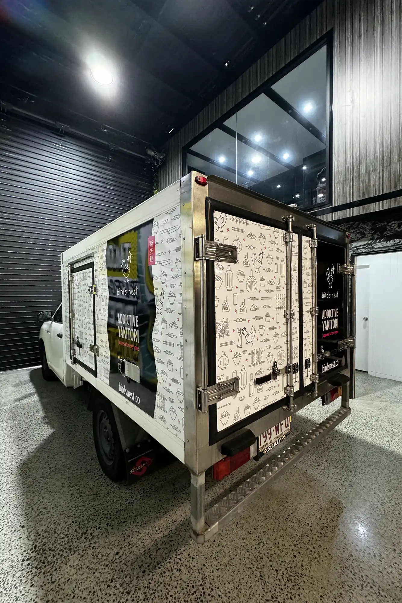
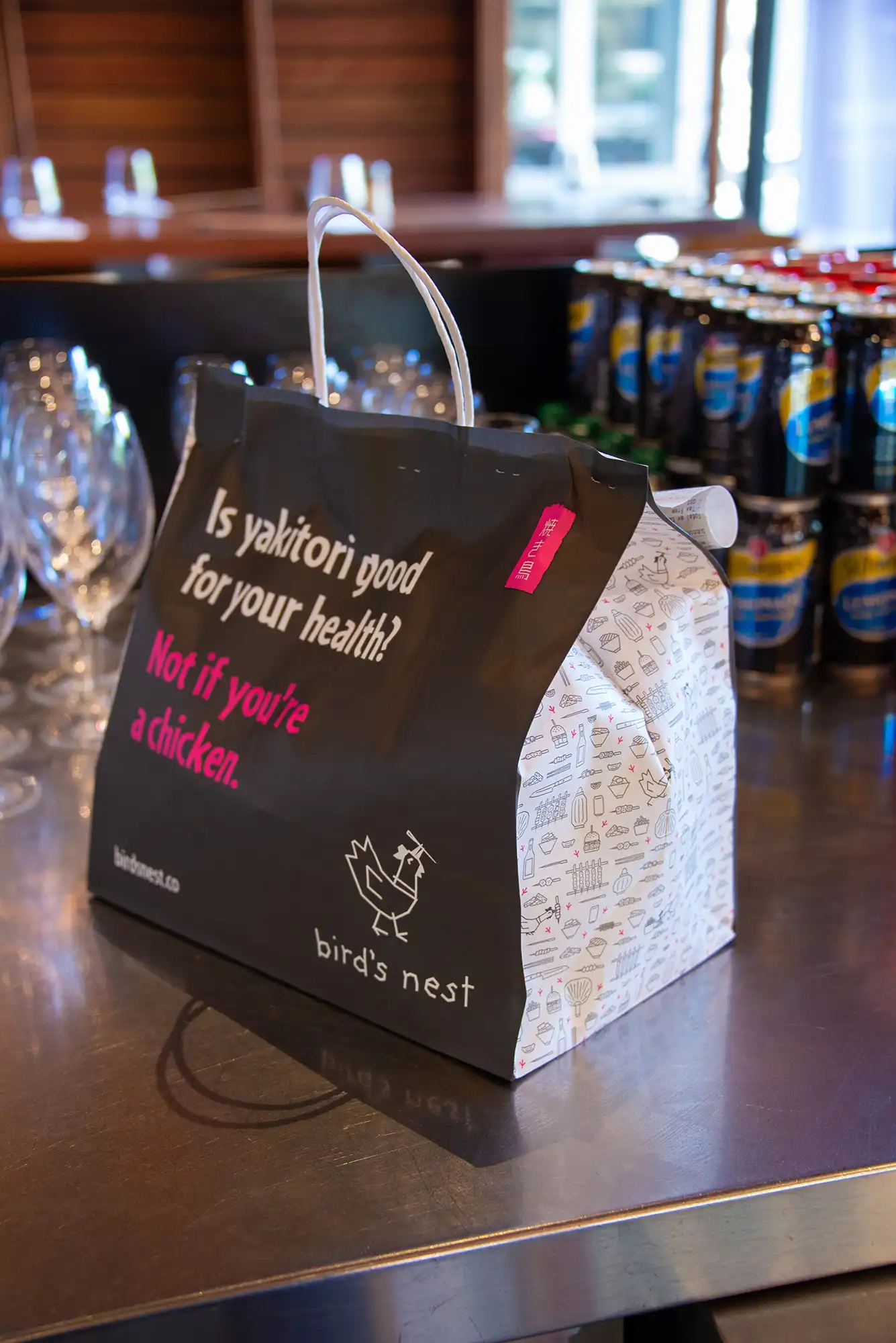
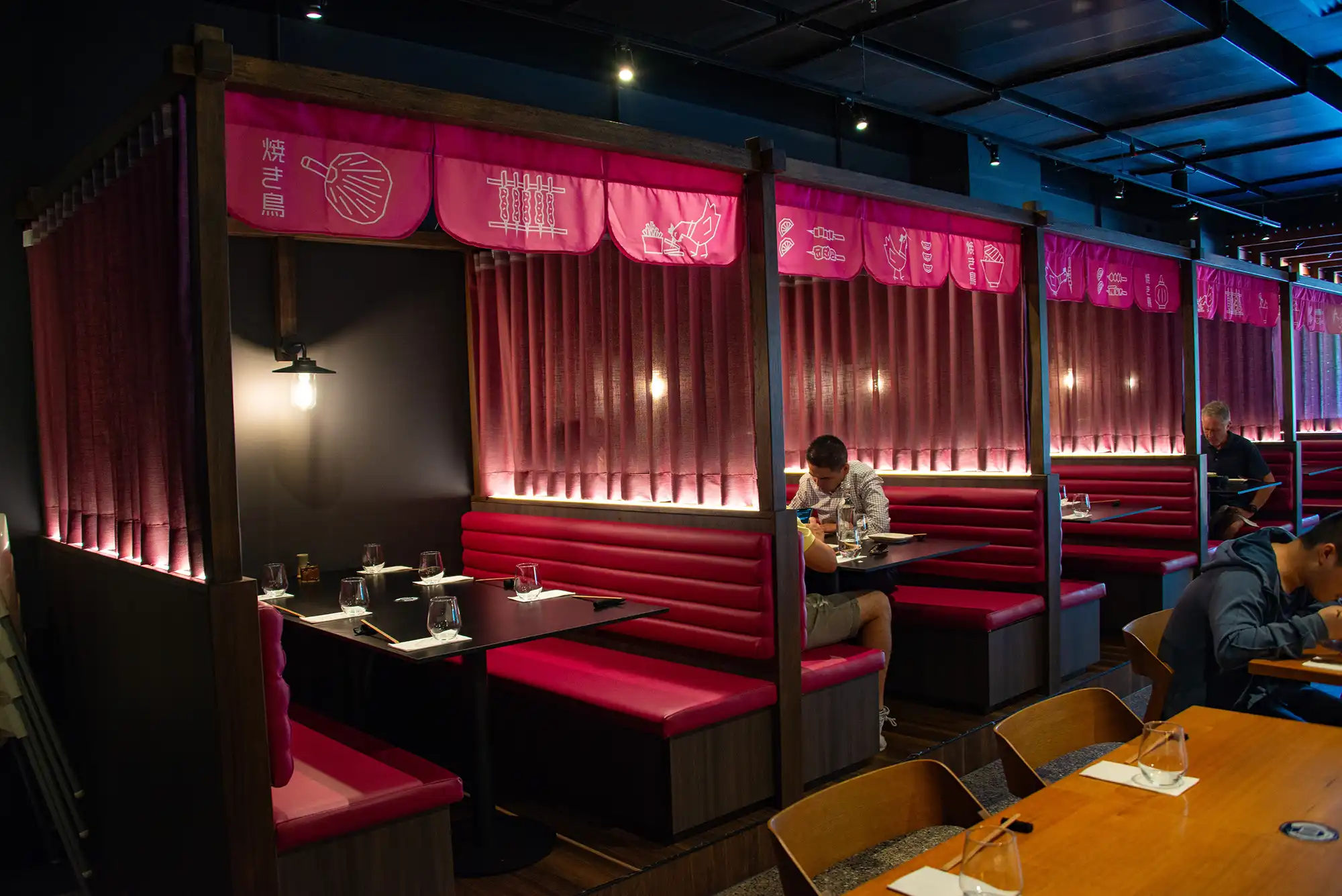
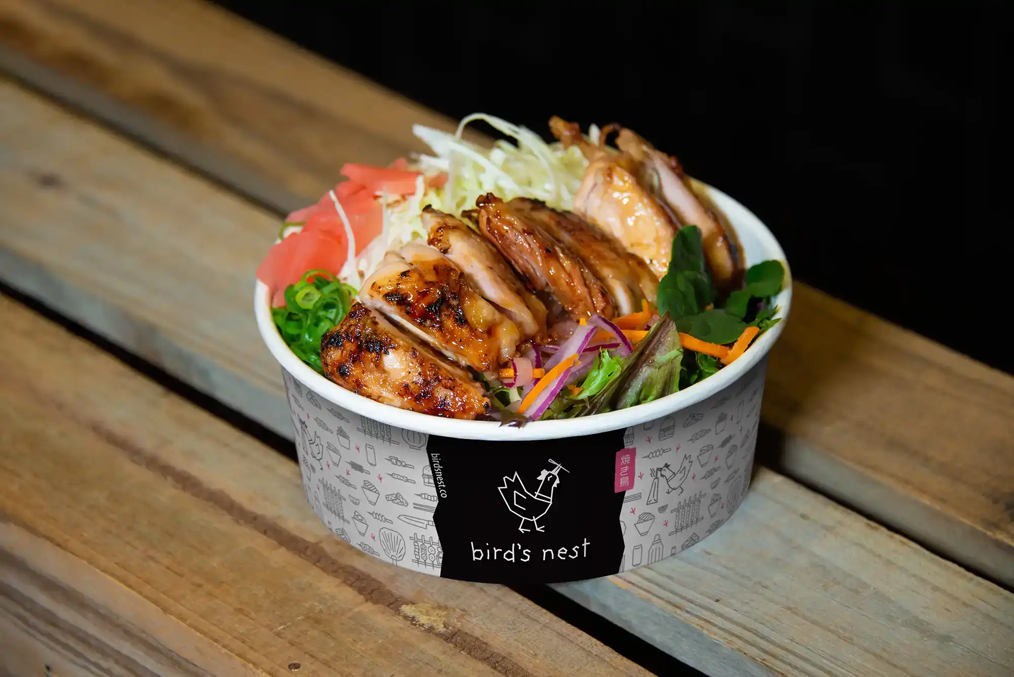
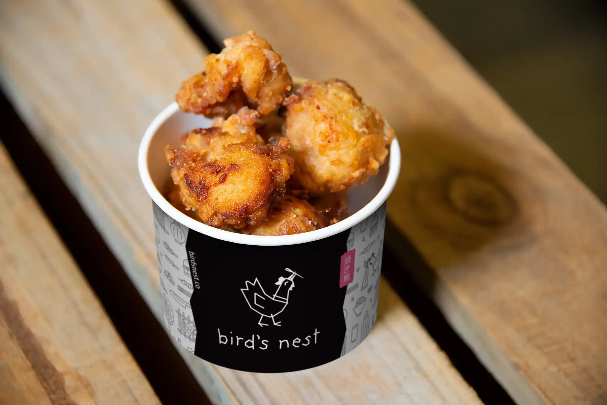
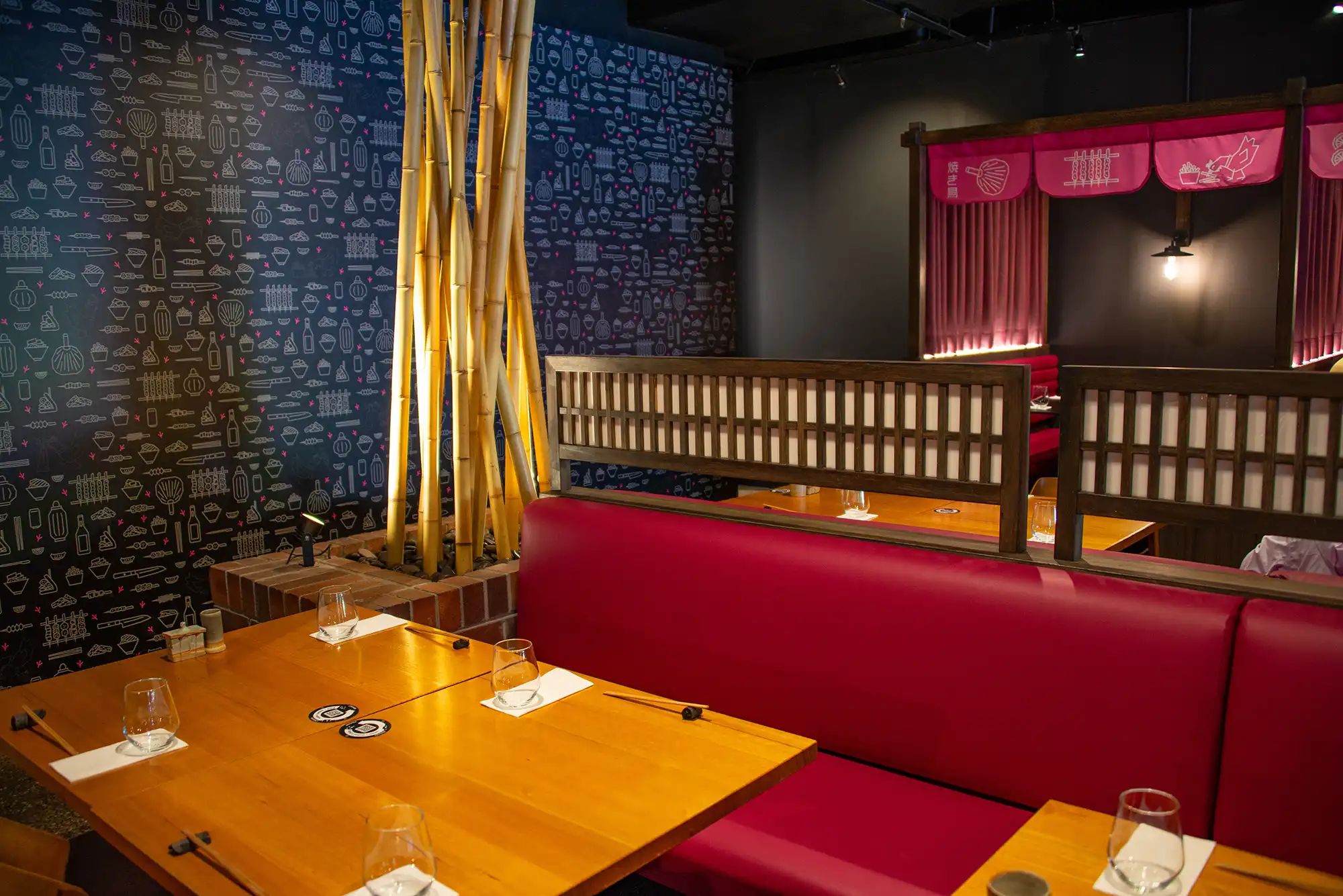
Evocative also performed a number of photoshoots, generating a comprehensive library of menu items for the Toowong takeaway venue, and collections of venue images for Everton Park and the new West End venue.
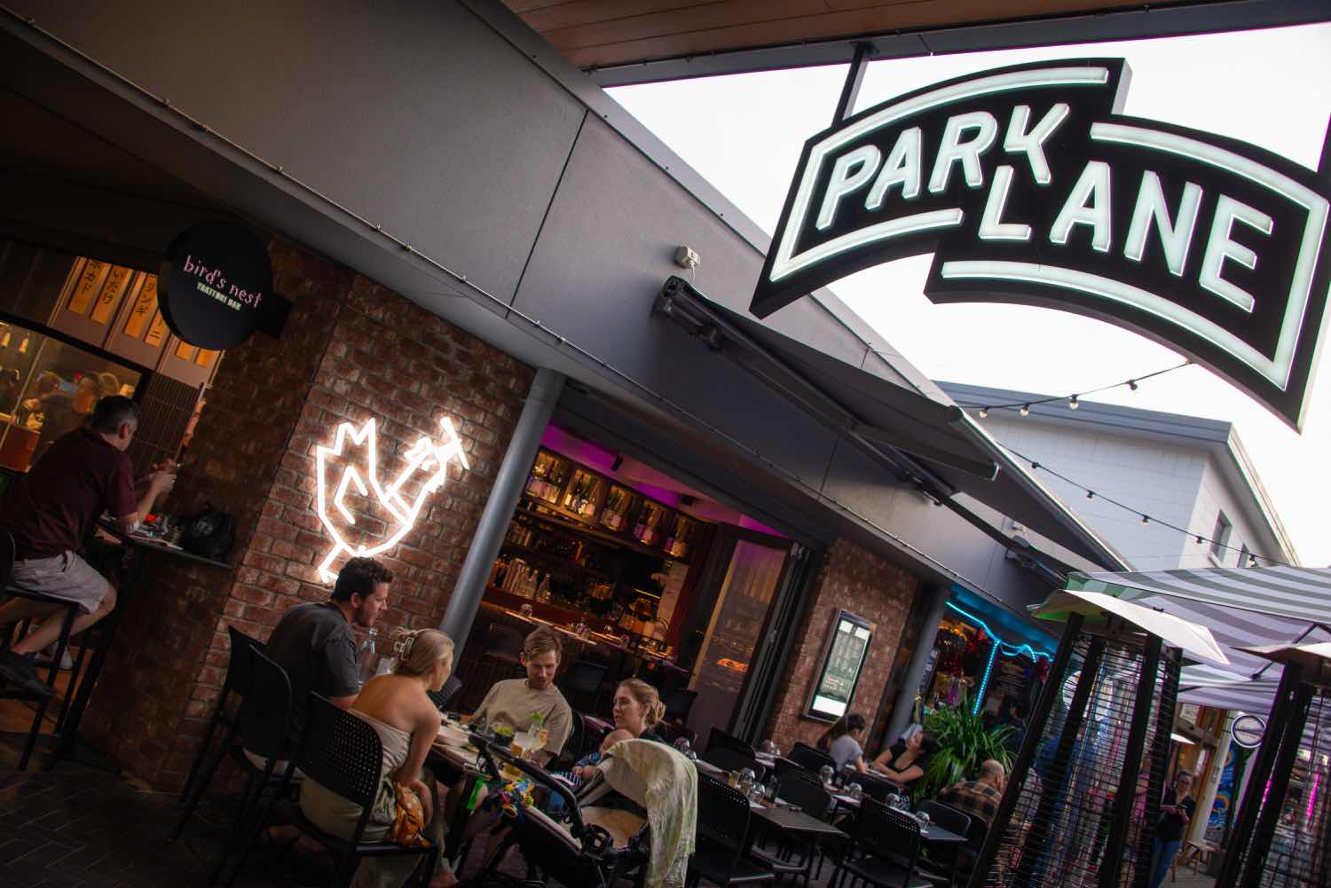
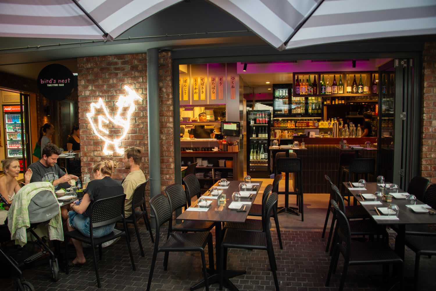
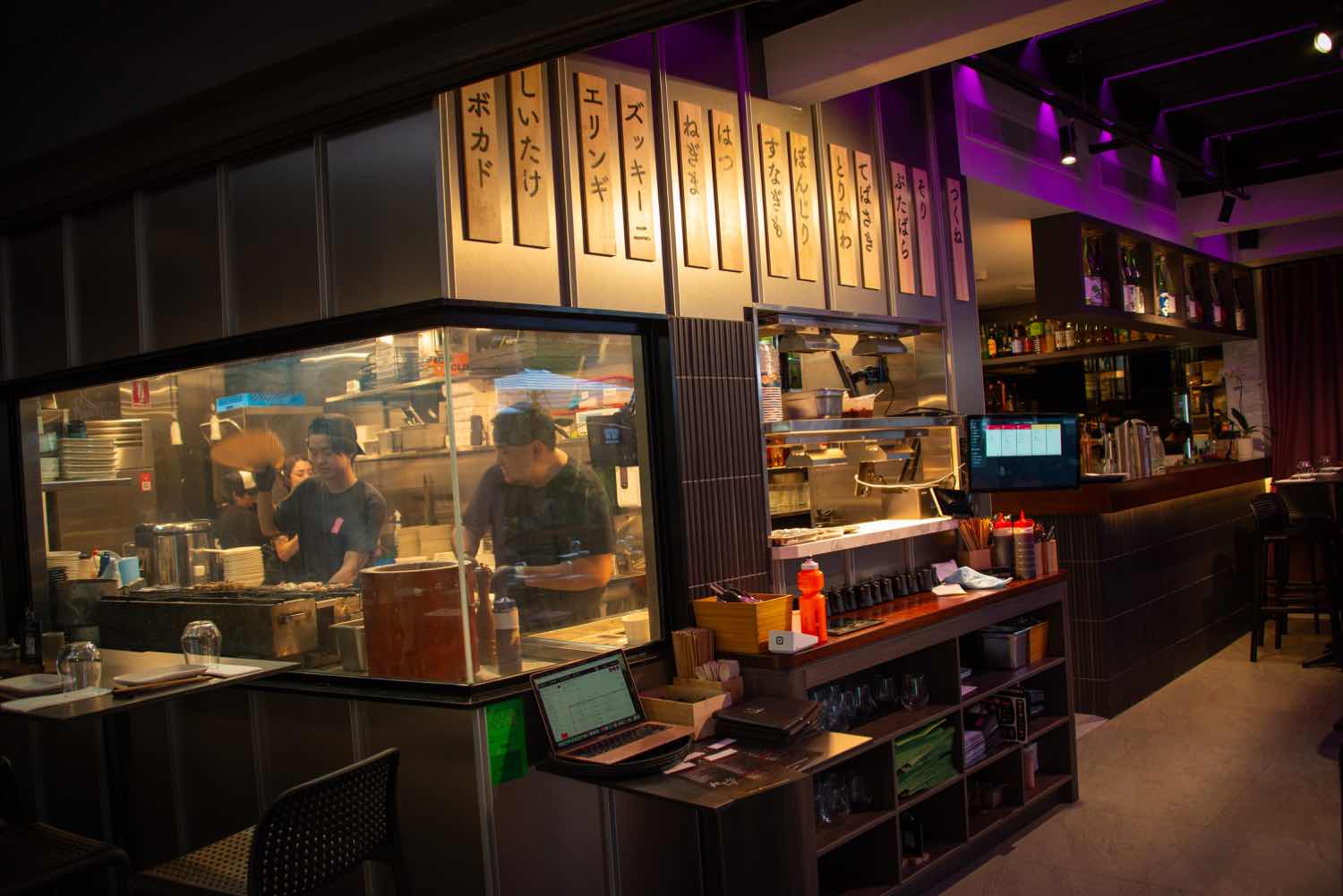
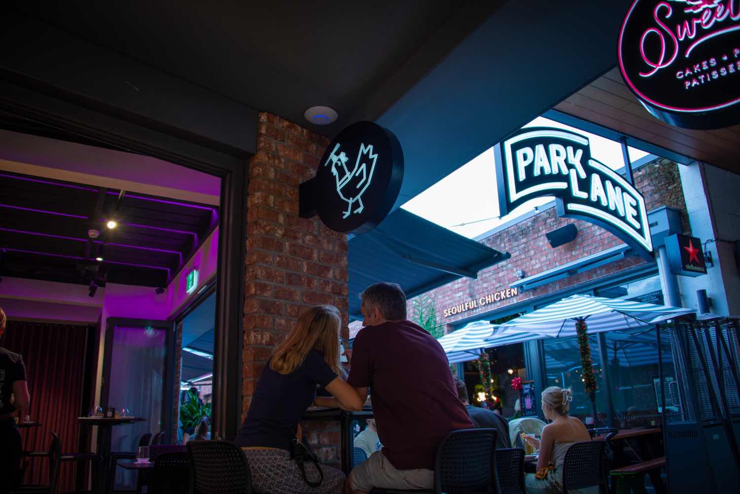
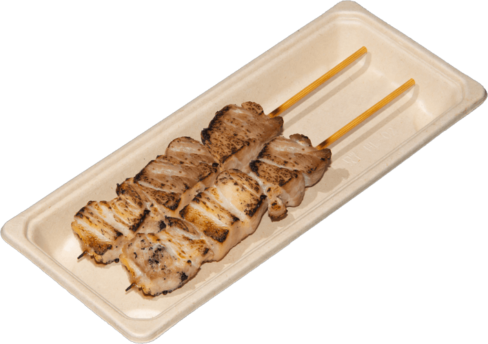
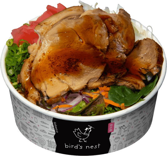
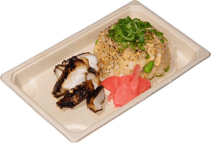
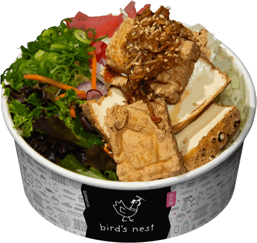
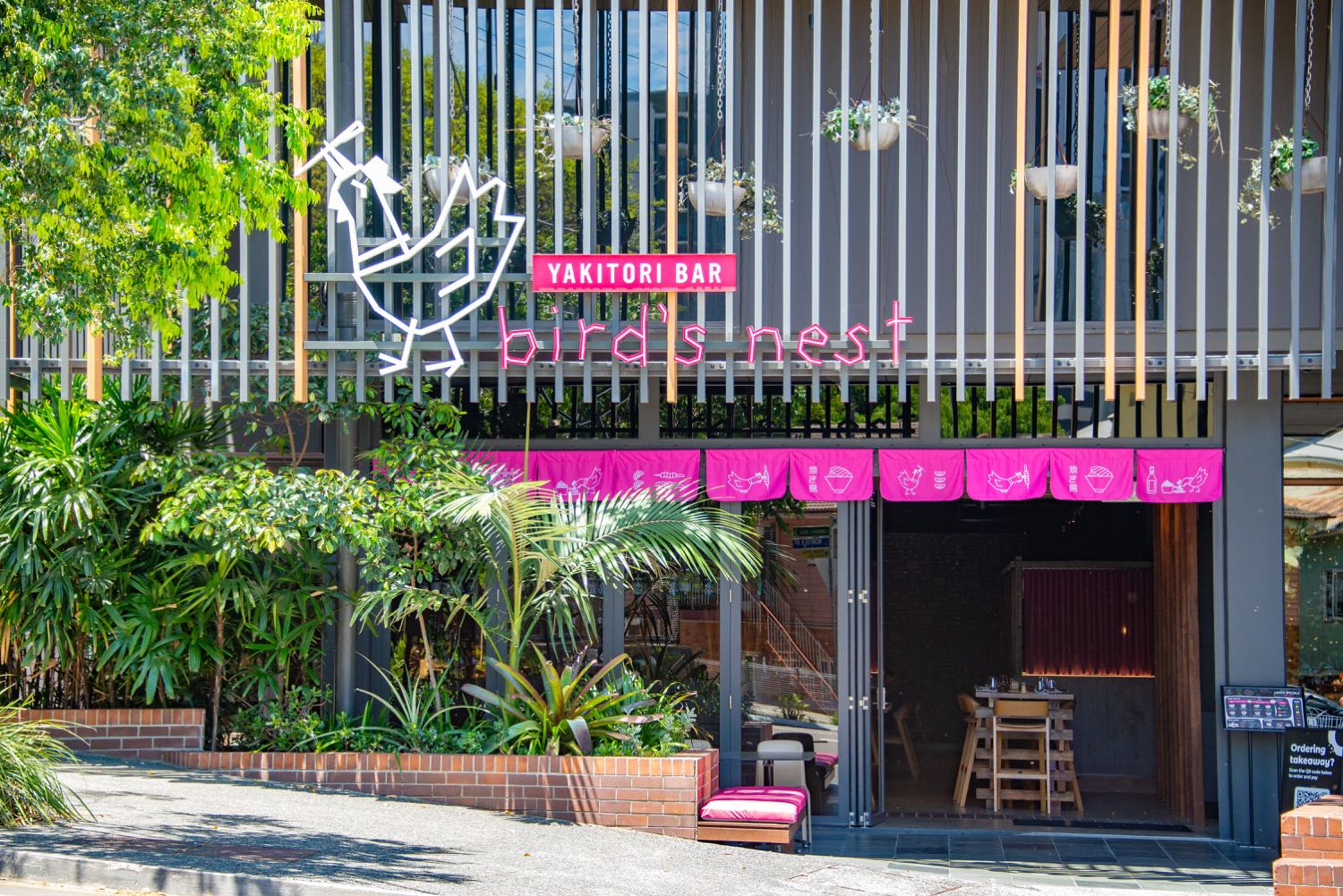
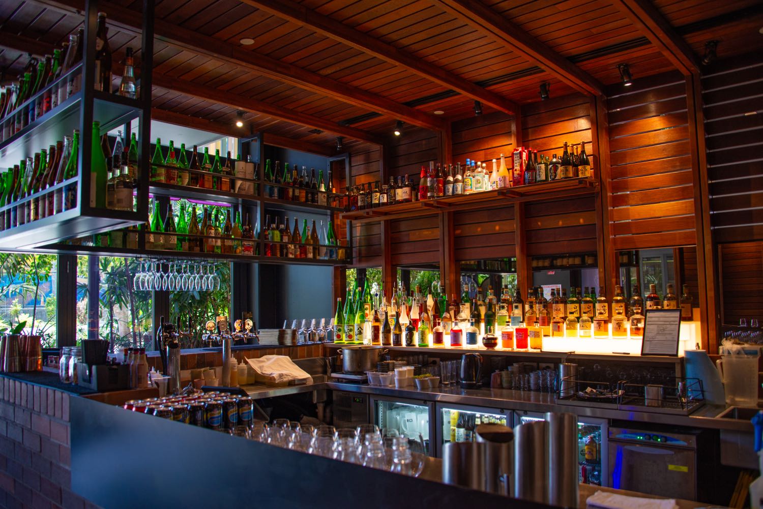
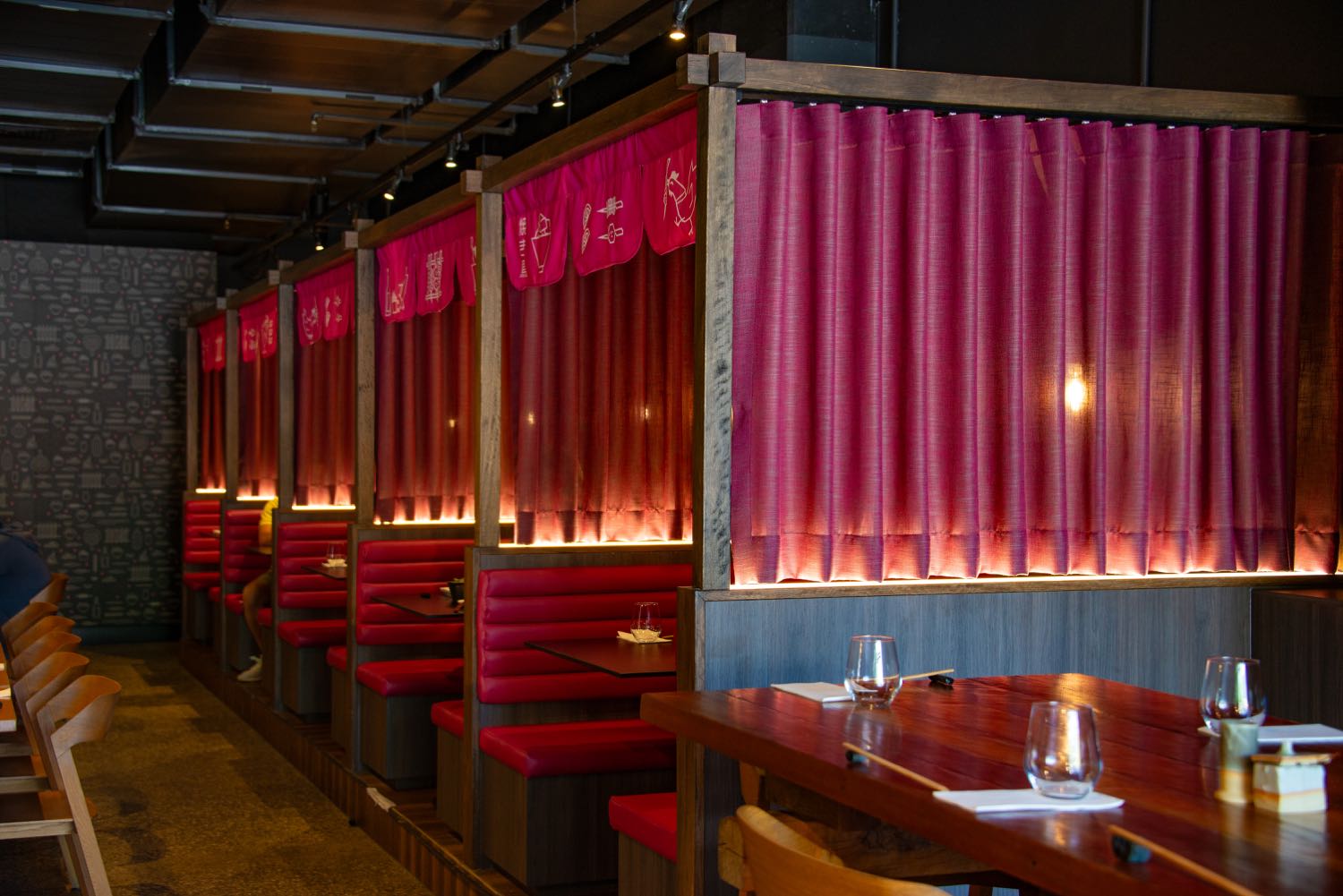
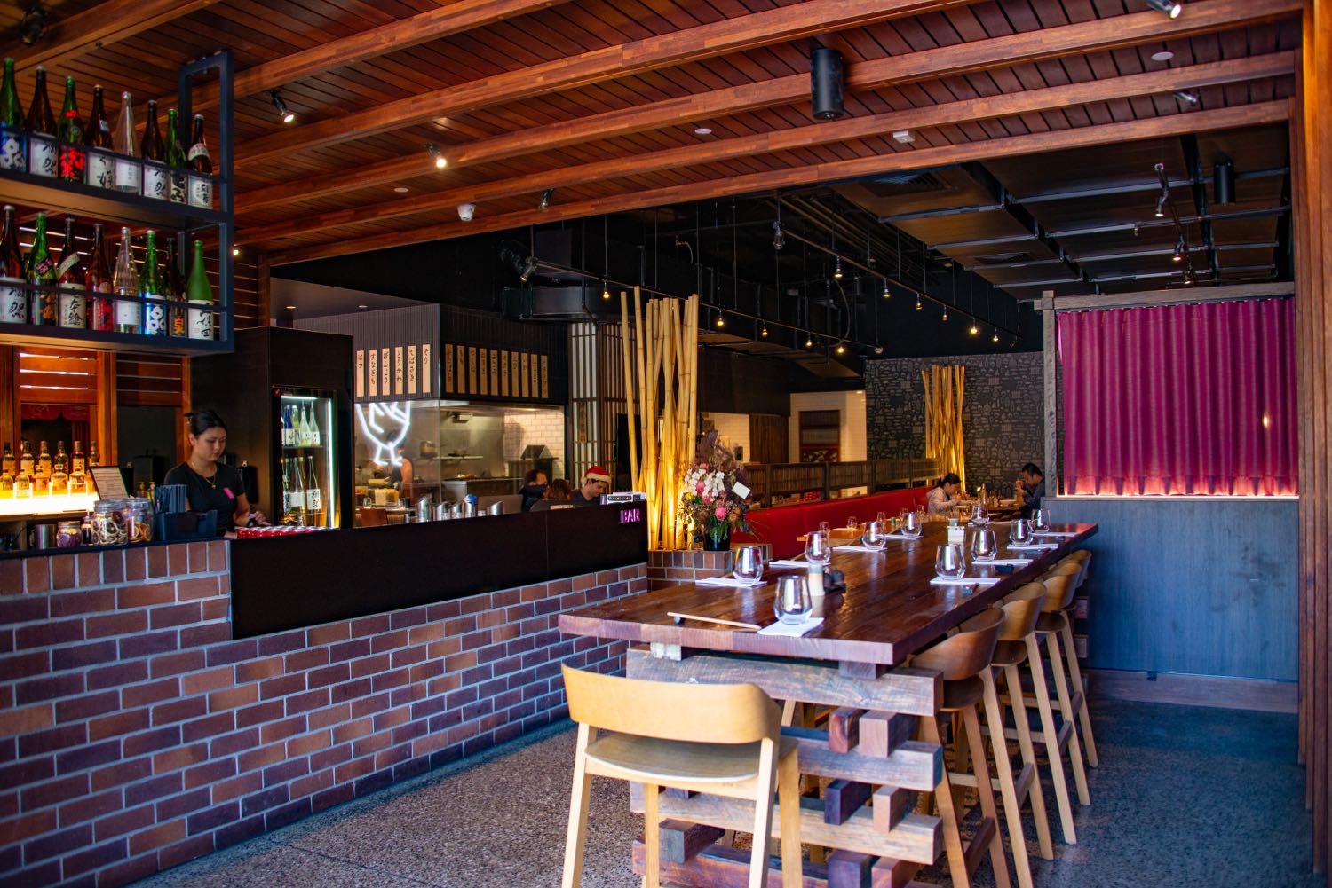
Taking all the written copy, brand design elements, and libraries of photographs, Evocative then designed and built a brand new website on the Oncord platform. The website architecture was carefully considered as each venue has its own unique menu, along with online booking and ordering options. We also researched and updated the URL from birdsnestrestaurant.com.au to the much easier to remember and type: birdsnest.co
The website makes full use of the chicken animations, with various chicken characters walking across the screen.

Co-founder and co-director Marie kindly gave us this five-star Google Review:
'We have recently worked with Evocative to do a refresh of our brand. Not only is he extremely creative, but he is seriously thorough in his work. We were blown away by the attention-to-detail, and his time spent researching not only our brand but market competitors. I have really enjoyed working with him, and look forward to working with him closely in the future. We have worked with a few brand design companies, and so far Ben and his team at Evocative by far exceed everyone else!'
You can visit the Bird's Nest website here: birdsnest.co


