
Empower Social Work Services
logo design | brand identity | illustration | website
Empower provides social work and support coordination for people with non-terminal acquired brain injuries (ABI) or neurological disorders. During the process Empower becomes a new client’s case manager to support, coordinate and link the client to all the services they require.
'Empower began in 2018 as a direct response to witnessing the real need people and families have for assistance bringing their NDIS supports to life. Filling this need with care and competence is what drives us. Being innovative and insightful in how we help lift a person’s plan off the page and into their reality is what makes us a provider of choice.'
Owner David wasn't connected to his existing brand design, to the point it was annoying him every time he went to send an email and saw the
old logo sitting in the email signature.
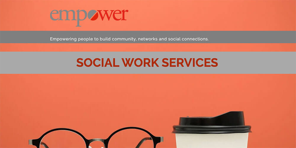 The
original brand design
The new brand design needed to represent Empower's personal but professional approach to social work with ABI clients, while targeting the
patient, their family, and their carer. Empower was already well known in the industry for turning talk into action with highly
specialised knowledge for ABIs.
Another key aspect was to avoid the typical symbols and imagery used by most of Empower's competitors. Semiotics around brains and minds were seen by Empower as negative imagery, and the use of stock images of disabled people really wasn't appropriate to represent the mission of the company: helping people live a meaningful life by empowering them to work, find friends and have fun.
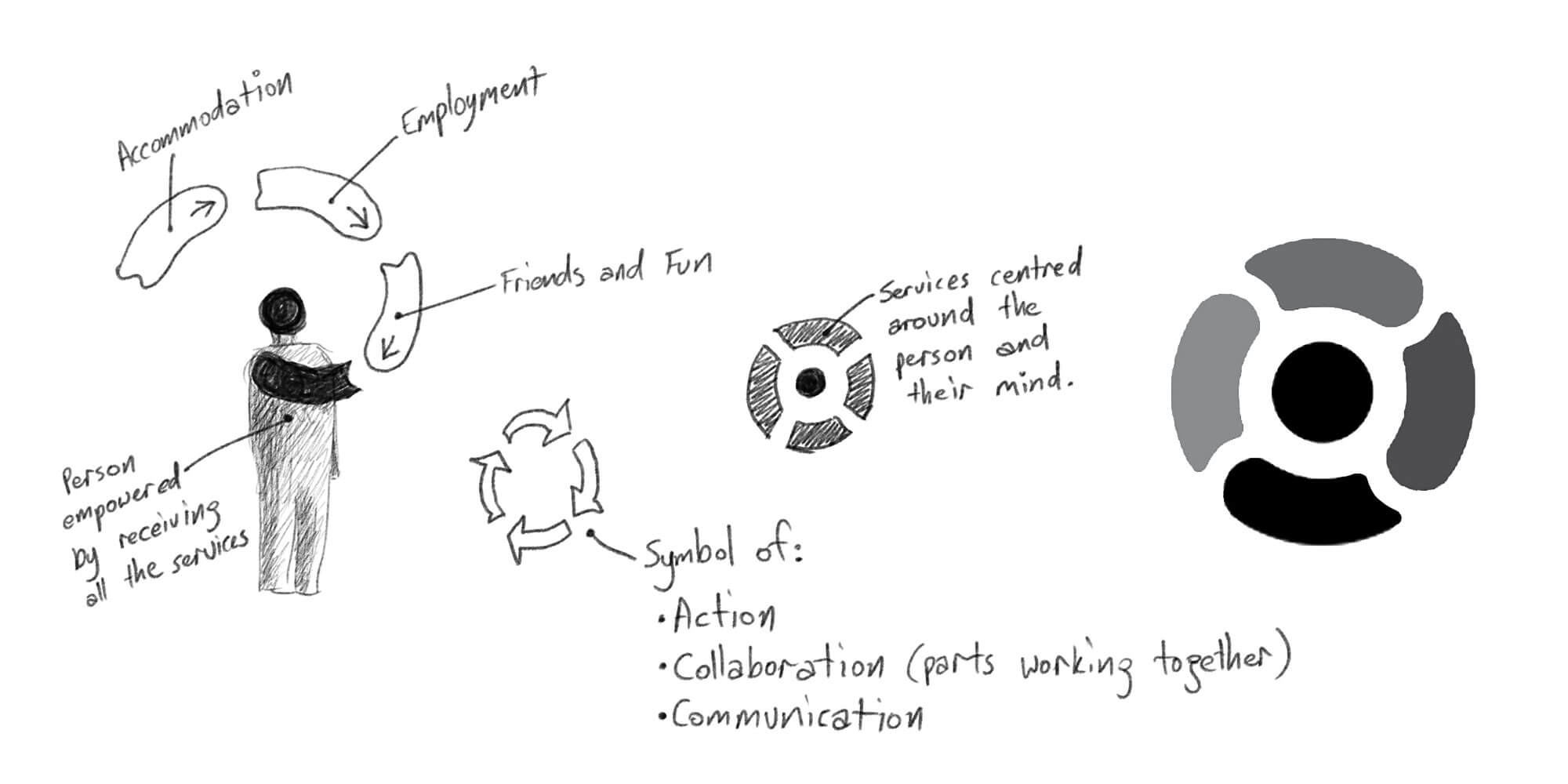
Once the commercial objectives were set during the OUTLINE phase, ideation and sketching began for a new logo design.
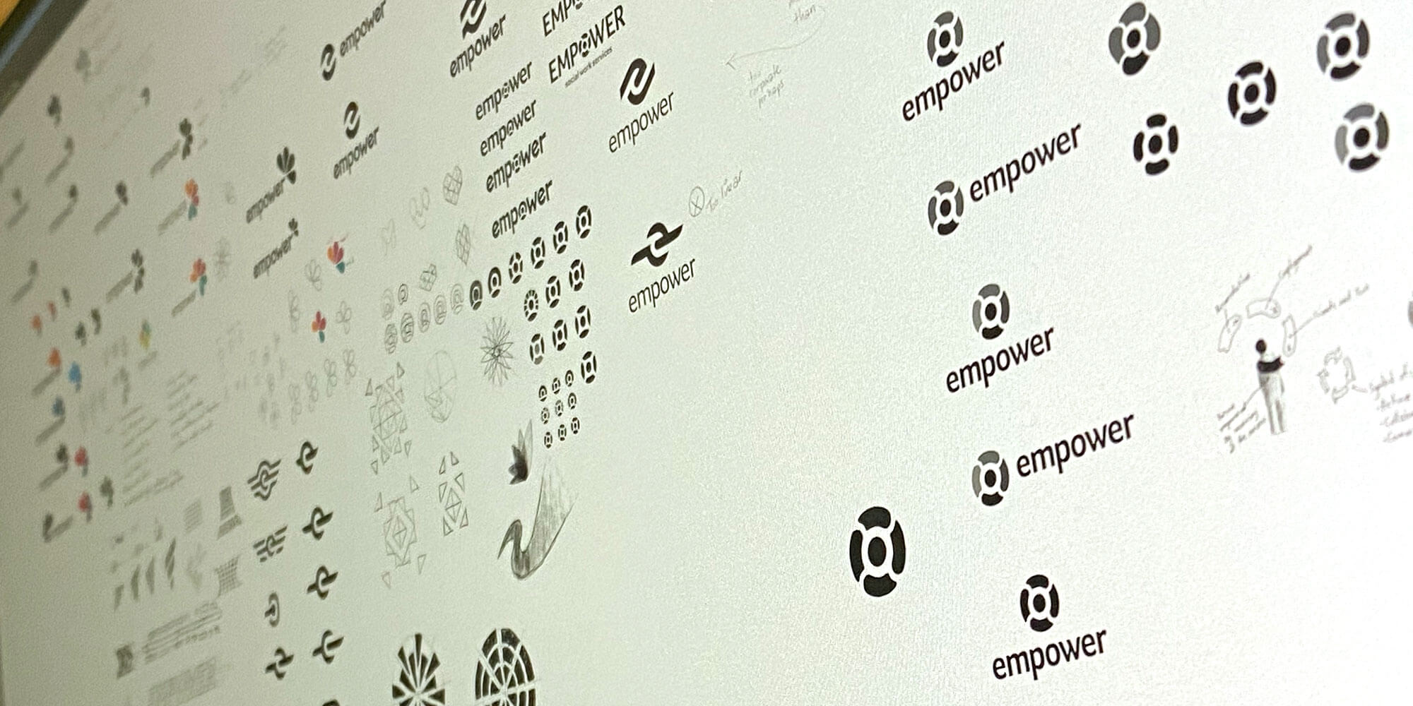
After presenting a couple of options, the one that resonated with David the most was a circular design symbolising services that are centred around a person and their mind.
The logomark is a stylised person surrounded by solutions. The middle circle and the bottom shape create a person receiving the services and support, while the three parts surrounding the person represent ‘accommodation’, ‘employment’, and ‘friends plus fun’. The direction of the shapes implies these services are being given to the client, thus empowering them to live their best life.
The shapes themselves show movement, becoming a symbol of action, collaboration (multiple parts or facets working together), and communication between multiple parties.
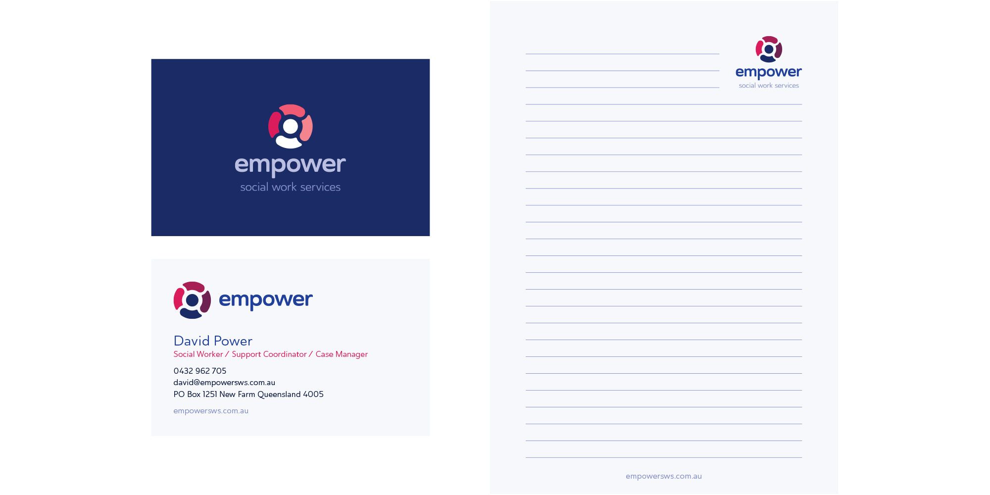
The logotype is structured with even weighting, while featuring some customised letters. This is balanced with subtle curves and rounded corners that represent Empower as highly professional yet human and approachable.
The corporate blues and greys create trust and professionalism. The deep crimson to rich pink palette creates warmth and energy without clashing with the blues or being too aggressive like a fire engine red. The background is a blue-grey that further promotes professionalism and creates a distinct look and feel away from a more traditional white background.
Ultimately the colour palette creates a balance between professional and personable, while featuring some warmer colours to help symbolise the energy and action that Empower creates.

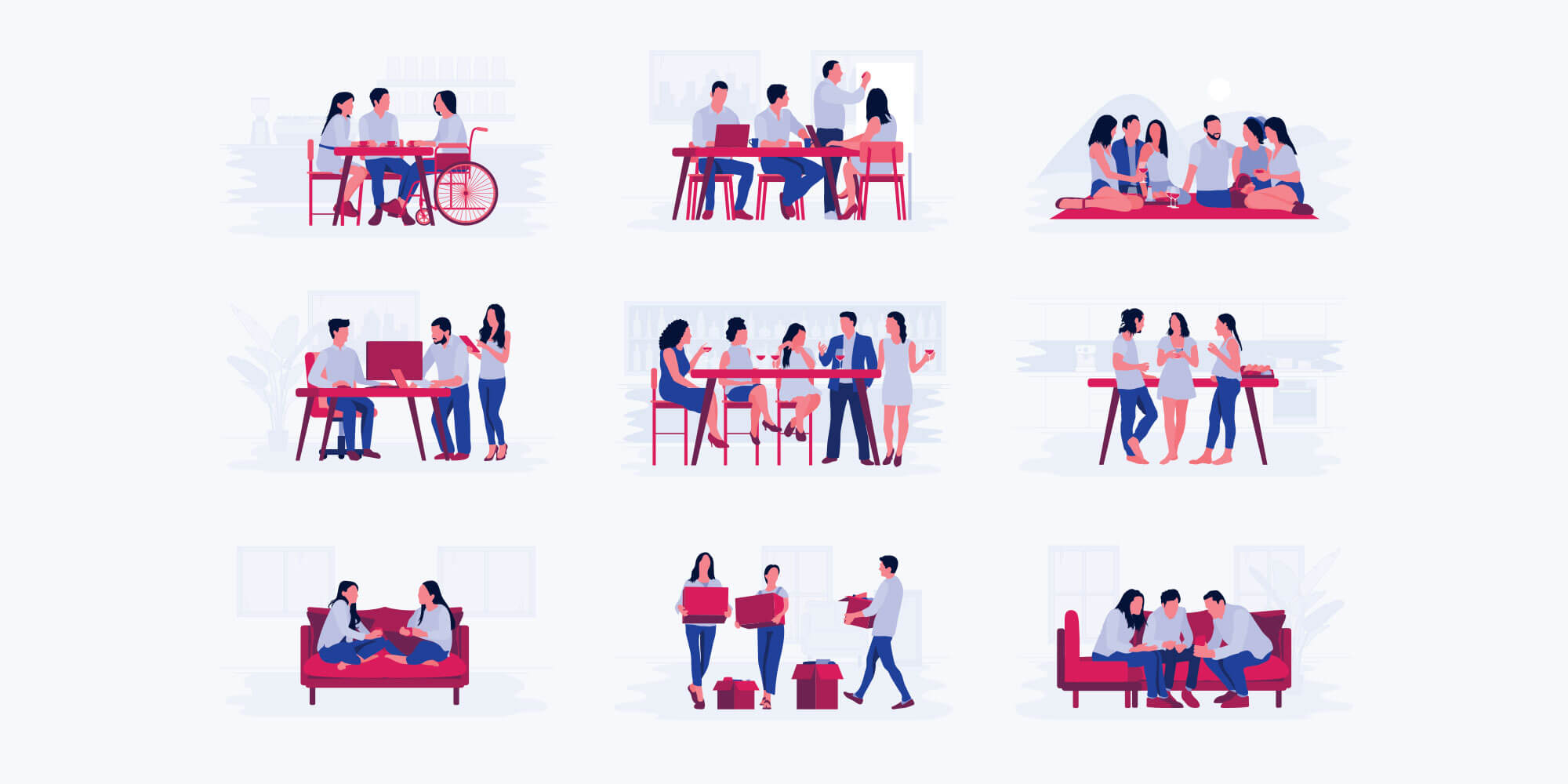
We then created a collection of custom illustrations to help tell the story of client outcomes. Each of the illustrations' figures were hand drawn in Illustrator using a Wacom Cintiq Pro, then each scene finished off using a combination of Wacom pen and traditional mouse inputs.
Care was taken to make sure the figures weren't artificially happy—thus the blank faces style—however they also needed to appear positive in body language and interaction with others. It was important to convey the community support of family, friends and co-workers.
We also worked to utilise all the brand colours throughout the illustration series, ensuring they would appear consistent and unique while covering the various topics of client benefit.
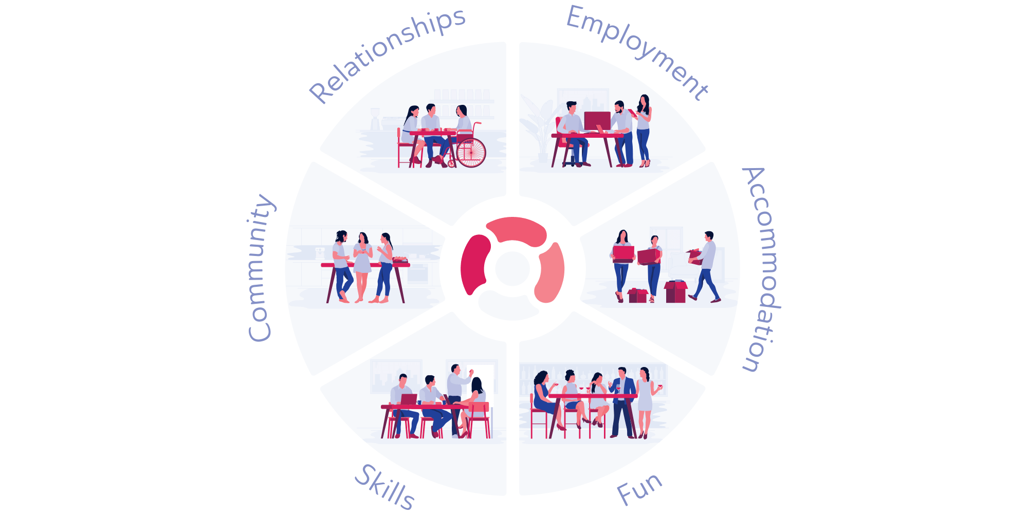
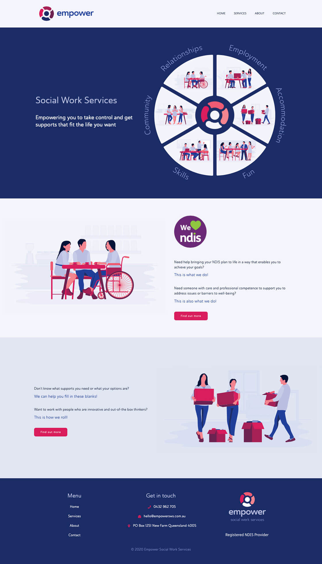
The illustrations were then combined into a 'wheel' that would feature as a summary on the homepage of the website.
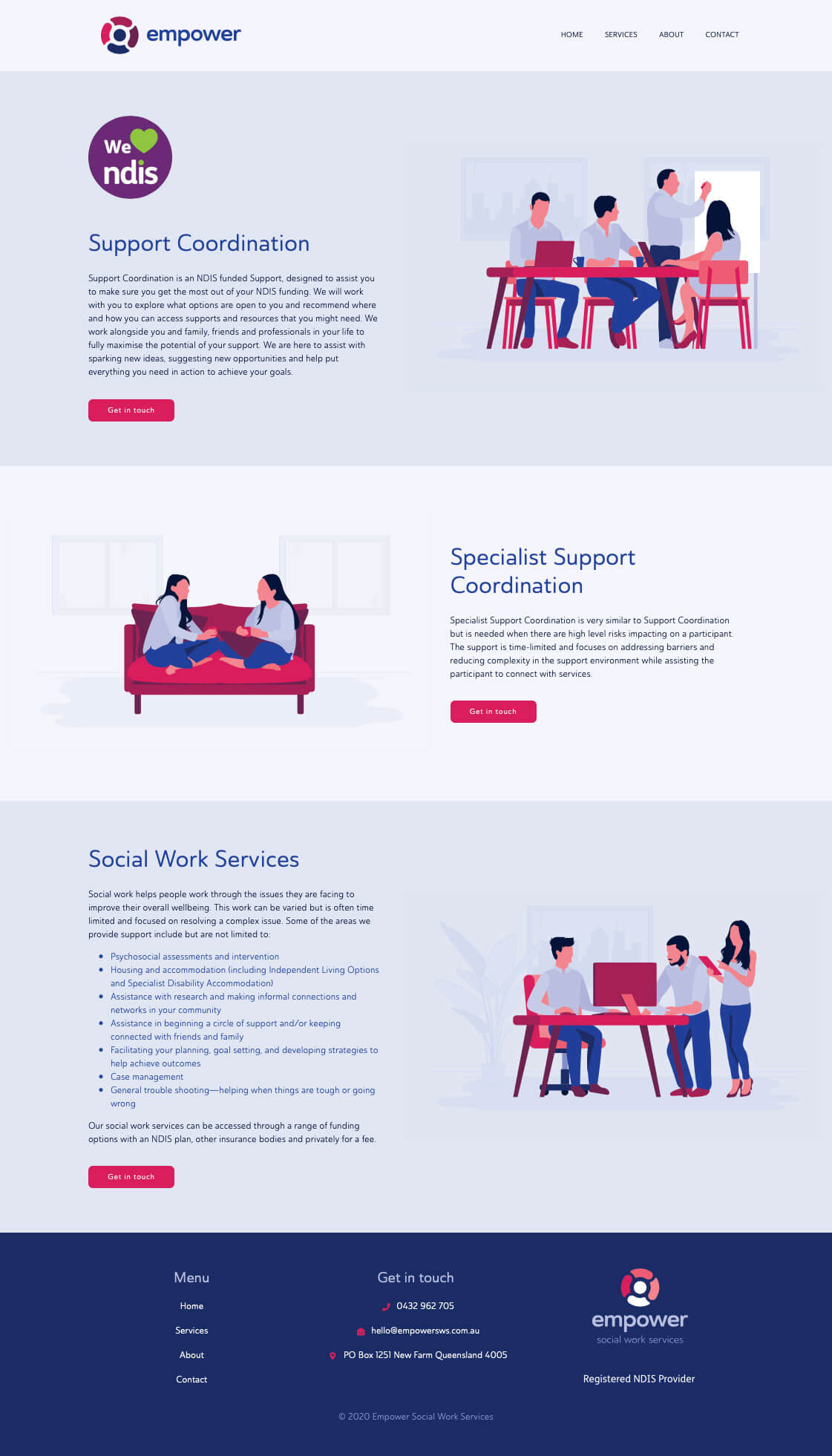
Taking the newly created brand assets, the illustrations, and some updated written content supplied by the client, we put together a brochure style website built and hosted on the Oncord platform. The new website not only conveys the professional yet friendly approach that Empower takes with its clients, but also benefits from Oncord's super-fast hosting, integrated SEO, and enterprise-grade security.
You can visit the Empower Social Work Services website at www.empowersws.com.au

