![]()
Australian Constructors Association
logo design | brand identity | illustration | animation | graphic design
The Australian Constructors Association (ACA) represents leading construction and infrastructure contracting companies. The ACA is dedicated to promoting a sustainable construction industry for Australia. Membership of the Association is open to national contractors with an annual turnover in excess of $1 billion, or international companies with combined Australian and international annual turnover exceeding $5 billion.
'The Nation’s third-largest industry, construction contributes $137bn to the economy annually, representing 7.2% of Australia’s total economic activity. We employ 1.17 million people or almost 1 in 10 working Australians and account for approximately one-third of all registered businesses. We are called upon to help with recovery in times of economic hardship as every $1 spent on infrastructure boosts economic activity by $3 but our industry has the potential to do so much more if only it can become more sustainable.'
Jon Davies was appointed as the association's first CEO in July 2020, and one of his first action points was to address the existing brand
which he saw as tired and not representative of what the ACA is nor where it is heading into the future.
 The
original brand design
The
original brand design
The brand design needed to better represent the construction industry while providing a greater focus on the people and values within the
sector. It also needed to be able to work across a wide range of communications focused on new initiatives designed to create a more
sustainable construction industry and a more positive industry culture.
We started with the OUTLINE phase including a discovery session, then moved into the ideation and sketching stage of the DESIGN phase.
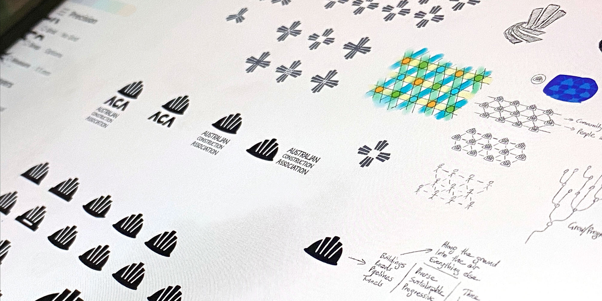
After sketching a wide range of ideas, we presented three options to the CEO who in turn presented them to the ACA board. One of the concepts was chosen which was then taken through to final artwork.
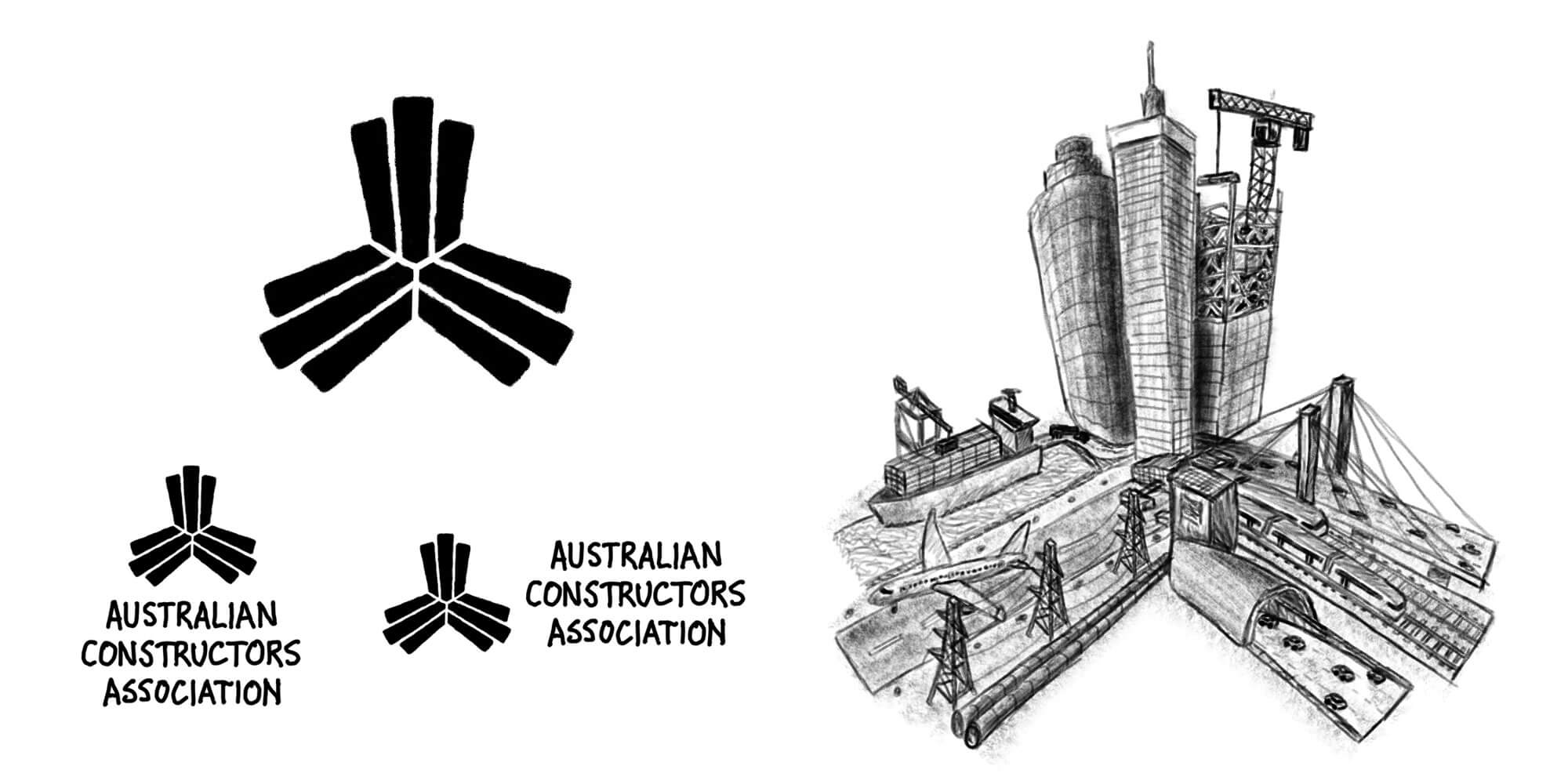
The chosen design worked to incorporate ‘three elements’ into the design (part of the brief identified during the discovery session), represented by three shapes that grow out of the centre in three directions; the fanning out represents forward progression, community improvement, and driving change via collaboration. The three sections represent the three cornerstones from the association's vision, plus the three principles: diverse, sustainable, progressive.
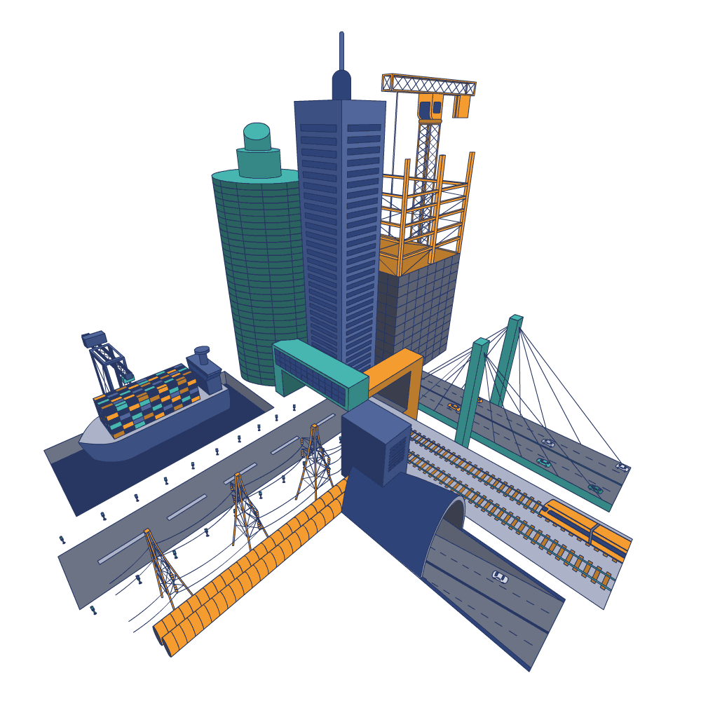
There’s three components to the design—each made up of three smaller parts. In a literal sense the design represents skyscrapers, buildings and other construction going up; then roads, railways, bridges and tunnels going across; and infrastructure such as transmission wires, pipes, airports and marine ports going across in the third direction.
In addition to the logo sketches we also created a literal representation of the above description to better convey the logo meaning to the CEO and the board.
The logomark part of the new ACA logo was designed to reflect the three main sectors of the industry that ACA represents:
- vertical construction
- civil construction
- industrial and resources construction
It also depicts interconnectedness as they join together under their peak body to achieve a brighter future. The three selected brand colours represent:
- TEAL: advocacy and communication
- ORANGE: people and spirit
- BLUE: projects and reputation

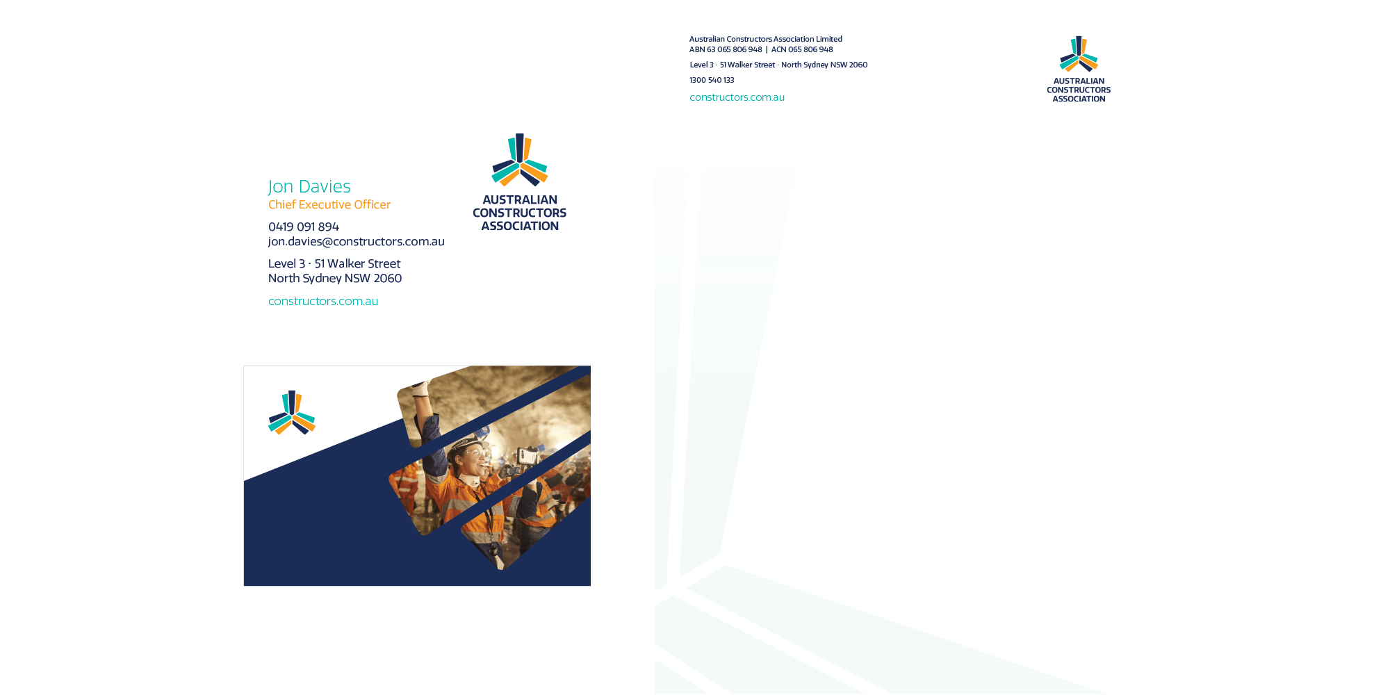
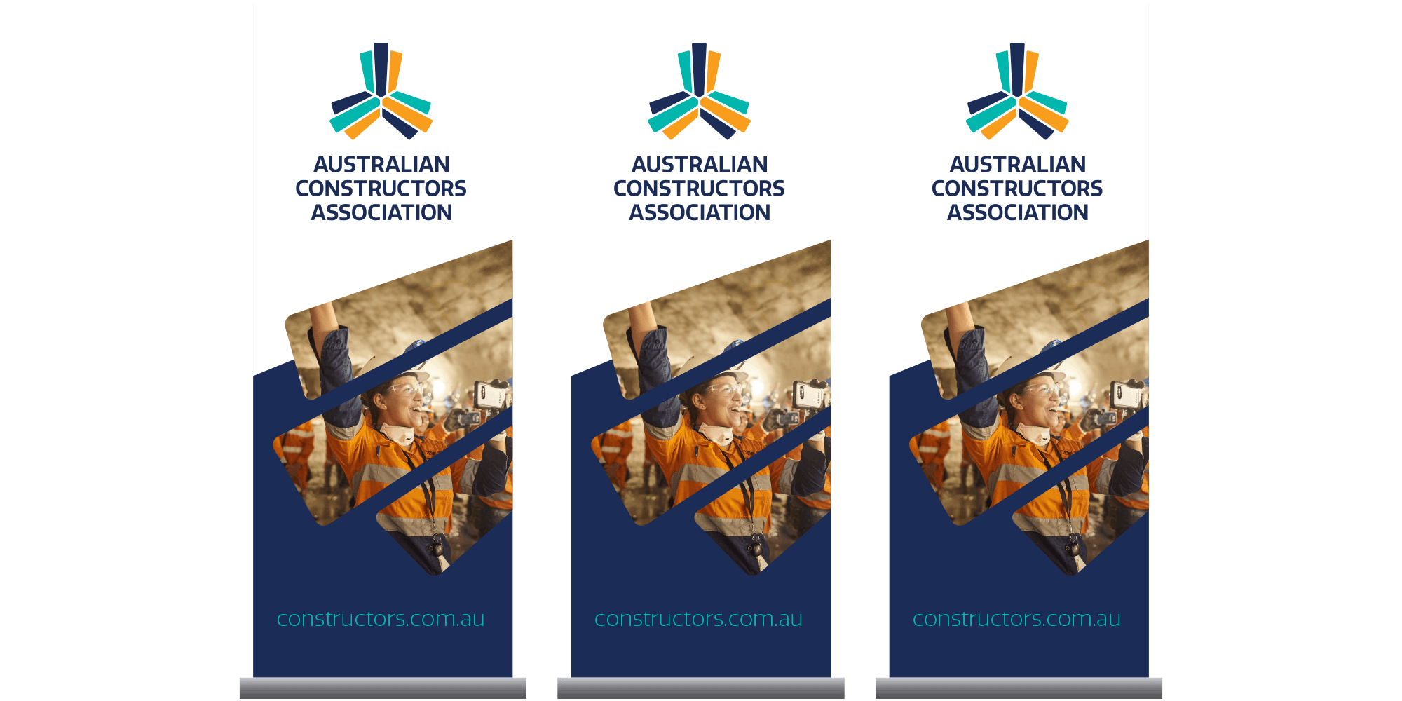
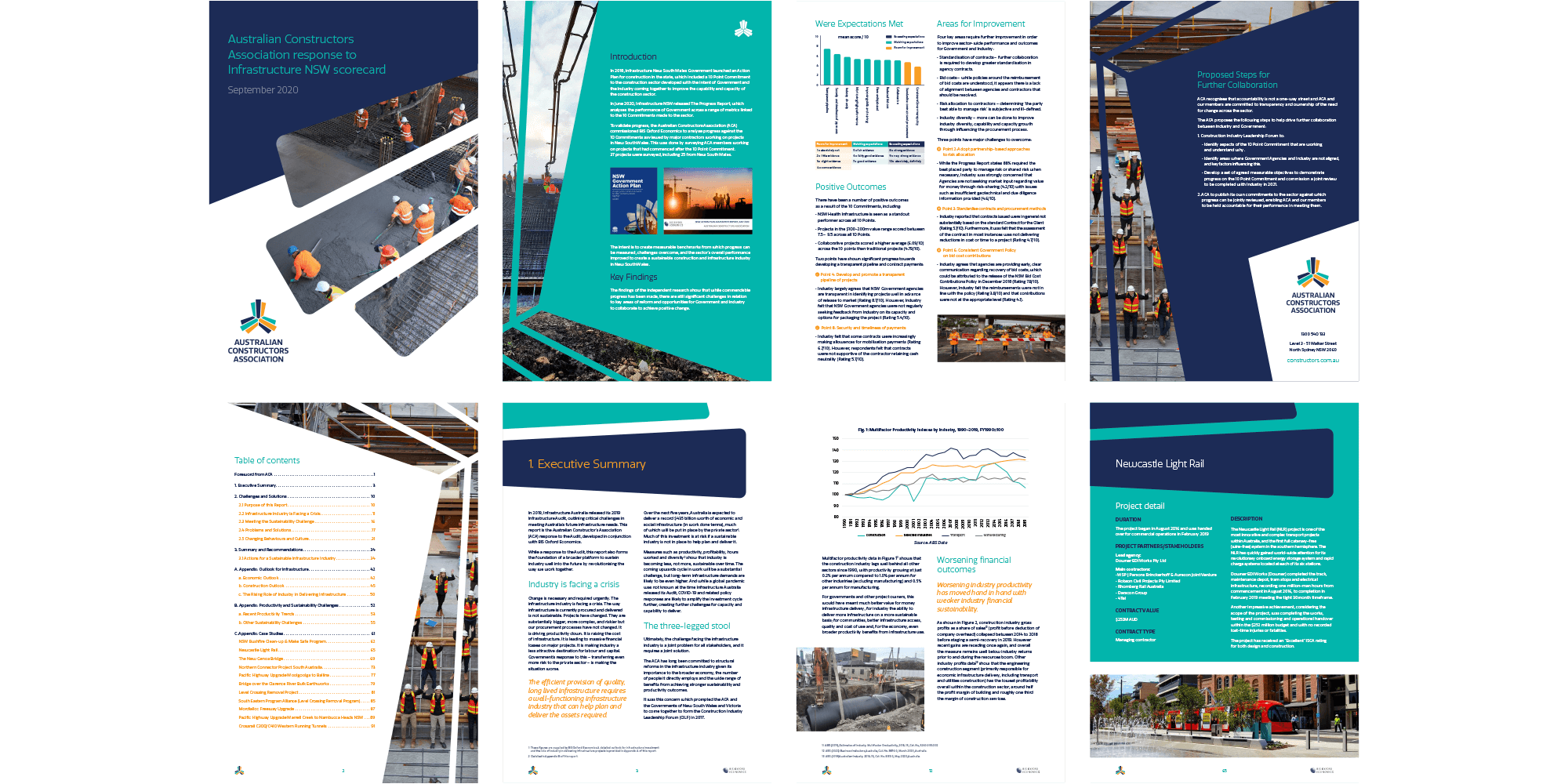
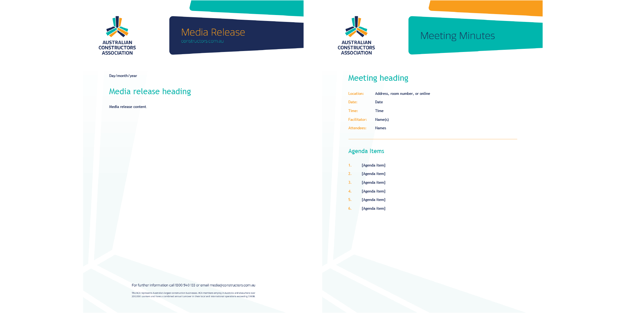
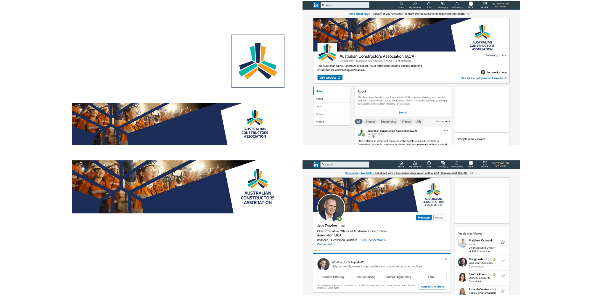
With the core brand design established we then created a range of graphic design elements and communications to bring the new brand design to life. This included business cards, letterhead, pull-up banners, a range of printed publications, documentation, and social media assets.
The earlier literal representation sketch of the ACA logomark has proved so popular by providing context and meaning to the brand design, that ACA commissioned us to formally illustrate and animate the scene.
The design represents skyscrapers and buildings going up with one building under construction; roads, a railway, a bridge and a tunnel going across; and infrastructure including transmission wires and pipes, an airport, and a shipping port going across in the third direction. The animated file can be used in PowerPoint presentations, on the ACA website, and on social media.
Overall the brand design has been very well received by internal and external stakeholders, with CEO Jon Davies saying this about the design process and working with Evocative:
'Australian Constructors Association engaged Evocative to undertake a full rebrand for the Association. We
were very impressed with the professional approach taken and the quality and breadth of assets provided.
'We were so impressed that Evocative have now become our go-to for graphic design and have helped design everything from thought leadership
documents to social media assets.'
You can find out more about the Australian Constructors Association at constructors.com.au or follow them on LinkedIn.
In this Inspired by Evocative, Ben describes the design process behind creating the Australian Constructors Association logo. The design features three lots of three shapes, that represent advocacy and communication (teal), people and spirit (orange), plus projects and reputation (blue)—along with the three main types of construction: vertical construction, civil construction, and industrial and resources construction..