
Xray Vision
messaging | logo design | brand identity | illustration | graphic design | photography | photoshop | videography | product packaging | website design
Disclaimer: this project was undertaken as an employee of ESG. All trademarks and work created remain copyright of the ECCO Safety Group and are reproduced here with permission. Project case study written by Ben who now runs Evocative.
This was a brand I built from the ground up while working in-house at ESG: from creating the logo and corporate style guide, to establishing the ‘WHY’ and tone of voice for the brand, right through to the execution of product packaging, social media and video production. Xray Vision is a premium automotive lighting range which focuses on vehicle occupant safety and lighting education as its core values.
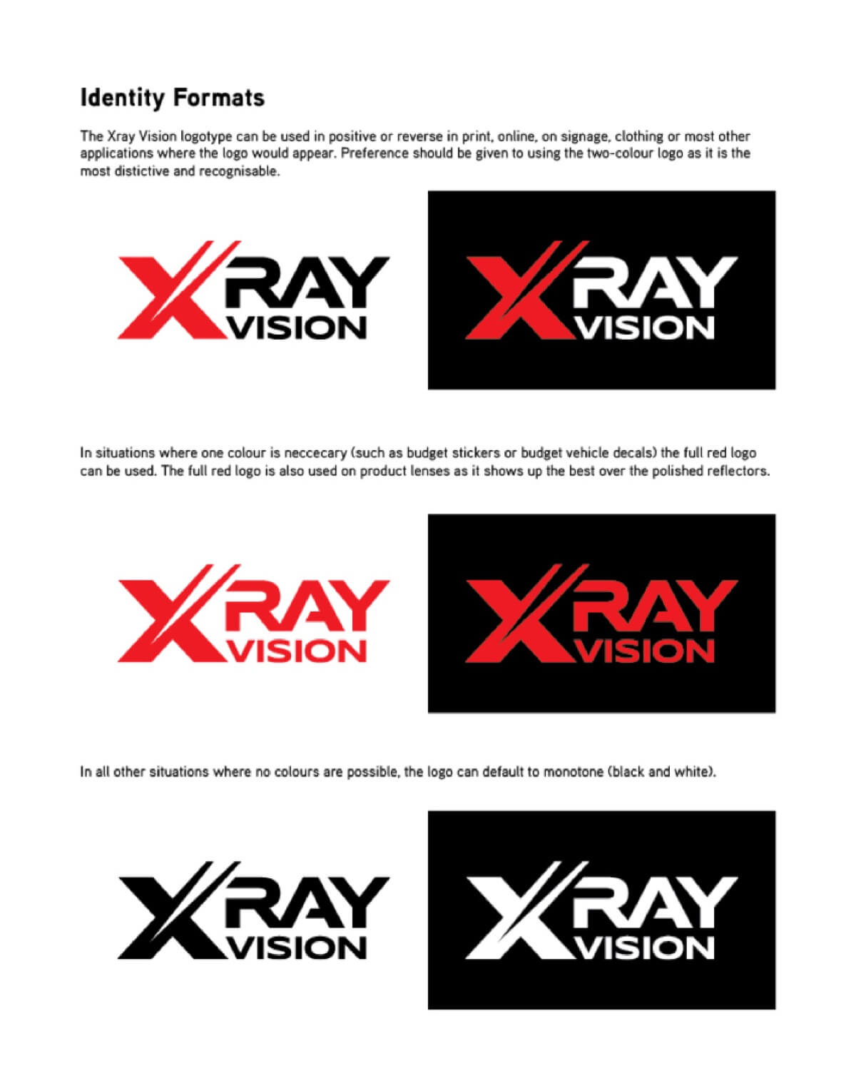
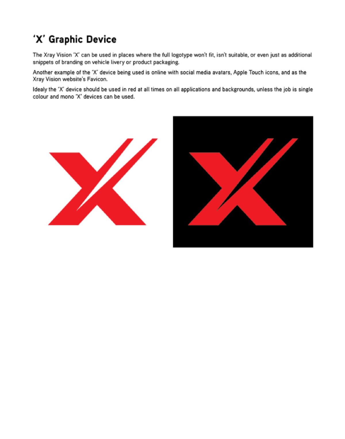
The logo was designed with a few factors in mind, but by far the biggest consideration was to make it highly visible on packaging, retail displays, sponsored vehicles, and on broadcast television. This led to the bold and striking colours and lettering allowing it to stand out in cluttered distributor stores and amongst a sea of other logos on sponsored vehicles on TV. The ‘X’ includes a stylised driving light beam that also symbolises forward movement and progressive technology.
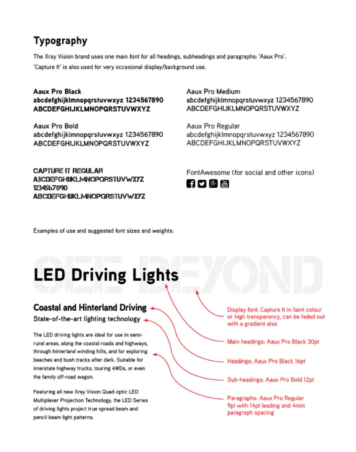
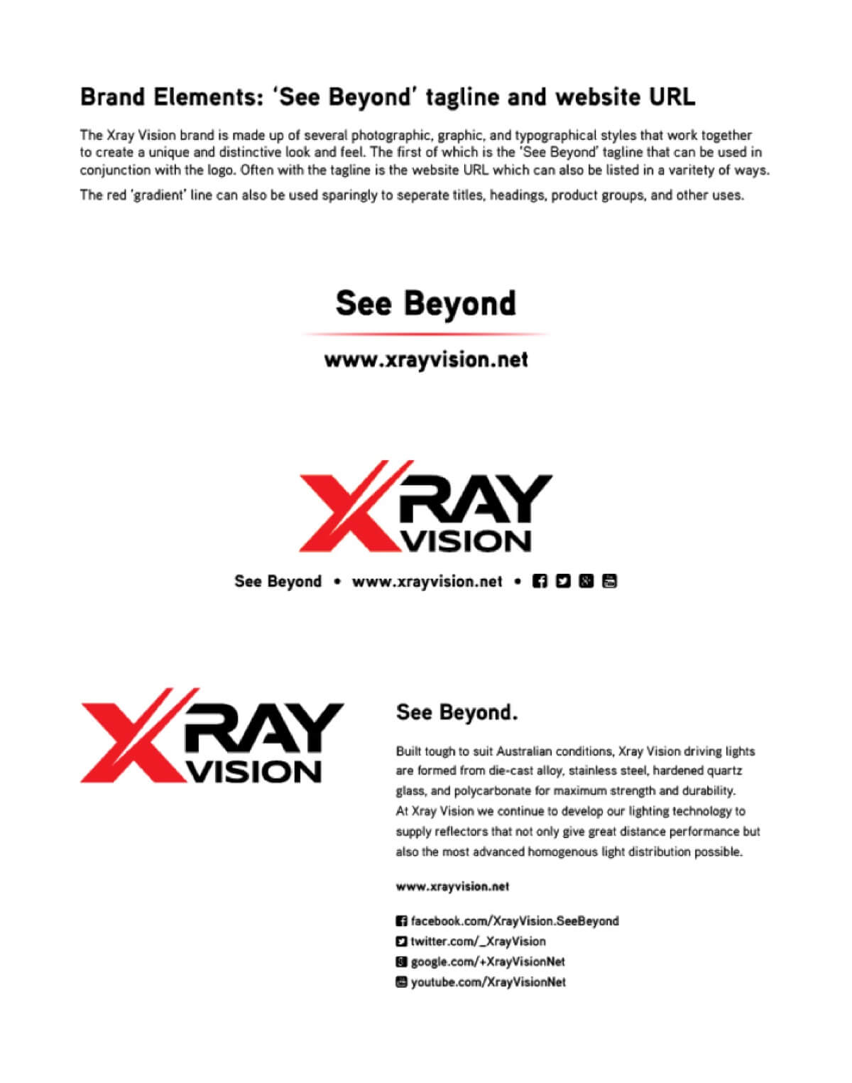
The logo was also designed in such a way that the red ‘X’ could be used as a graphic device on its own; making it ideal for use on social media as a profile icon, embossing onto parts and components, and for producing reflective red kiss-cut SAV decals that can be stuck to brand enthusiasts’ vehicles. Below of some pages from the corporate style manual covering various versions of the logo, the ‘X’ as a graphic device, styling guidelines for typography, and some relationship guides for combining the branding elements.
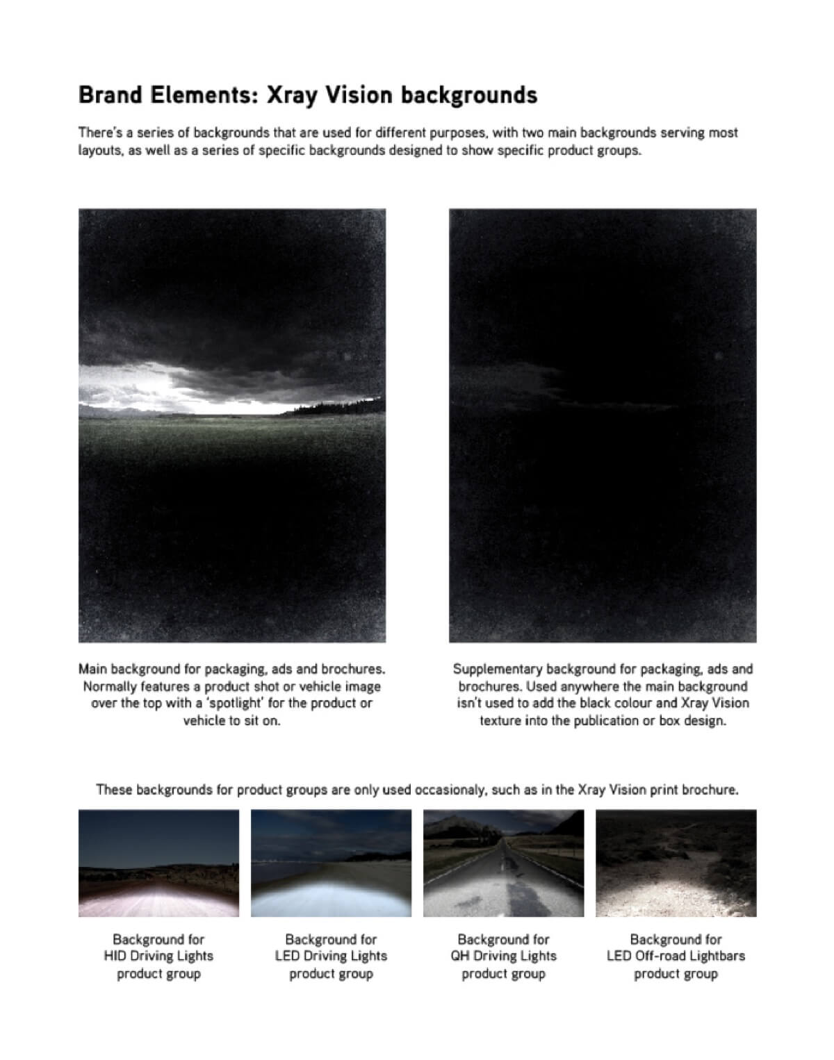
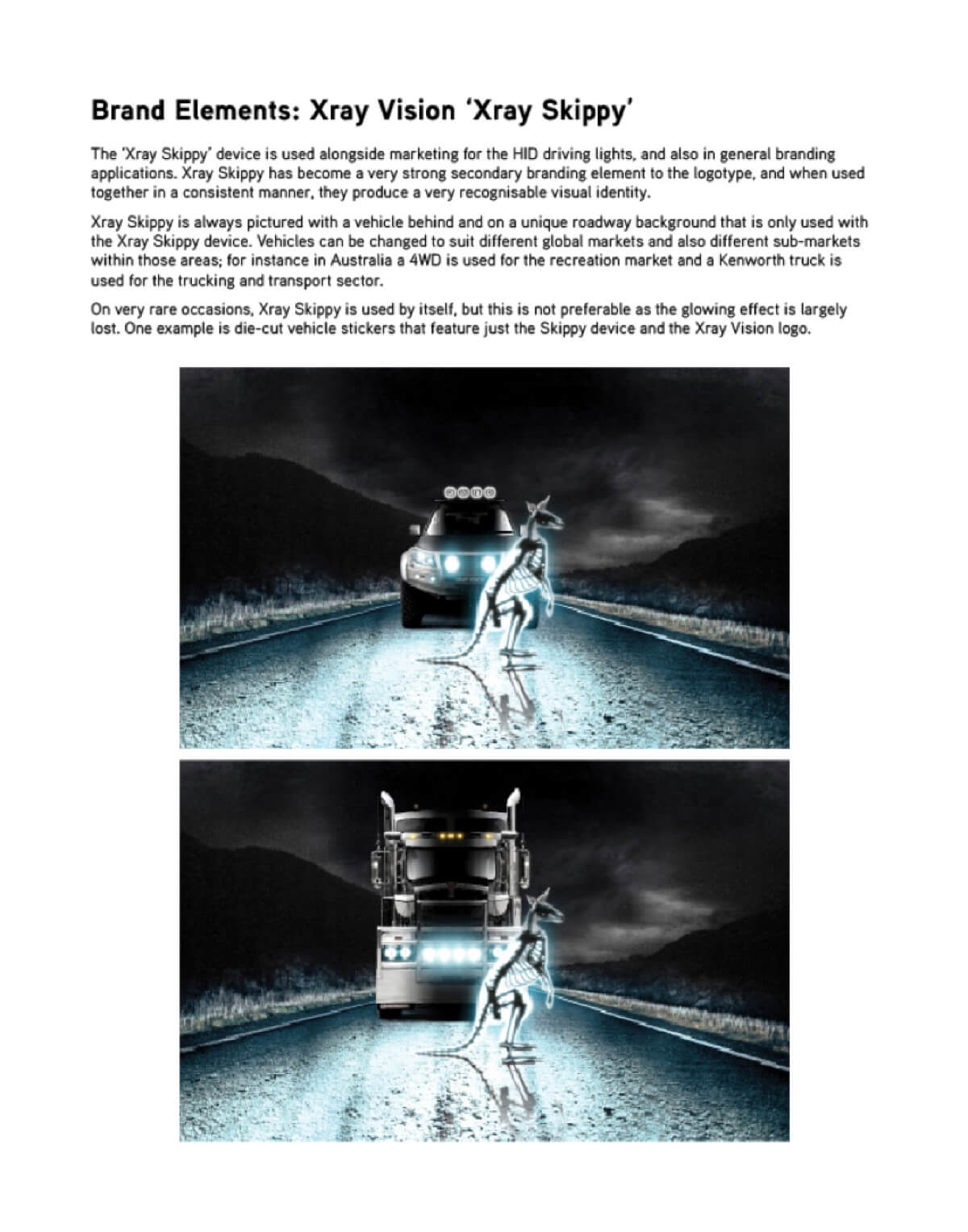
Following on from the core branding elements are the visual branding elements that complement the logo and typography. These include the stylised photographic backgrounds, the creation of the infamous ‘Xray Vision Skippy’ image, plus the styling and production of vehicle and product photography.
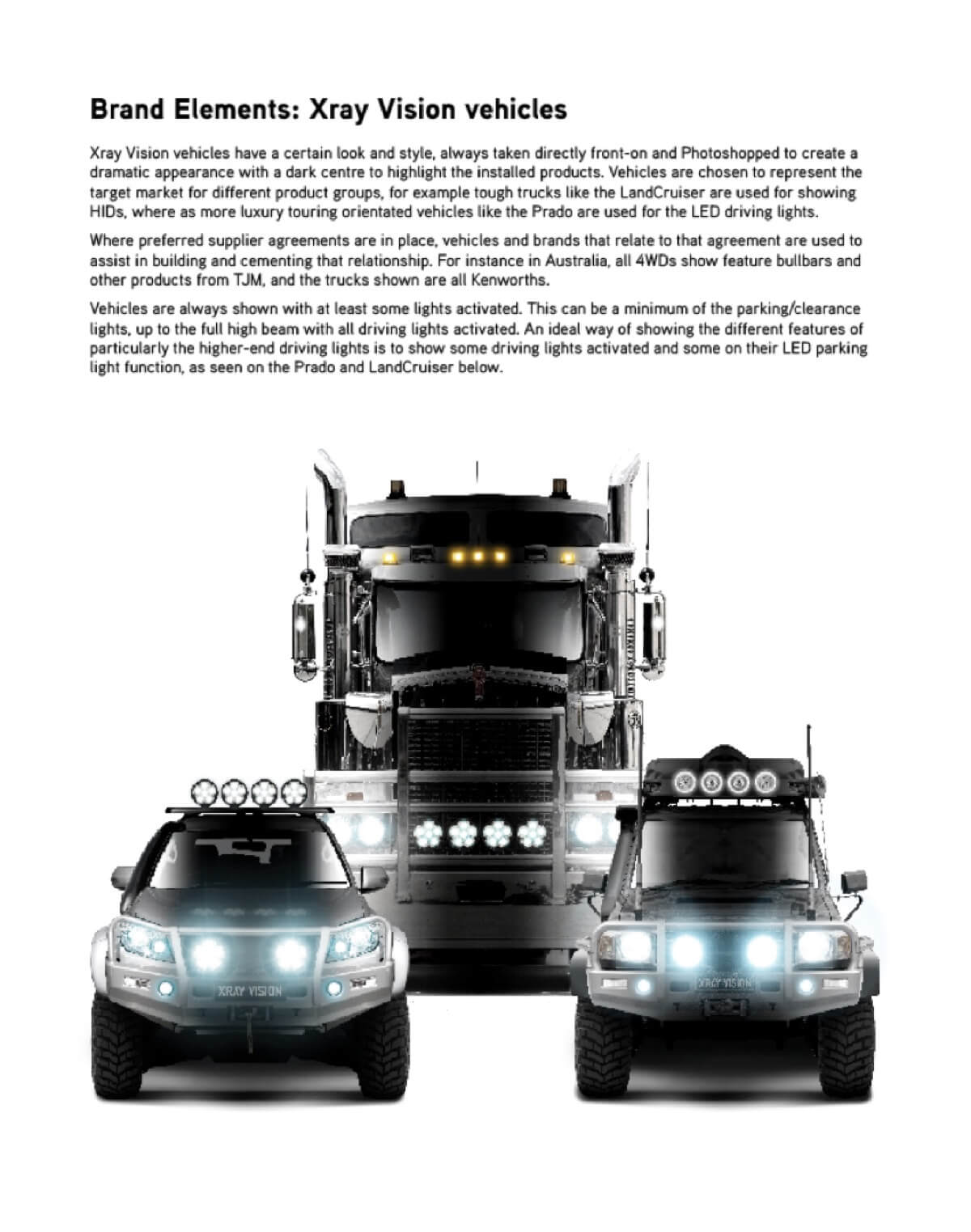
All of the product photography is done in a very specific way to ensure each image helps to build the branding, and the range of vehicles used throughout the branding are heavily modified to create a unique and recognisable look.
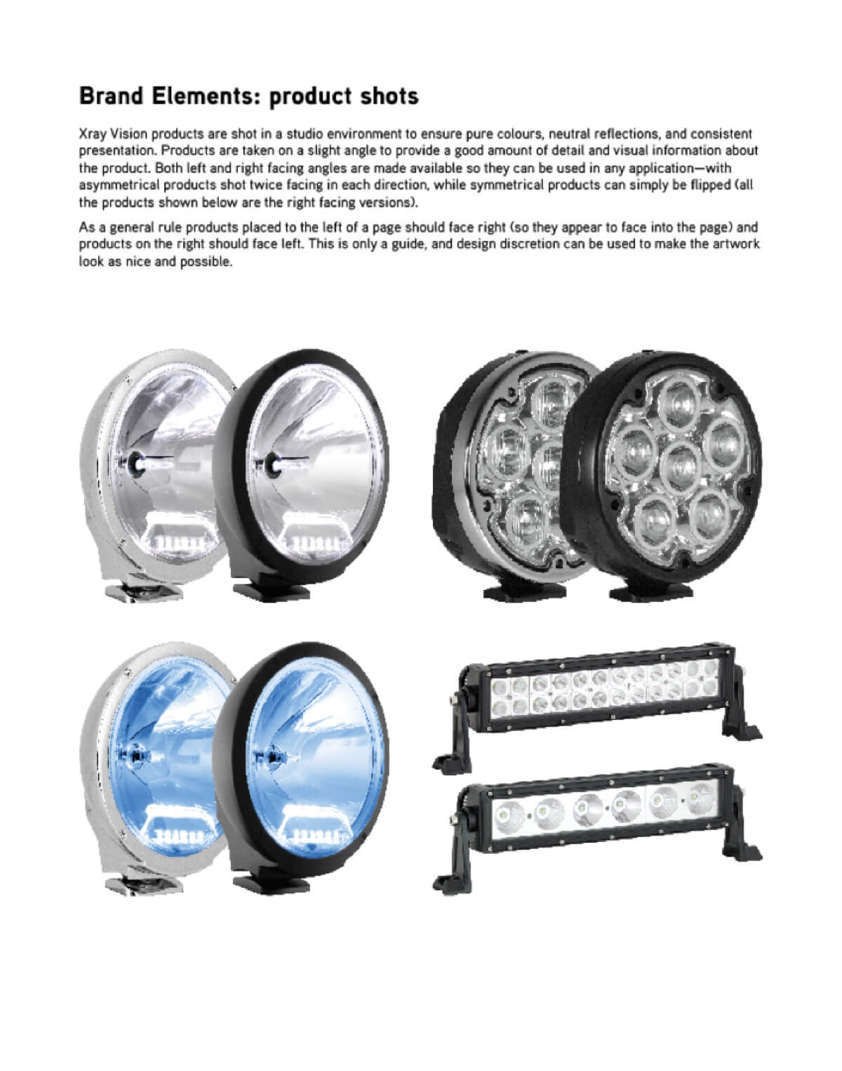
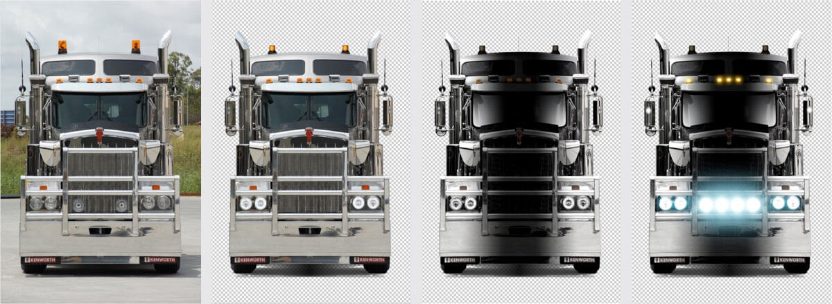
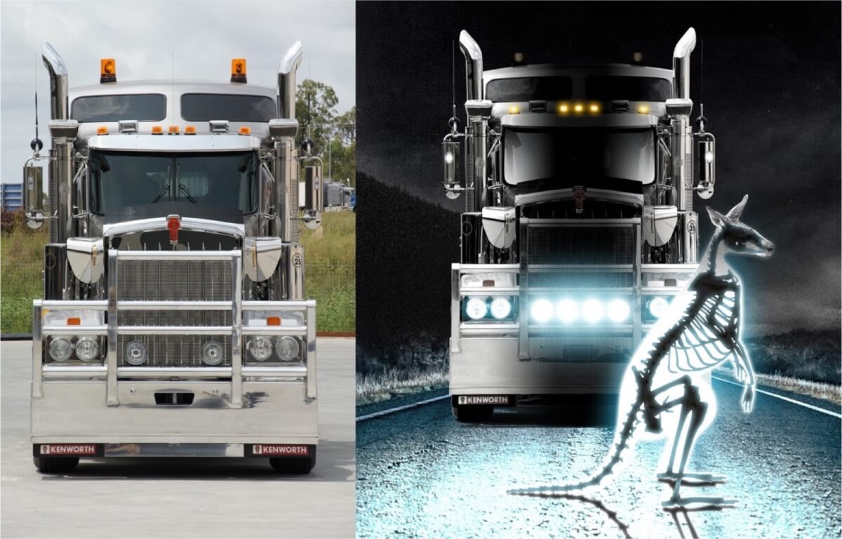
As part of the Xray Vision branding project a very specific photographic style was developed to not only enhance the branding, but also to prominently feature the lighting products that might otherwise get lost on the front of highly detailed vehicles. Below you can see the original photograph on the far left, which in the next image has been clipped out and modified to remove competitor product and add new product. Then in the third image some heavy editing work is done to create the Xray Vision ‘look’ which includes darkening the centre of the vehicle where the driving lights will eventually go. Then in the final image on the far right, the driving lights are added and lit up, along with lighting the headlights and other clearance lights.
I created ‘Xray Skippy’ using a heavily modified photograph of a kangaroo skeleton that was on display in an Australian museum. The glowing silhouette was hand drawn using a Wacom tablet, and the head was created using several reference photographs of different kangaroos.
Once the parts were assembled, the halo and glowing effects were applied in Photoshop. A shadow was also added to help complete the appearance of being lit from behind.
The Kenworth image and Skippy were then merged onto a custom created road background to generate the final image which was then used throughout much of the Xray Vision print and online material.
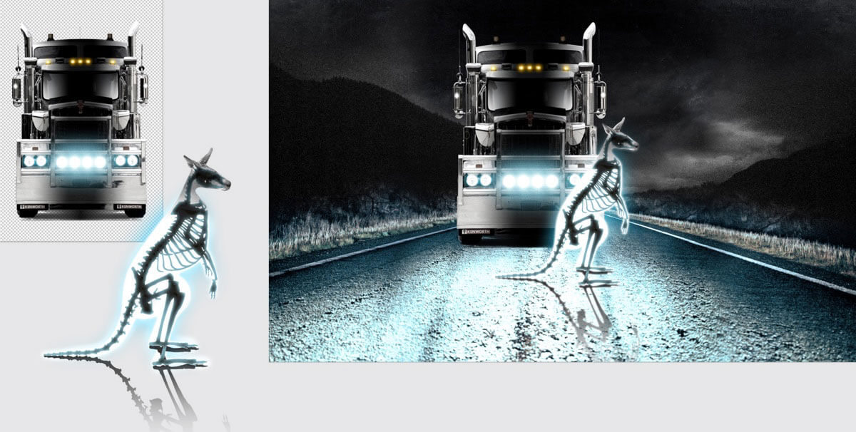
As you can see below, the change from the original photograph I shot to the final composite image is quite drastic!
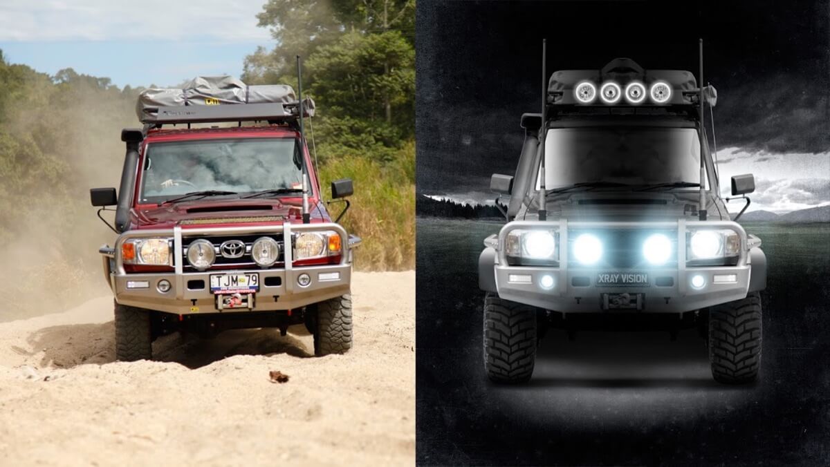
This same technique has been applied to various vehicles; including ones that were less than ideally shot. For example, the image on the left below was supplied by TJM and features a LandCruiser that is in motion and on a slight angle.
I used extensive digital manipulation including duplicating and flipping parts of the image, the end result is again quite different to the original image. In this particular case bigger wheels and larger flares were also digitally added to enhance the presence of the vehicle.
The graphical branding elements were then combined with the ‘WHY’ of the brand by helping and educating the customer as to why they would need lighting in the first place, and then what type of lighting would suit their particular situation best depending on where they do most of their after dark driving.
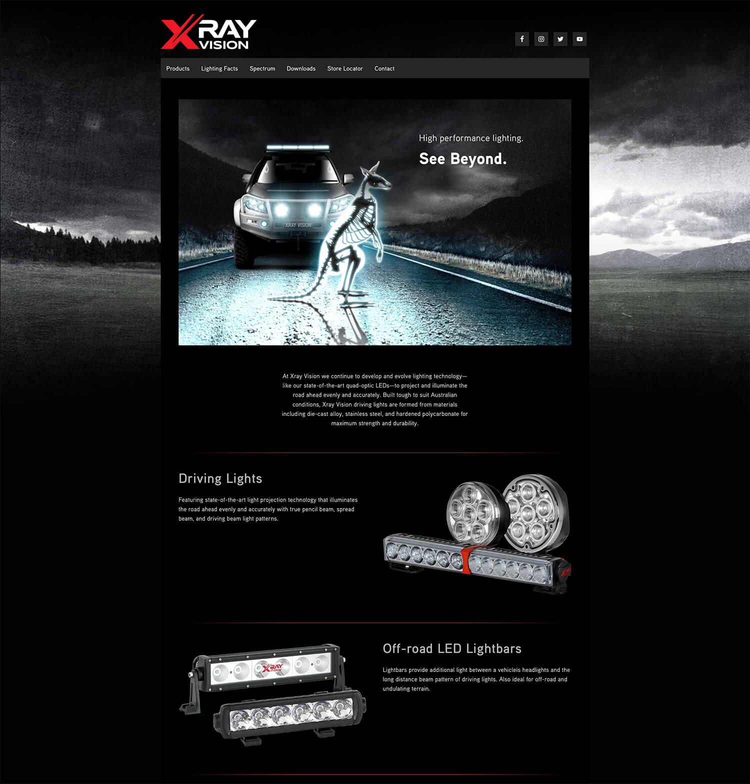
In the form of the product brochure, this begins with an introduction and also the striking image of the x-rayed Skippy: a visual representation of one of the most dangerous aspects of night driving in Australia—animal strikes! The second page then breaks down different areas that people drive at night and relates them to a particular technology type.
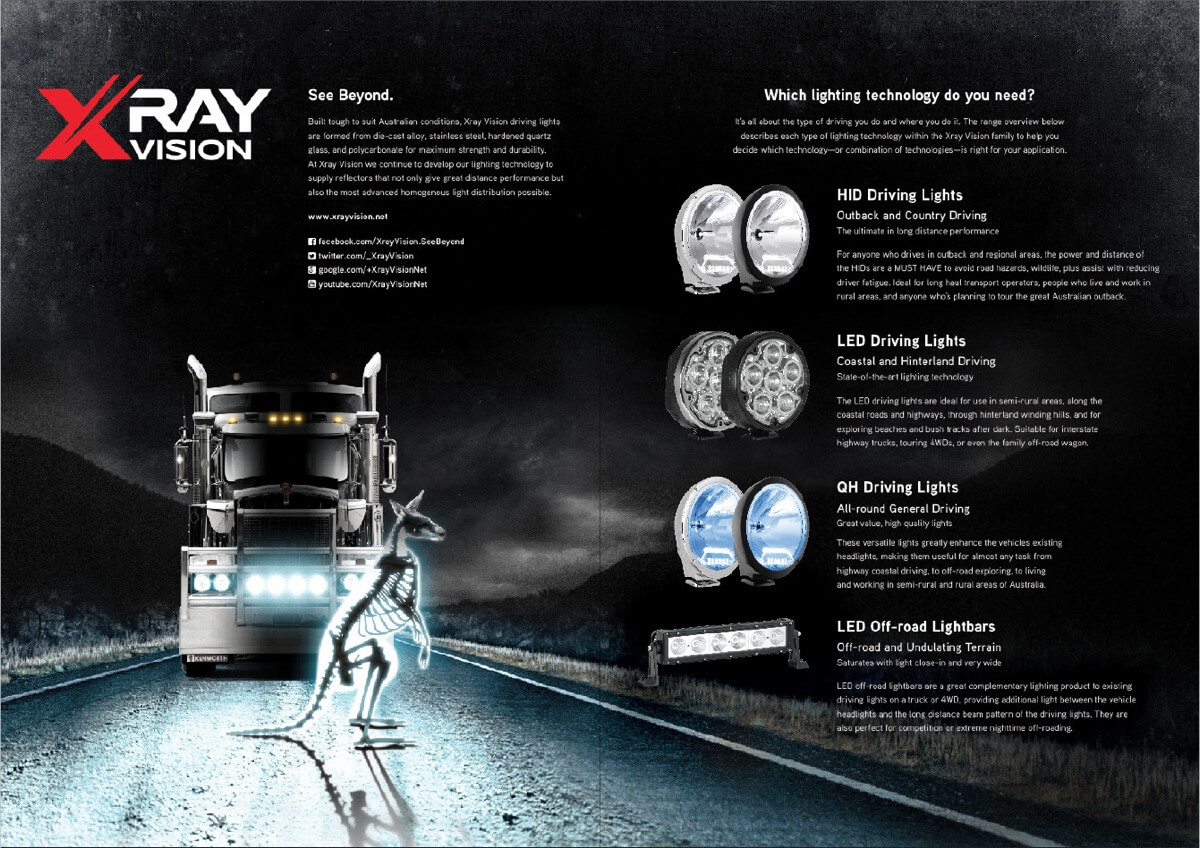
Then within each technology type, the ‘WHY’ and ‘HOW’ is explained in more detail and is then linked to the ‘WHAT’, which is the product range on the right hand side.
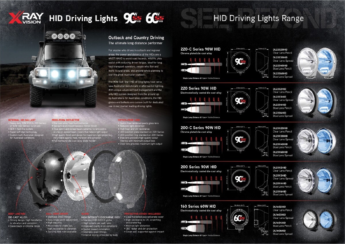
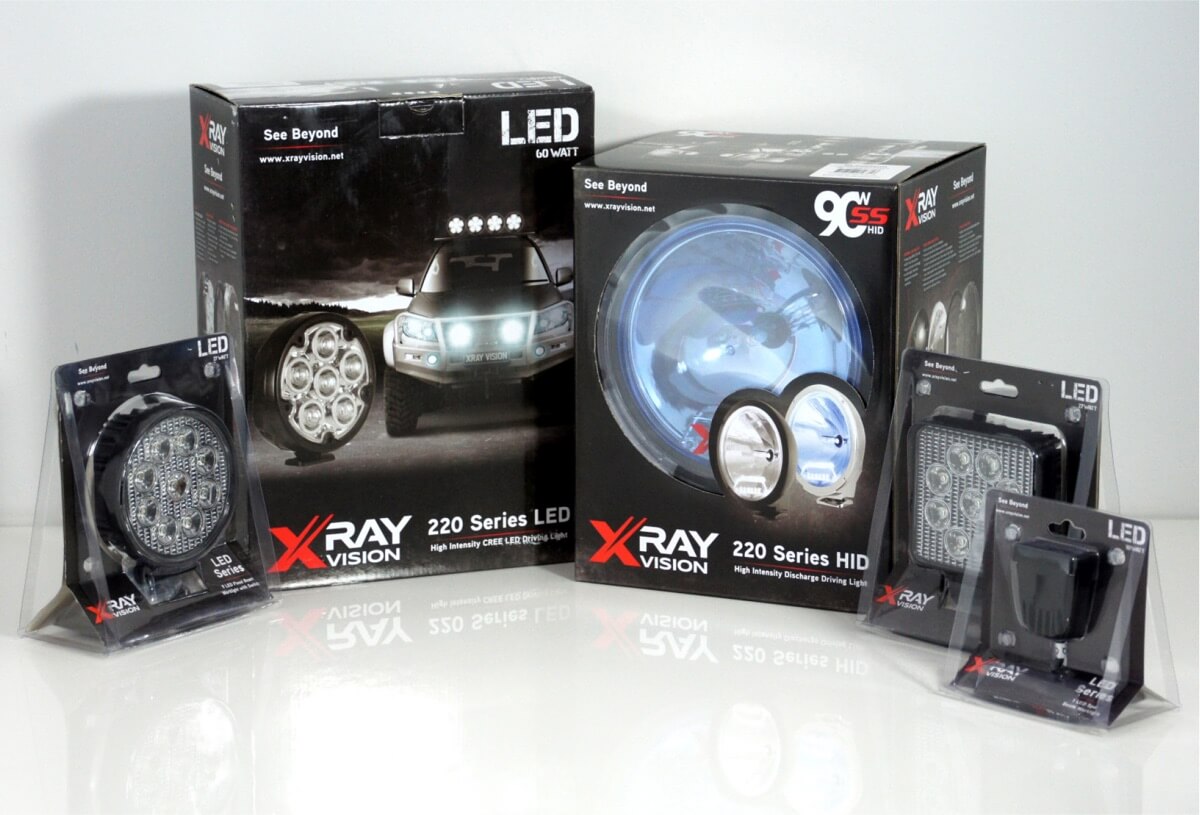
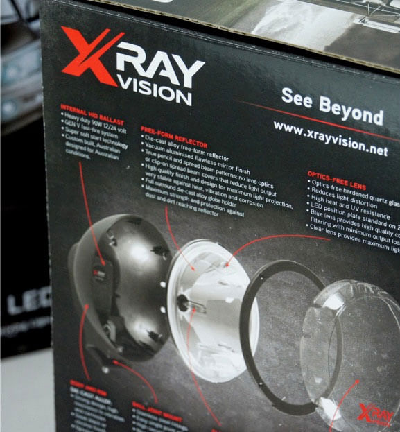
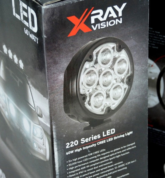
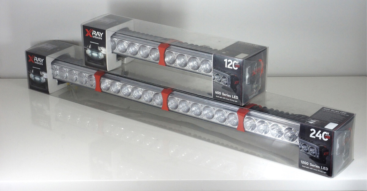
The branding and product features and benefits were then carried over onto the product packaging, so that messages are reinforced at the actual point-of-sale. It also helps the consumer to pick and choose the product that will best suit their needs while standing in the store.
The basic order of information from the brochure was then translated into the Xray Vision website which provides an introduction, then guidance into which type of technology will suit the website visitor, and finally into the actual product ranges.
In addition to this, there are several pages of ‘lighting facts’ and ‘lighting FAQs’ to continue the theme of market and consumer education, while establishing the Xray Vision brand as experts in their field. There’s also a downloads section for brochures and instruction sheets, plus an interactive distributor locator.
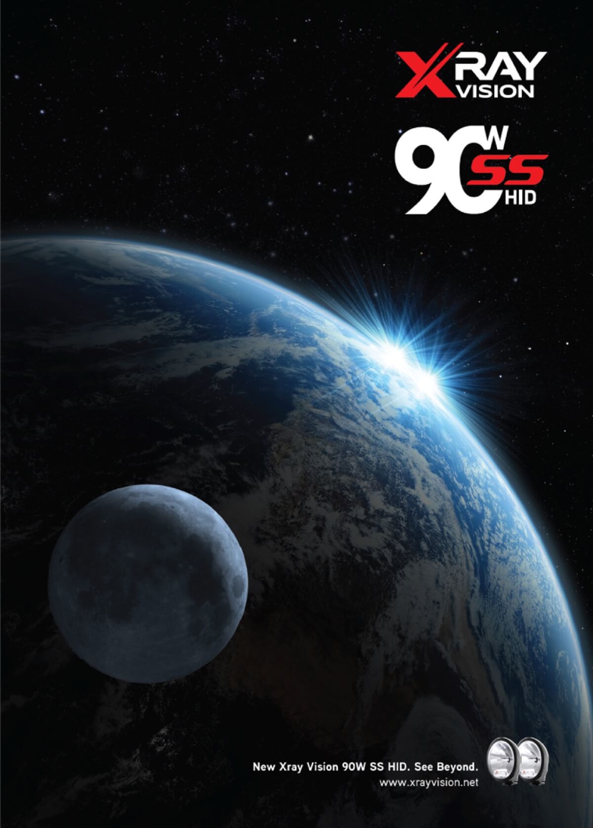
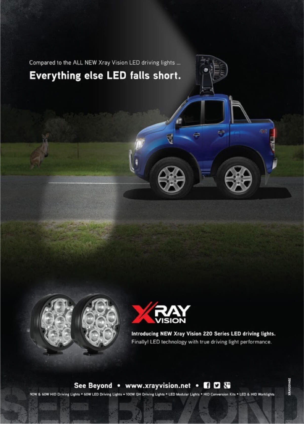
I’ve also conceptualised and created many online and press ads for the brand, two of which are below. The first was the launch of the 90W HID driving lights, which was a play on the new dawn coming over the horizon. And the second was for the launch of the quad-optic LED driving lights, which involved a Ford Ranger Photoshopped to appear very short … which alluded to the lack of performance from most other LED products that were on the market at the time.