![]()
Britax
messaging | brand identity | photography | photoshop | product packaging
Disclaimer: this project was undertaken as an employee of ESG. All trademarks and work created remain copyright of the ECCO Safety Group and are reproduced here with permission. Project case study written by Ben who now runs Evocative.
This was a two-part project while working in-house at ESG: firstly giving the existing Britax branding an overhaul and refresh, and secondly creating product-specific branding for the new BF Series range of LED beacons. The Britax logo was the only thing left unchanged after I finished redesigning the brand’s visual identity!
Starting with the product packaging that had been unchanged even after decades of production—not to mention every box and package looked different to each other despite being part of the same brand—I developed new styles, fonts, layouts, and naming conventions for the products. The naming conventions and product descriptions were a very important part of this process as easily identifying products and specifications in the retail environment is paramount for sales staff and customers alike. This was then rolled out by ESG Asia Pacific across the entire range of beacons, microbars, mirrors, lighting products and accessories. The updated branding works in all different shape and size packaging; from small plastic blister packs up to large printed boxes.
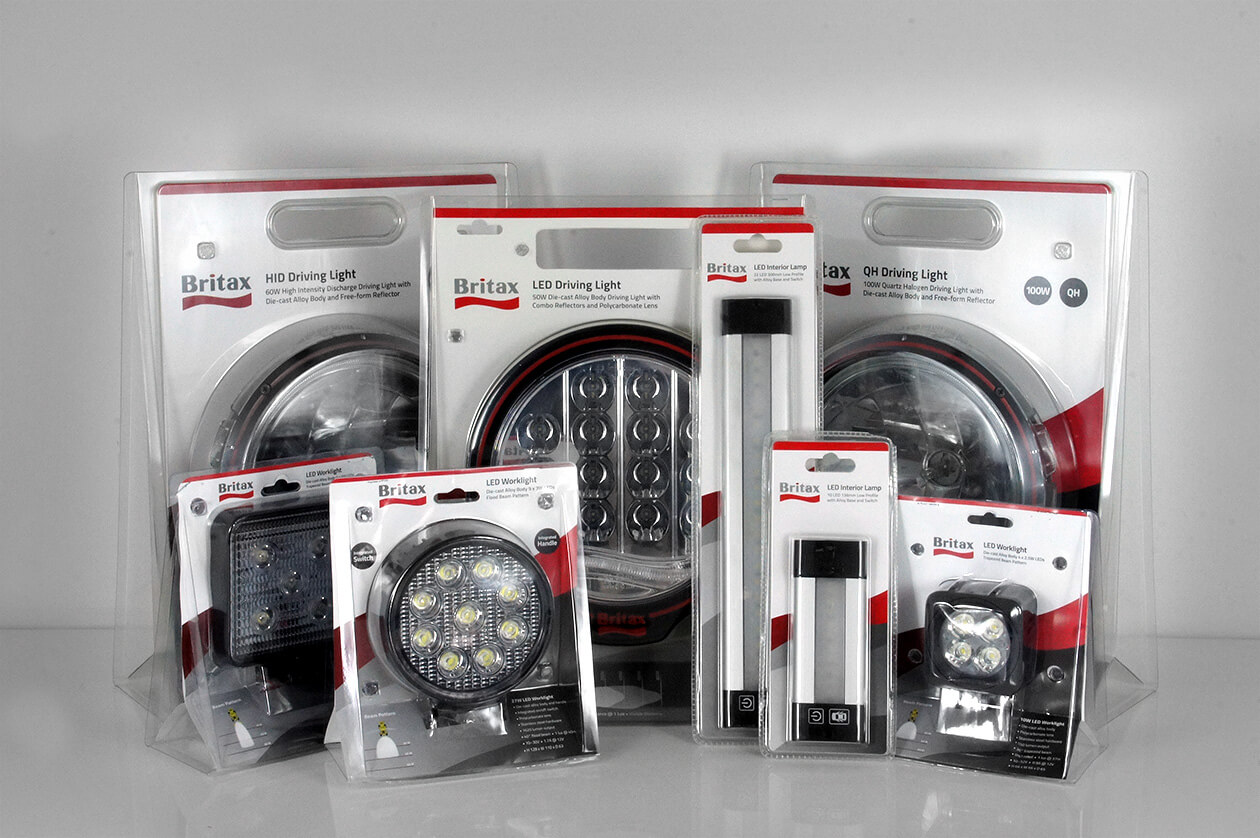
The branding was also then applied to product brochures, product specification sell sheets, in-store displays, and brand-specific websites—bringing every touch point of the Britax brand together as one.
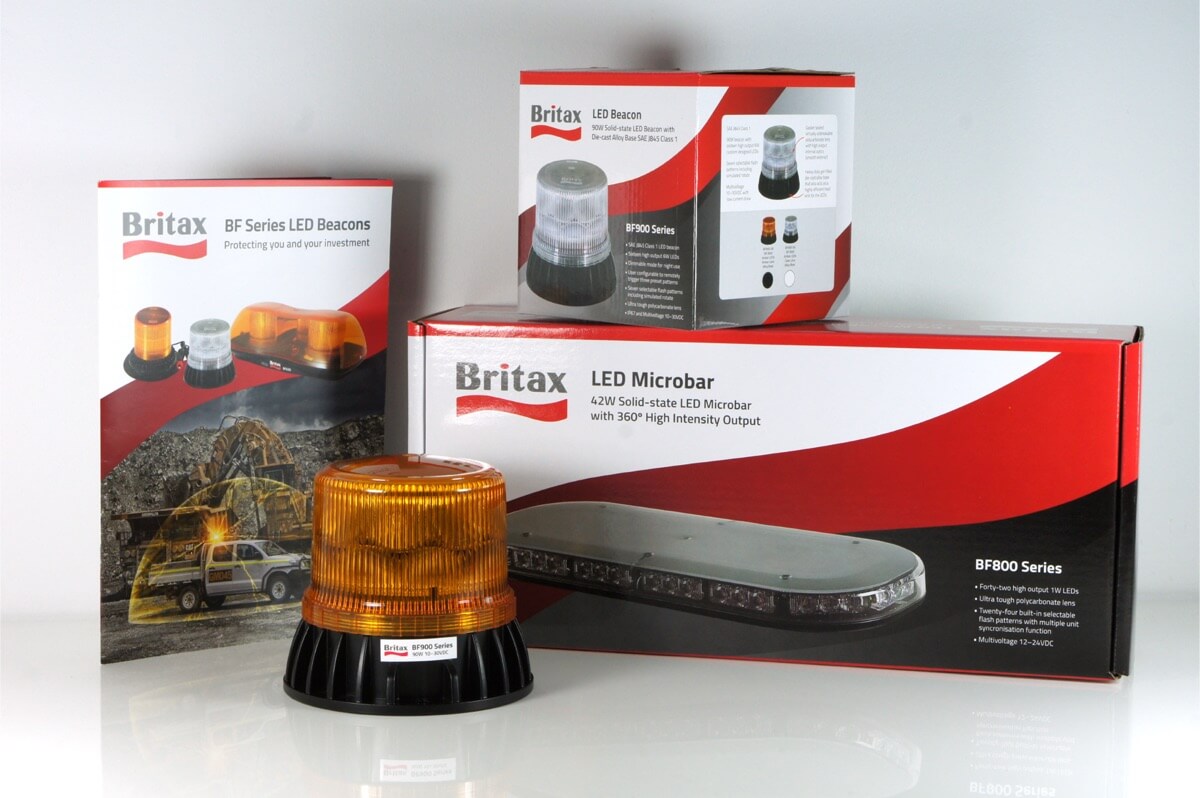
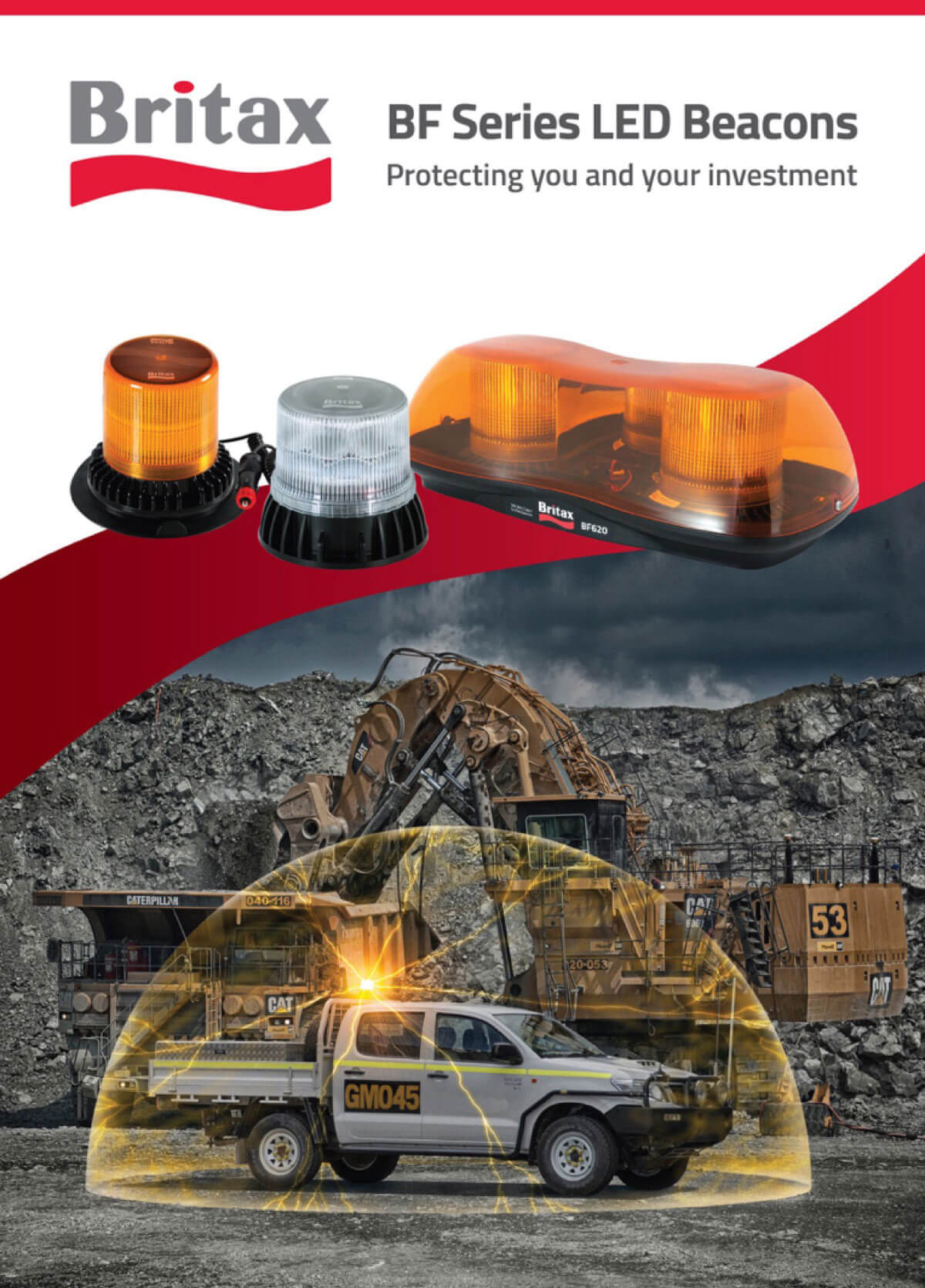
The second part of the project was the development and launch of the BF Series of LED beacons. The BF range was well engineered and built, powerful in terms of output, and had many additional features and certifications that cheaply made products in the lower end of the market do not. It was therefore imperative that this quality and reliability was clearly conveyed to the consumer, as the range does not (and should not) compete on purely on price.
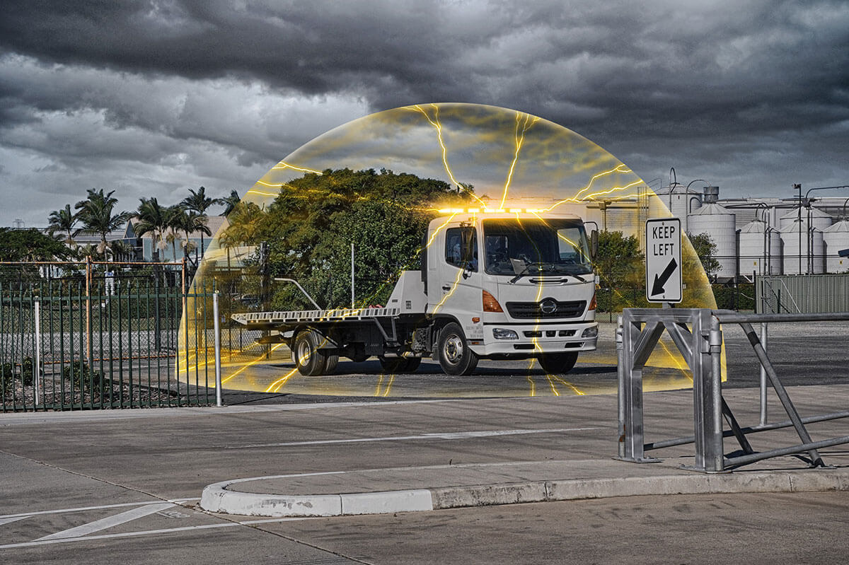
My approach to this challenge was to focus on the story of ‘why’. Why would anyone even need a beacon in the first place, and why would they want something that was of premium quality and performance? The answer: Roads, highways, construction sites, and mines are all dangerous places to be. And the people exposed to these environments all have friends and family who care about them dearly. It’s our mission to make sure they return home from work and travel safe and sound, day after day, year after year.
This was my ‘why’ which was summed up in the simple statement:
'Protecting you and your investment.'
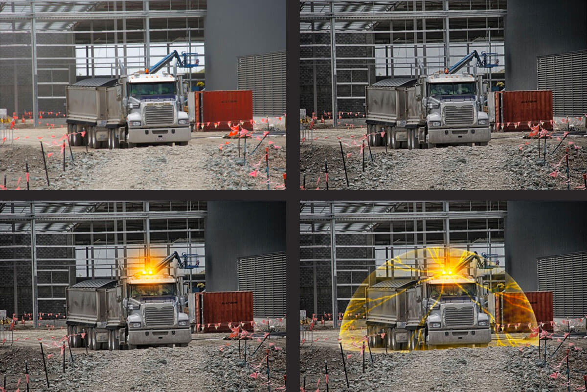
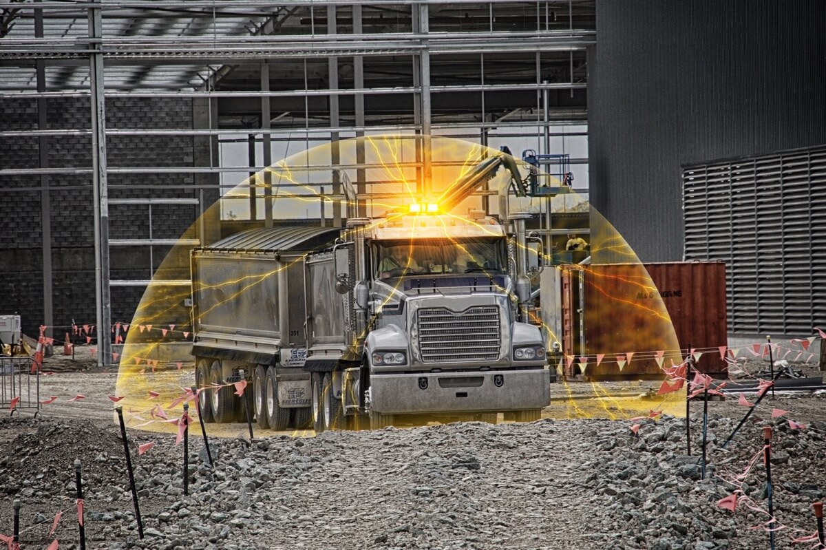
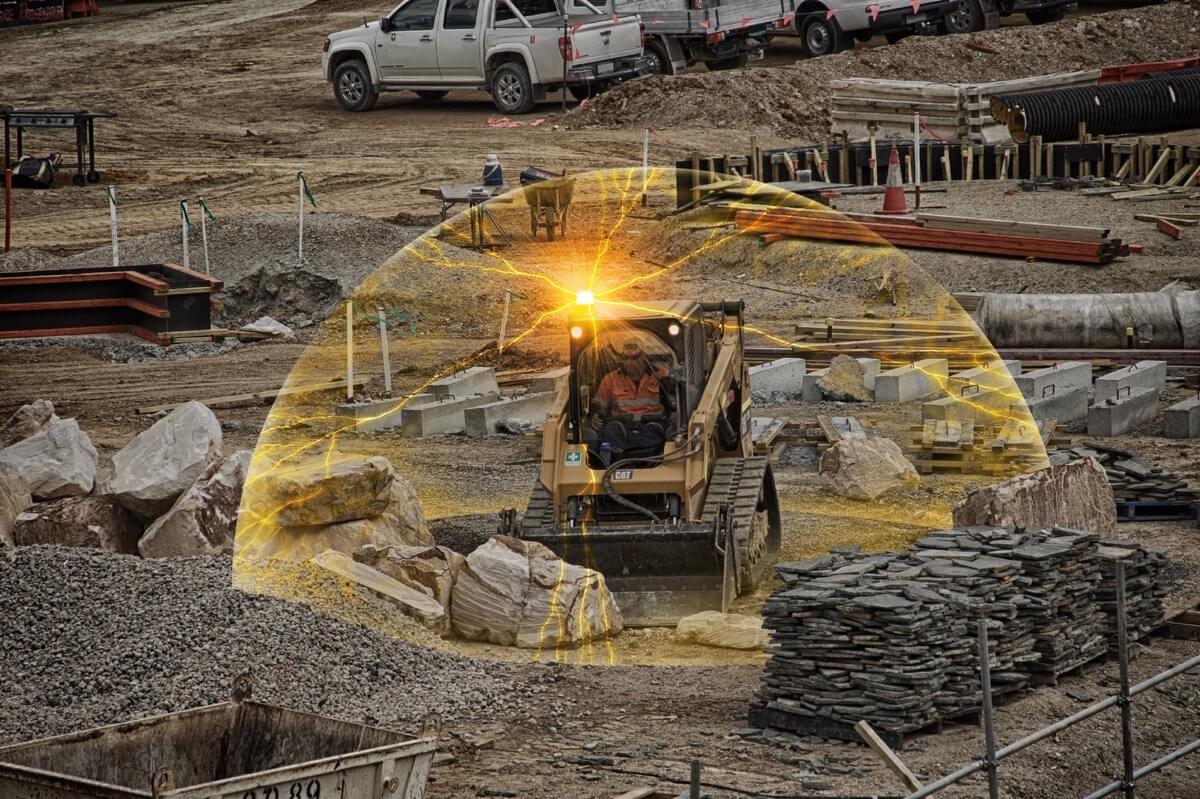
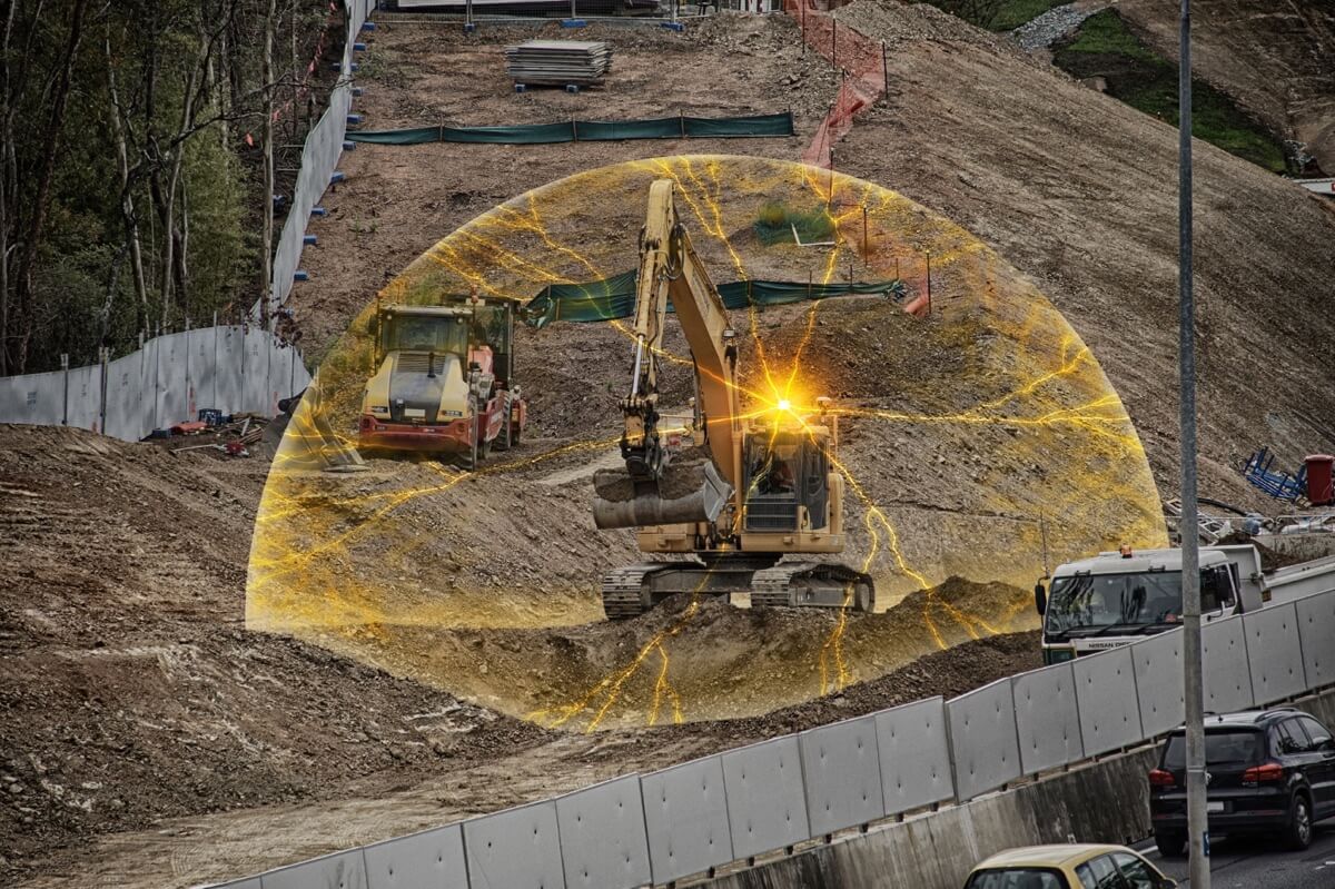
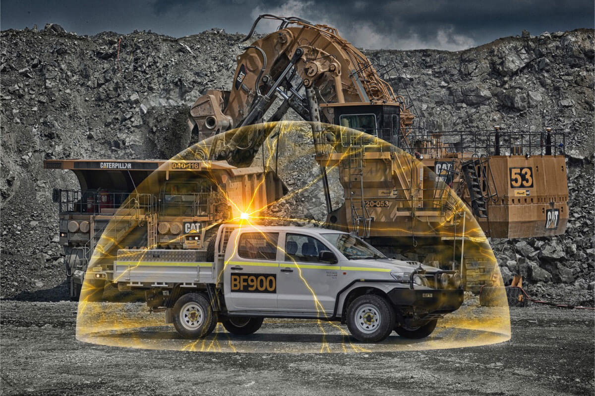
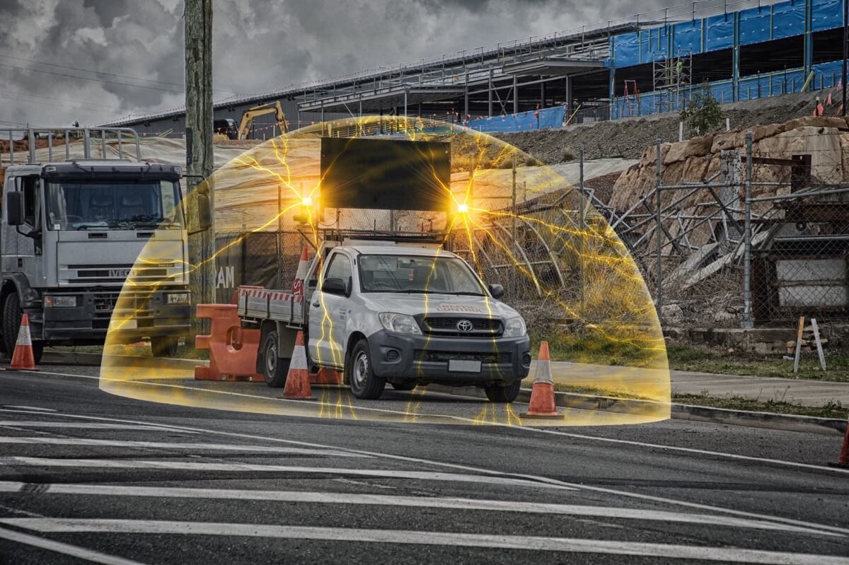
People are precious, vehicles and machinery are expensive, so why would you risk protecting them with a cheap beacon you bought off the Internet? I then created a visual representation of this concept, creating the ‘safety dome’ that flared out from the beacon and shrouded the vehicle with a kind of visual forcefield. Taking this concept we then shot several different vehicles in their respective environments, and applied the effect to each of them using Photoshop.
The first step was to scout around Brisbane to find appropriate locations and vehicles. Once these had been established, photographs were taken on mostly overcast days to help create the desired moody look and feel—plus the lower levels of contrast would eventually help the ‘safety domes’ to stand out better on the finished images.
Below you can see the original photograph on the top left, then on the top right effects and processes were applied to create a grungy industrial look. Then in the bottom left image the beacon was edited to be the appropriate model and type, and then was lit up using Photoshop techniques. And finally the bottom right image has the ‘safety dome’ applied over the top … taking special care to ensure details such as foreground elements and also the rear half of the dome were carefully edited to ensure the dome appeared to sit on the ground around the vehicle.
A series of images were created to cover industries including mining, construction, infrastructure, road works, and roadside assistance.
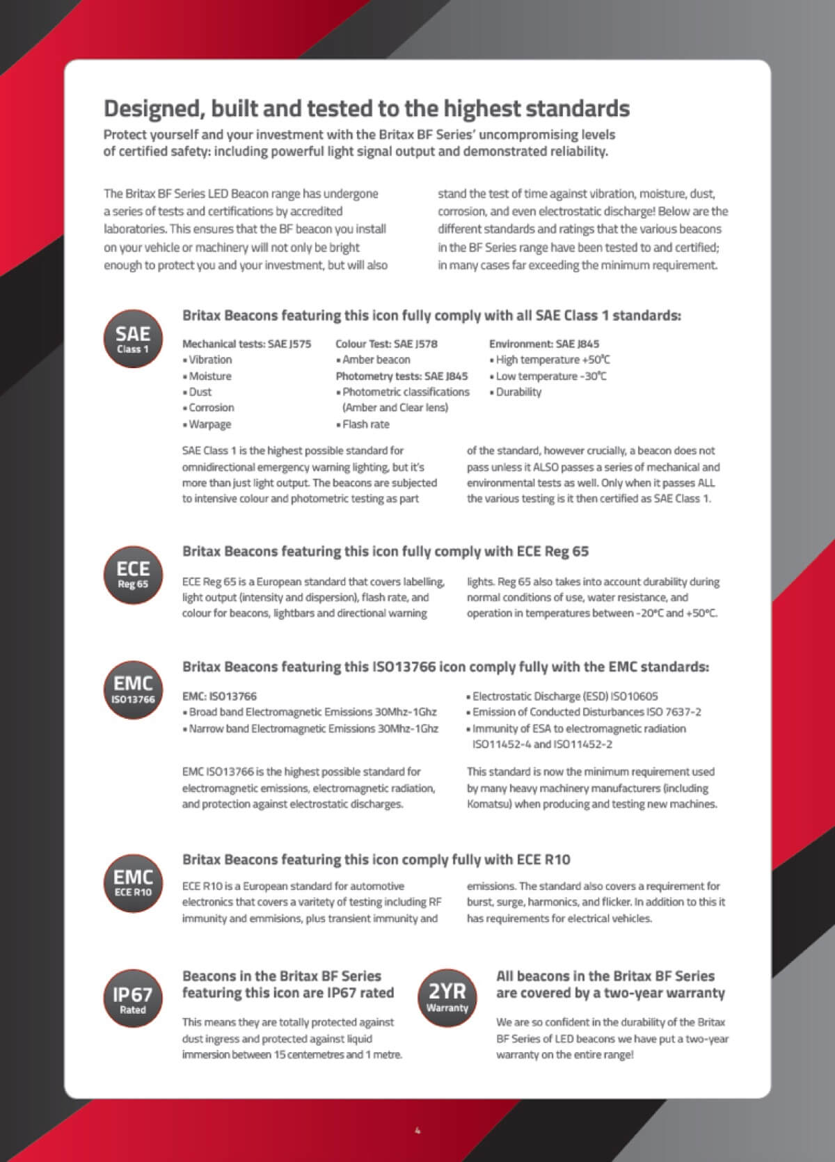
I then needed to tell the story in a way that would lead the customer to the product: starting with the introduction of ‘why’ high quality beacons are important, then a ‘how’ description of what makes a high quality product, then some information on the pedigree of the company that makes the Britax range, followed by an information page with all the standards and certifications of the range … and finally the actual products get introduced as the answer to the questions of ‘why’ and ‘how’. So by the time the customer gets to the product listing part of the brochure, they are already more-or-less on board with the ethos and reasoning behind buying a high quality safety product.
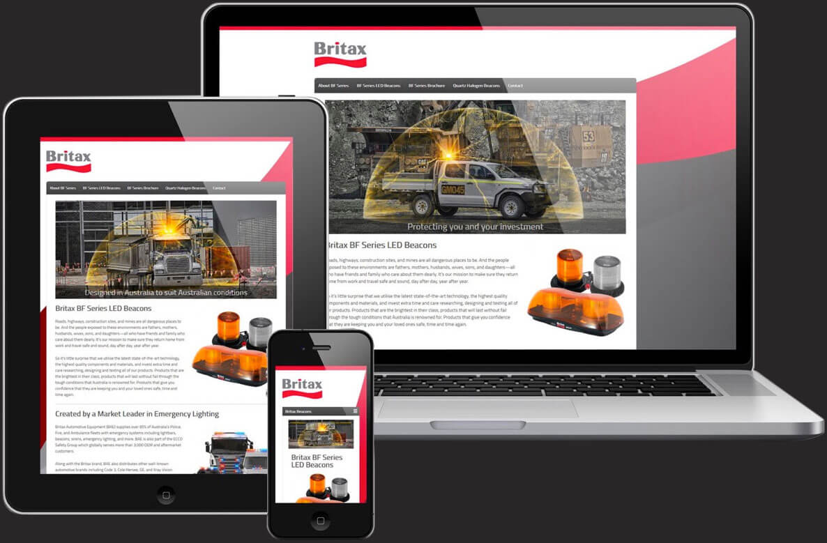
ESG then took the information and imagery from the brochure and translated it into the Britax beacons website—making sure that the order of the information was retained in the way visitors navigate the site. The website is also responsive, meaning it adjusts and rearranges itself to fit any screen size and orientation on any device.
To date the Britax BF Series LED beacon range has been one of ESG Asia Pacific’s most successful new product launches, and the flow-on effect from the branding overhaul has helped boost Britax products in all the other categories.