
LeadingEdgeCyber
naming | logo design | brand identity
LeadingEdgeCyber helps organisations of all sizes and in all industries to manage their cyber security effectively. Their cyber security specialists combine business acumen, technical expertise and industry-leading solutions to equip organisations with reliable defences against current and emerging cyber security threats.
Business partners Neil and Rob worked with us to create a brand design for the company that would appeal to corporates; presenting as intelligent and professional but with a creative edge and a bit of flair. The first step was word-mapping to develop the company name.
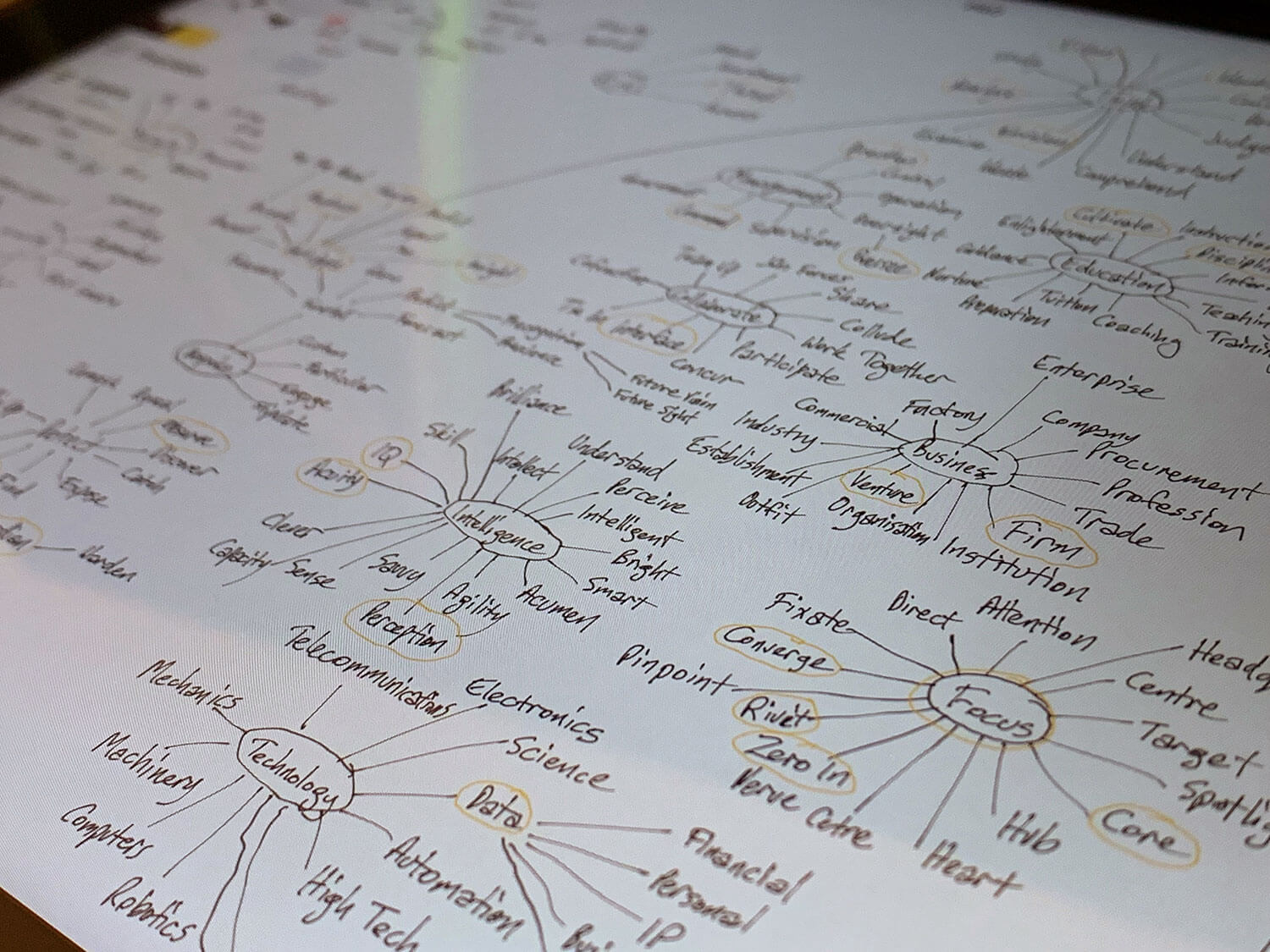
A vast number of options were explored, until Leading Edge was chosen. In order to make the name more unique and tie it to the industry, the decision was made to add ‘Cyber’ to the end. Written as one word, LeadingEdgeCyber was checked for name availability and URL options.
We then worked to ideate and create a logo that would encompass the various aspects of the business, while showcasing the professional manner in which they conduct their services.
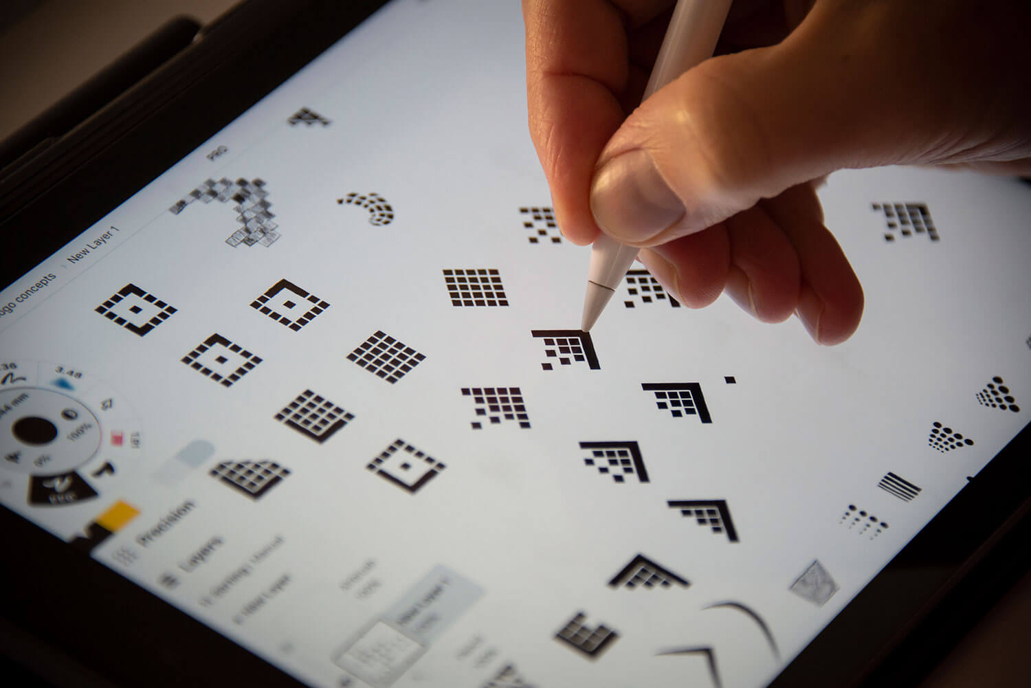
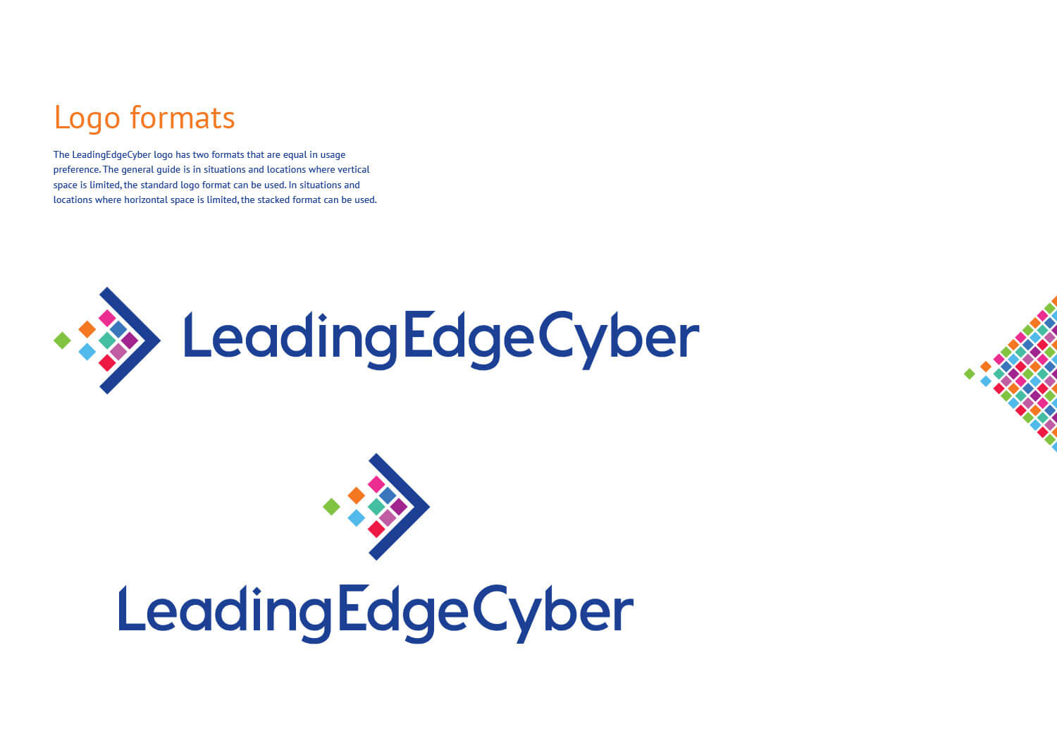
The LeadingEdgeCyber logo represents the various parts of an organisation that are structured and aligned to form a protective edge. The leading edge pushes forward keeping the components behind it safe. Three of the blocks are arriving into formation representing the active guidance LeadingEdgeCyber provides to bring many parts together, allowing an organisation to minimise the risk of damage caused by a cyber security breach. There is also a sense of movement with arrow shape moving from left to right, creating connotations of progression and advancement.
The logotype was custom designed to include an array of positive direction edges, along with a dotted ‘i’ that reflects the brandmark.
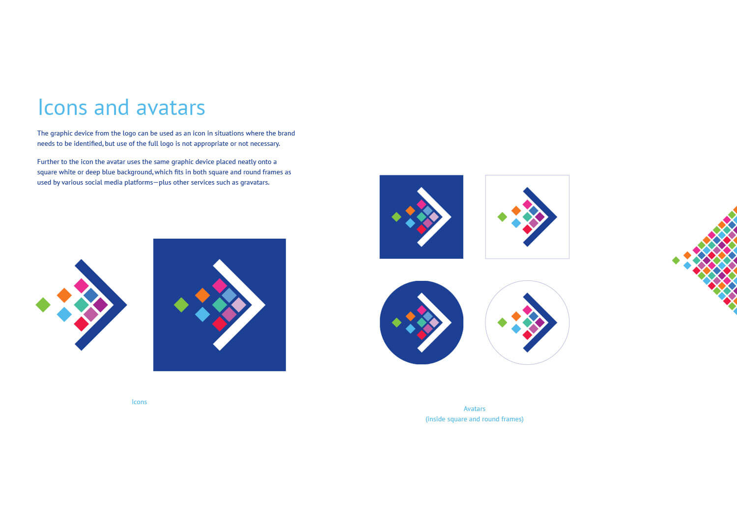
A brand design style guide was created to ensure clarity and consistency for the brand, including logo formats and other design elements. A graphic device was also created—essentially an extension of the logo design—to further promote the message of the company’s cyber security strategy working to influence structure and cohesion of their clients’ people and IT systems.
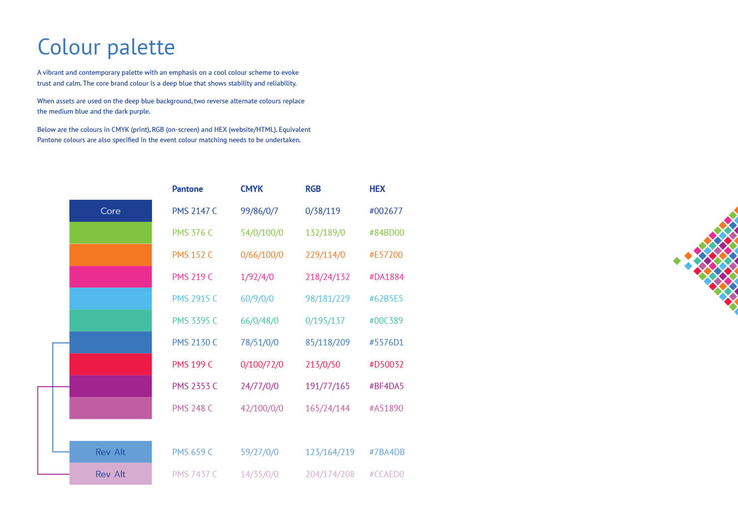
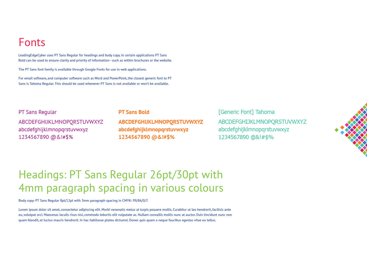
A core dark blue was chosen to provide connotations of reliability, trust and expertise. The blue is contrasted by a bright and energetic colour palette that is bold and vibrant without appearing playful or childish. These colours are used in the logo design, along with various graphic elements and the typography system.
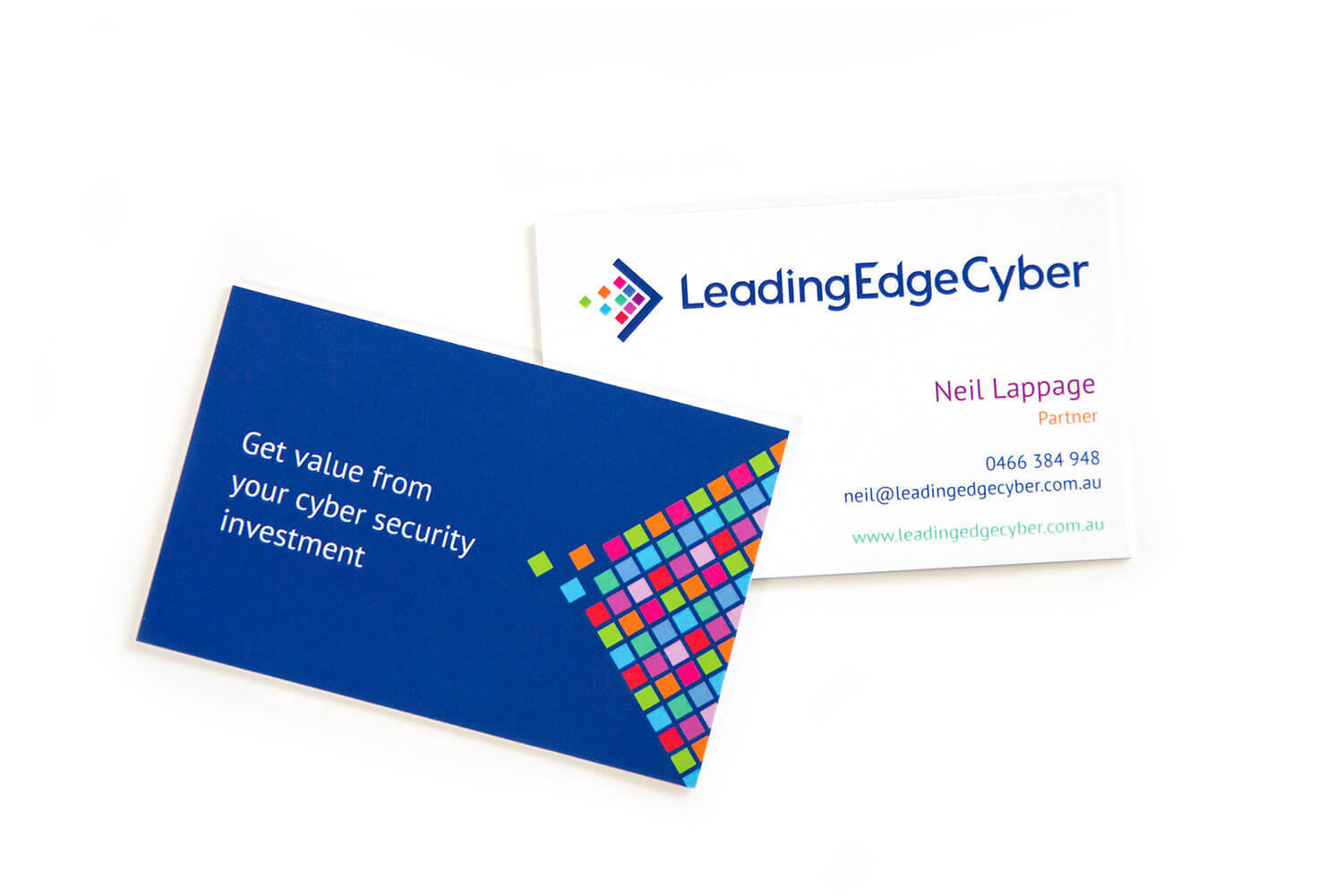
One of the first touchpoints designed and produced were the company’s business cards. Using contrasting sides, the dark blue side features LeadingEdgeCyber’s tagline along with the graphic device. On the details side the brand colours are used to add some personality into the type.
The team at LeadingEdgeCyber then took the brand design style guide and supplied brand design assets to create a website, which you can visit here: leadingedgecyber.com.au